| Image |
Comment |
| 04/17/2007 03:35:33 PM |
|
 Photographer found comment helpful. Photographer found comment helpful. |
| 04/17/2007 03:34:47 PM |
Identicalby ecdillonComment: A really sweet, pretty photo. I found the eyes very striking... and then read the previous comment about there not being highlights. I actually like that! It's kind of neat looking IMO. :) |
| Photographer found comment helpful. |
| 04/17/2007 03:32:59 PM |
Sunlightby ecdillonComment: Nice! I'm always a sucker for black backgrounds. Beautiful colors and contrasts. I like the simple curves of the branch. |
| Photographer found comment helpful. |
| 04/17/2007 03:31:59 PM |
Symmetryby ecdillonComment: I like the simple clean-ness of this too! Here is a shot though that would be cool to try using the rule of thirds a little more... it might be interesting to see what it looked like if it more towards the upper right-hand corner, for example. A nice, pretty shot! |
| Photographer found comment helpful. |
| 04/17/2007 03:29:59 PM |
|
| Photographer found comment helpful. |
| 04/17/2007 03:29:17 PM |
The Evil Eyeby ecdillonComment: Cool! I know from experience myself how difficult it is to photograph black-furred animals: either the details of the fur become very harsh or washed out, or the details are completely lost in a black void. But I think you've captured the fur details perfectly here! It would be cool if the cat's eyes were a little wider open (although it certainly does make the cat look evil!) But, having a cat myself, I know how difficult models they can be! |
| Photographer found comment helpful. |
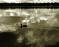
| 04/17/2007 03:26:22 PM |
Adirondacksby ecdillonComment: I love the peaceful, serene atmosphere here... I wonder how it might look if you cropped some of the extra tree-tops off? The path is bright, but I like that! The only thing that bothers me is the washed-out sky. Very nice photo! |
| Photographer found comment helpful. |
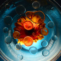
| 04/17/2007 12:36:27 PM |
Bubbles and Blossomsby CitadelComment: Beautiful! The warm and cold colors are so pretty when they contrast each other like this... I love it! I agree with the others that it looks a little over-sharpened, and might pop a little more with better lighting... but I like the centered composition! It's a really neat shot. |
| Photographer found comment helpful. |
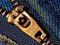
| 04/17/2007 12:10:56 PM |
YKKby GinaRothfelsComment: Well, I guess I agree with most of what Konador said below... it does look a little over-sharpened, but still, this is really cool! It's an everday object in a new and interesting perspective.
As for the crazy score...I can just as easily picture this in the 6.0 range or in the 5.0 range. I can NEVER figure out what the DPC voters are going to like! The only theory I can come up with is this: if I personally like a photo, it will score horribly. :) |
| Photographer found comment helpful. |
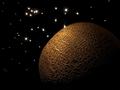
| 04/16/2007 06:42:18 PM |
Planet Melonby LevTComment: Awesome! This is very creative... I'm suprised it didn't score higher. (okay, maybe I'm not. I've seen lots of great images get dumped in the 5.5 range for no apparant reason) :P The lighting is beautiful, and the composition perfect. I love this! |
| Photographer found comment helpful. |
Home -
Challenges -
Community -
League -
Photos -
Cameras -
Lenses -
Learn -
Help -
Terms of Use -
Privacy -
Top ^
DPChallenge, and website content and design, Copyright © 2001-2025 Challenging Technologies, LLC.
All digital photo copyrights belong to the photographers and may not be used without permission.
Current Server Time: 08/11/2025 11:07:04 AM EDT.