| Image |
Comment |
| 05/21/2007 05:25:07 PM |
Love & Lossby TezComment: Very awesome!! Wonderful idea, and good execution. I love your composition. |
 Photographer found comment helpful. Photographer found comment helpful. |
| 05/21/2007 05:22:55 PM |
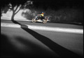
The bikerby pmottaComment: Cool! It would be cool if the biker was in a little better focus, although the motion blur does give a feeling of motion. Neat composition, and awesome contrasts here! I might suggest straightening the horizon out, but this is pretty cool. |
| Photographer found comment helpful. |
| 05/21/2007 05:21:25 PM |
The Stone Houseby JeffDayComment: Very cool! Reminds me of another photo in the first selective desaturation challenge... :) Great textures and colors. |
| Photographer found comment helpful. |
| 05/21/2007 05:20:00 PM |
|
| Photographer found comment helpful. |
| 05/21/2007 05:19:29 PM |
My Babyby KenComment: I like the high-key effect here... how everything is white-ish. But either it's slightly out of focus or some of the details have somehow been lost. Good try though! |
| Photographer found comment helpful. |
| 05/21/2007 05:18:30 PM |
Breath of a Childby StrikeslipComment: I love it! The lighting is so unique, and I love the little touch of green in the bubbles over the tree. Good composition too. |
| Photographer found comment helpful. |
| 05/21/2007 05:17:49 PM |
Stopping the voicesby hsolakidisComment: It looks like your white-balance might be off a bit. There's nothing truely white in the shot... highlights that might be white area actually gray. I've had this problem too, and have discovered I can usually fix it by adjusting the levels in Photoshop. Excellent try though, and very cool idea! :) |
| Photographer found comment helpful. |
| 05/21/2007 05:16:15 PM |
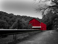
The Red Barnby ChinabunComment: I love the contrasts and the deep tones - good shot! When I first saw it, I almost wished it had a slightly different POV... but the leading lines you have are nice. |
| Photographer found comment helpful. |
| 05/21/2007 05:15:13 PM |
Three Little Flower Girlsby loveComment: Beautiful! I might suggest burning or darkening out that light-spot behind the girls, it's a little distracting. But otherwise you have a nice shot. :) |
| Photographer found comment helpful. |
| 05/21/2007 05:14:22 PM |
so what?by aznymComment: unique and interesting - I find it interesting how you left the sign's reflection also in color. Good contrasts, and nice shot. |
| Photographer found comment helpful. |
Home -
Challenges -
Community -
League -
Photos -
Cameras -
Lenses -
Learn -
Help -
Terms of Use -
Privacy -
Top ^
DPChallenge, and website content and design, Copyright © 2001-2025 Challenging Technologies, LLC.
All digital photo copyrights belong to the photographers and may not be used without permission.
Current Server Time: 08/14/2025 09:55:40 AM EDT.