|
|
| Image |
Comment |
| 09/28/2009 07:25:18 PM | Fireby heidaComment: Stunning shot. I'd love to find out how this was done. |  Photographer found comment helpful. Photographer found comment helpful. |
| 09/28/2009 07:20:51 PM | | | Photographer found comment helpful. |
| 08/10/2009 04:30:50 AM | | | Photographer found comment helpful. |
| 08/06/2009 03:14:02 AM | | | Photographer found comment helpful. |
| 07/06/2009 03:10:13 AM | | | Photographer found comment helpful. |
| 06/11/2009 08:04:23 PM | | | Photographer found comment helpful. |
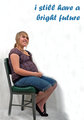
| 05/18/2009 10:53:21 PM | Poster Version 1by LadyKComment: First of all, the picture is fantastic. She looks so happy, and she's got a lovely glow in her eyes. It's a very positive image. However, unless there are editing restrictions, I'd get rid of all those creases in the lower left corner, they're quite distracting (make it just a uniform gray shade, or all white or something). Also, I think it would look better if the whole chair was in the picture, rather than chopping off the end of the leg (since it's only a chair, you could photoshop a leg extension in quite easily if you need to - I just think it looks neater if the whole image somehow seems contained within the poster). But yeah, that looks great, definitely go with it.
In terms of the message, hmm, not sure what to make of it... So for a start, the word "still" makes the message seem somehow very defensive rather than positive, in a "you all think I screwed up my life, but actually..." kinda way. If you want to go with the general message you've got at the moment, I'd maybe rephrase it with something like "19. A mother with a dream." or something. However, what I'd really like to see you do is think through exactly what it is you're trying to promote. I'm guessing it's not just a general "yay, teen pregnancy is good"? The UK has the highest rate of teenage pregnancy in Europe, it's a huge negative social issue where I'm from... On the other hand, because of the amount of negative stigma surrounding it, it's actually really nice to see a positive image saying that a teenage mother can be making a valid choice, be a good parent and love her child, and that the bad stigma is unjustified. Is that what you're trying to say? I think I'm missing the social/cultural context to understand it properly - could you explain what it is you're trying to convey?
Oh, also - the girl looks young, but doesn't immediately strike me as being a teenager, so if it's for a teen pregnancy competition, I think that would need to be clarified in some way...
Anyway, hope that helps :) | | Photographer found comment helpful. |
| 05/18/2009 10:11:45 PM | Toysby awpollardComment: Fantastic picture. The effects work really well, I can really see this on a T-shirt :) | | Photographer found comment helpful. |
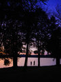
| 05/07/2009 06:00:20 PM | Summer Memoriesby CJDefend21Comment: Hi Caleb! Greetings from the Critique Club, and welcome to DPC :)
Nice entry, not bad for your first challenge :) Pretty sunset, and the silhouettes provide a good point of focus for the viewer.
In order to make an entry like this stand out, you need to think very carefully about the composition of it. This one is nice, and follows the rule of thirds, but all those tree silhouettes together look quite busy. I would've been tempted to try variations with either standing much further away and getting a lot more sky, or much closer to the people and getting rid of a lot of the trees, to see which one works better.
In terms of the post-processing: the main problems I can see with the picture are the noise and oversharpening. The noise is unsurprising since you were shooting at ISO1600 (you can see it very clearly in the top right corner), but also isn't the end of the world, since it's easily removable in pp - the two most commonly used programs for this are Neat Image and Noise Ninja. For the sharpening (you can see sharpening halos in the top right around the branches, and also around the silhouettes, that means you've gone a bit too far) - it's well worth getting familiar with the Photoshop 'Unsharp Mask' filter - it gies you a lot more control over the type and amount of sharpening you're applying than an auto sharpness setting does. There's a tutorial here. Of course, the best way to reduce the amount of sharpening you need is to be very careful about exactly where in the picture your camera focuses, but you'll always need some anyway just to make the picture pop a bit. Oh, also, do your noise reduction before you do any sharpening on the picture, since sharpening will amplify any noise present.
Anyway, hope that helps, and hope to see you submitting to more challenges soon :) | | Photographer found comment helpful. |
| 05/07/2009 05:11:22 PM | Christmas Trees For Saleby bennettjamieComment: Greetings from the Critique Club.
Hmm, don't know what to make of this one... It fits the challenge, and it's clearly been carefully composed - you've got that nice diagonal of trees fading off into the distance. But something about it just doesn't quite come together... Maybe it's the lack of a clear subject, leaving the viewer's eye to drift backwards and forwards without being drawn to any one single item. Maybe it's the mood of the colours - the normally happy greens and yellows somehow acquire a slightly morose feel mixed in with the darkness above and the subject matter. Overall, the viewer is left with the impression that the artist was indeed trying to say something, but also ends up slightly frustrated with the unspecificity of the message.
Not a bad shot though, and you've got some interesting stuff in your portfolio - I look forward to seeing further entries from you :) | | Photographer found comment helpful. |
Home -
Challenges -
Community -
League -
Photos -
Cameras -
Lenses -
Learn -
Help -
Terms of Use -
Privacy -
Top ^
DPChallenge, and website content and design, Copyright © 2001-2025 Challenging Technologies, LLC.
All digital photo copyrights belong to the photographers and may not be used without permission.
Current Server Time: 07/31/2025 11:13:31 AM EDT.
|