|
|
|
Showing 771 - 780 of ~991 |
| Image |
Comment |
| 08/29/2006 01:37:11 PM | The Dreaded 3-Way Mirrorby andrea22_alsComment: Greets from the Critique Club
This is a very well done shot. I would say that I would have cropped it just a little differently to get the whole camera in the scene on the right hand side.
Also, there is quite a bit of glare on the lens on the right hand side.
The sheet used for a backdrop is too wrinkled and doesn't cover the entire BG. Also, it shows where the harsher lighting is coming from, so there is an unevenness about the lighting.
Otherwise, I like the shot and think it was quite well done.
--Mike |  Photographer found comment helpful. Photographer found comment helpful. |
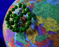
| 08/28/2006 07:49:37 PM | Peas in the Middle Eastby RebeccaComment: Greets from the Critiqe Club
I like the message you are portraying in this photo. And I think it's one of the best "Peas on earth" photos in the challenge as far as setup goes.
I'm going to have to agree that a different perspective would have brought the peace sign out. And geographically, if you would have moved it to the right some, to cover Iran, Pakistan, and Afghanistan instead of parts of Europe, it would fit the title more.
The background is a little too much texturized. I like the blue, but a lighter shade might have worked better. Also, there is still a major glare on the left hand side of the peas and the shadow is a bit harsh around them as well. Perhaps a soft light from the front would have worked better.
I do think this was an underrated photo in the challenge.
--Mike | | Photographer found comment helpful. |
| 08/28/2006 04:21:12 PM | Black Eyed Peasby mssnareComment: Greets from the Critique Club
I don't know exactly what to say about this. It's a good play of words on the Black Eyed Peas and I like how you portrayed it.
As was mentioned, the lighting isn't the best. If you would have lit this from overhead, it might have been more even. As it is, the top left is lit well and the rest of it is kind of dark and flat.
Also, the face is a bit distorted. Yes, it's a comical face and not an exact depiction, but I feel it's missing just a little something. Another kind of nitpicky thing, the shriveled peas don't really mix well with the round ones. I'd go with either one or the other, or have them separate for different parts, but not mixed together like they are.
Also, the color is a bit flat and it doesn't quite pop out at you.
Hope this helps.
--Mike | | Photographer found comment helpful. |
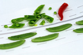
| 08/28/2006 02:47:24 PM | Delays possible, fire appliance in attendanceby julesskiComment: Greets from the Critique Club
First off, I have to say that this is a very creative photo. I like the effort put forth into doing it.
I agree that the hand drawn road would have looked better on black with yellow lines. And that the tight focus on the accident "victims" is very good.
However, I believe this would have scored better if more of it were in focus, especially the pepper. The red pepper should stand out more (I figure that's why you put it in there). Also, the shadows tend to take just a little away from this shot. I would have bounced the light more off of both sides of the light box to try to soften the shadows.
The colors seem to be just right, so you did a good job of making them true.
I'm also thinking about how well this would have stood out without the title. People might have just thought this was some peas, broken up, add a pepper, and toss them onto a sheet of paper with dashed lines.
Overall, very creative and humorous.
Keep shooting and making folks think and laugh.
--Mike
| | Photographer found comment helpful. |
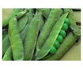
| 08/27/2006 11:56:16 PM | mmmm.....PEAS!by AppleFunkComment: Greets from the Critique Club
I didn't vote in this challenge, because basically, it didn't interest me. However, to critique isn't just on my interest.
Your photo has potential to be a very good one. As you mentioned there is a lot of graininess. Yes, shooting at 3200 ISO is probably the cause. Drop it to 100 or 200 for still shots. Also, in the post processing phase, you could use NeatImage or another program to get rid of the noise. Also a good Unsharp mask wouldn't hurt either.
The borders make this look like a polaroid. And that just isn't appealing.
The photo is also very flat. The colors seem to run together. If you used curves, this would really pop and the greens would really show and separate.
The composition of this is really good and I just love the idea. You have a good eye as to what can capture interest. You just need a bit more to make the images pop and capture the attention and imagination of others.
Hope this helps.
--Mike | | Photographer found comment helpful. |
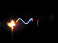
| 08/27/2006 11:20:25 AM | Fusionby SebiComment: Greets from the Critique Club
First off, I'd like to say that this shot has potential for being a really great shot.
The colors from the led light on your finger (?) against the flame really complement each other well.
The photo is extremely noisy and seems a bit over sharpened in places. Perhaps some NeatImage, Noise Ninja, or USM would have helped this out.
Also, since this was an advanced editing challenge, you could have cloned out some of the stray movements/light that don't really fit with the flow of the rest of it.
Some have said to crop the background, giving more focus to the subject. I can agree with that, or make it so the background is all black, giving it the negative space needed to really draw you into the center.
Well thought out, a bit of better PP and this type of shot is going to be up there.
--Mike | | Photographer found comment helpful. |
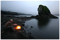
| 08/27/2006 11:12:16 AM | The lone rangerby BrinComment: Greets from the Critique Club
What can I say about this photo that hasn't been said? Congrats on the 4th place finish.
The composition is lovely. The orange flames really stand out against the very understated scenery. It is a very calm and peaceful setting, and draws you into it.
The only thing that I can say is that the big rock tends to compete with the fire for my attention.
Congrats again!!
--Mike | | Photographer found comment helpful. |
| 08/26/2006 09:01:11 PM | Blue Fire Cogby hotpastaComment: Greets from the Critique Club
First off, congrats on the top 10 finish with this shot. Not sure I can add a whole lot to what has already been said, but I'll try.
This is a beautiful abstract macro and the softness of the flames does help against the hard cold black of the burner. However, the focus point seems to be on the edge of the burner, where you can easily make out the scuff marks on the black edge of the burner.
The colors of this are magnificent, the orange, blue and black complement each other magnificently.
The crop and angle are superb. It shows just enough to make this very interesting. I think if you would have had more of the burner, the photo would have been very boring.
Great job on the top 10 again.
--Mike | | Photographer found comment helpful. |
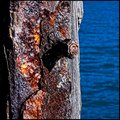
| 08/24/2006 08:56:30 PM | Rustic Charmby sherpetComment: I love the color and texture of rust. You really captured it well. | | Photographer found comment helpful. |
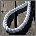
| 08/24/2006 08:55:47 PM | Ropedby sherpetComment: Wow, this is a great photo. Too bad you didn't enter this one. | | Photographer found comment helpful. |
|
Showing 771 - 780 of ~991 |
Home -
Challenges -
Community -
League -
Photos -
Cameras -
Lenses -
Learn -
Help -
Terms of Use -
Privacy -
Top ^
DPChallenge, and website content and design, Copyright © 2001-2025 Challenging Technologies, LLC.
All digital photo copyrights belong to the photographers and may not be used without permission.
Current Server Time: 08/05/2025 03:32:22 PM EDT.
|