| Author | Thread |
|
|
08/28/2006 07:49:37 PM |
Greets from the Critiqe Club
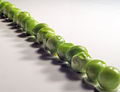
I like the message you are portraying in this photo. And I think it's one of the best "Peas on earth" photos in the challenge as far as setup goes.
I'm going to have to agree that a different perspective would have brought the peace sign out. And geographically, if you would have moved it to the right some, to cover Iran, Pakistan, and Afghanistan instead of parts of Europe, it would fit the title more.
The background is a little too much texturized. I like the blue, but a lighter shade might have worked better. Also, there is still a major glare on the left hand side of the peas and the shadow is a bit harsh around them as well. Perhaps a soft light from the front would have worked better.
I do think this was an underrated photo in the challenge.
--Mike |
|
 Photographer found comment helpful. Photographer found comment helpful. |
|
|
08/22/2006 04:09:55 PM |
Hey there:) I think it came out pretty well! I didn't vote since I knew it was yours but thought I'd comment now that voting is over and such.
I agree with one of your other commenters, that maybe a diff perspective might have helped the peace symbol stand out better. Also, my first impression was that the lighting is a little harsh- dark pea shadows in contrast to the highlights on the left being a bit blown, but overall a cool idea!
|
|
| Photographer found comment helpful. |
Comments Made During the Challenge  |
|
|
08/21/2006 03:41:48 AM |
|
This sure made me laugh. Well done. |
|
| Photographer found comment helpful. |
|
|
08/20/2006 03:34:06 PM |
|
nice play one words. perhaps a different angle and the peas making a peace sign would have helped |
|
| Photographer found comment helpful. |
|
|
08/19/2006 04:18:34 PM |
|
Interesting idea, but you needed a bigger globe or map to pull it off IMO. At this scale, the peas are too big to form a neat symbol. |
|
| Photographer found comment helpful. |
|
|
08/18/2006 06:05:58 AM |
|
I give you 10 for the message I hope to hear you somebody |
|
| Photographer found comment helpful. |
|
|
08/16/2006 05:47:16 AM |
|
very creative, well lit, well composed. unfortunately, I wouldn't be at all surprised if many don't make the connection to "peace", even though it's more than obvious. one nit, the blue background is much too texturized and it's not really a complimentary shade of blue. it does distract a bit. something darker and flat would probably have worked better. ehh, but what do I know... |
|
| Photographer found comment helpful. |
|
|
08/15/2006 10:28:40 PM |
|
| Photographer found comment helpful. |
|
|
08/15/2006 12:09:57 PM |
|
I think this one is my favorite! Very cool! |
|
| Photographer found comment helpful. |
|
|
08/15/2006 11:41:41 AM |
|
a little hard to mke out the peace symbol, but very clever idea |
|
| Photographer found comment helpful. |
Theme:
Classic /
System /
Light /
Dark
Home -
Challenges -
Community -
League -
Photos -
Cameras -
Lenses -
Learn -
Help -
Terms of Use -
Privacy -
Top ^
DPChallenge, and website content and design, Copyright © 2001-2026 Challenging Technologies, LLC.
All digital photo copyrights belong to the photographers and may not be used without permission.
Current Server Time: 10/02/2026 05:37:24 PM EDT.







 Add photograph to your favorites
 Add photographer to your favorites


