| Image |
Comment |
| 04/17/2008 05:25:36 PM |
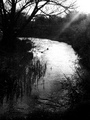
Evening Riverby DaisyBootsComment: This looks like a pretty setting, but the glare from the sun is distracting imo. I also feel that it is too grainy. |
 Photographer found comment helpful. Photographer found comment helpful. |
| 04/17/2008 05:20:19 PM |
Dancing Watersby 777STANComment: it looks like a pretty fountain, I don't know that I like the composition. It seems a little blurry to me. Like you are somewhere in between stopping the water and having that pretty long exposure of running water. jmo |
| Photographer found comment helpful. |
| 04/17/2008 05:18:20 PM |
A Way of Lifeby BudComment: I like the green in the boat, but I feel like this would be better for me with a tighter crop from the left |
| Photographer found comment helpful. |
| 04/17/2008 05:14:04 PM |
|
| Photographer found comment helpful. |
| 04/17/2008 05:12:36 PM |
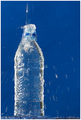
Splashby CitadelComment: I like the concept, but i think that if the motion had been stopped it would be a little better, the bottle also seems a little tilted and that is distracting on the composition, imo |
| Photographer found comment helpful. |
| 04/17/2008 10:43:24 AM |
|
| Photographer found comment helpful. |
| 04/16/2008 11:53:46 PM |
|
| Photographer found comment helpful. |
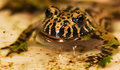
| 04/16/2008 12:55:06 PM |
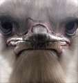
Bubble Troubleby JulietNNComment: I didn't vote on this one, but it would have probably been a 4 or 5 from me. The head could be straight but even with that it would still look freeky. (although I must say Charlie is a cutie :).. ) Way too much negative space for me and it does seem blown out. It takes a while to get that it is bubbles. So I would have really liked this if you had gotten a little more up close and personal with some softer lighting, and maybe a conversion to black and white. jmo |
| Photographer found comment helpful. |
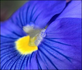
| 04/16/2008 11:37:29 AM |
Spring Bluesby patio127Comment: thank you for your comment. I did not get a chance to vote on this one but I love it! Course I love flowers so I am a little biased :)Great color and depth of field. Would have been an 8 from me |
| Photographer found comment helpful. |
| 04/15/2008 07:30:09 PM |
|
| Photographer found comment helpful. |
Home -
Challenges -
Community -
League -
Photos -
Cameras -
Lenses -
Learn -
Help -
Terms of Use -
Privacy -
Top ^
DPChallenge, and website content and design, Copyright © 2001-2025 Challenging Technologies, LLC.
All digital photo copyrights belong to the photographers and may not be used without permission.
Current Server Time: 06/19/2025 08:32:25 PM EDT.