| Image |
Comment |
| 09/14/2007 07:45:31 PM |
Levitateby lovethelightComment: Critique Club feedback -
You regularly submit well executed, creative shots and this is no exception. The lighting is very nice and the amount of effort you put into the shot certainly paid off. I'm actually puzzle as to why this didn't score higher as it pretty much delivers everything the 'typical' DPC style shot should. Who can predict the fickle tastes of the masses...
Very nice work!
|
 Photographer found comment helpful. Photographer found comment helpful. |
| 09/14/2007 07:39:03 PM |
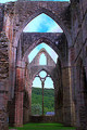
Tintern Abbey: Through The Eyeby obsidianComment: Critique Club feedback -
It is difficult to critique HDR images because I have a hard time telling what came from the camera and what came from the computer. so, ifsomeof these comments are way off base I apologize in advance.
Three things hold this image back and keep a wonderful subject from really catching the viewer's interest.
First, the tilt. While architectural shots are tough due to perspective warping, it is often best to make sure that prominent edges within the scene are level. here that would be the horizontal line about half way up the frame. Itwould also help to bring the crop down slightly to hide that bit of sky that creeps in and emphasizes another bit of tilt there.
Second, all the haloing and fringing. The purple fringing makes me think this is a lens quality issue from shooting such a high contrast scene, but it could also be from the HDR processing as I have seen it on other such shots. In either case, it is worth removing via history brush if the editing rules allow as they do in this case. Nothing screams 'photoshop' like haloing around the edges.
Finally, the ever present desire for sharpness in challenge entries. I think in a detail filled image like this, a desire for sharpness throughout the imageis both desirable and warranted.
Hopesome of that is helpful advice. Good luck! |
| Photographer found comment helpful. |
| 09/14/2007 07:33:22 PM |
Dark Realmsby AtlantisComment: Critique Club feedback -
Very creative image and you've done a good job portraying the classic 'warlock' type of imagery. The only nitpickwould be the oversaturated areas of the flames which have turned into unsightly blobs of yellow.
This picture scored well so your efforts paid off and rightly so! |
| Photographer found comment helpful. |
| 09/14/2007 07:31:19 PM |
d a w nby hotpastaComment: Critique Club feedback:
Wonderful lighting and great capture of the reflections of the ships. Regarding the horizon tilt comments from the Flat Earth Society - what is tremendously reinforcing that perception is the tile of all the masts. Many vertical lines tilted to the right - the eye is tricked.
I have no other meaningful commentary. This is a very beautiful image and it score quite well as you would expect.
Very nicely done. |
| Photographer found comment helpful. |
| 09/14/2007 07:24:25 PM |
Muncasterby SweetlittlepixieComment: Critique Club feedback:
This is a very nice landscape and it works well in b/w. The range of tones is nice and the balance of the darkness below with the lights above works well. The overexposed bit of the sky doesn't work quite as well, and given the editing rules this might be a candidate for some selective masking to try and salvage that area if you are so inclined. Another thing to consider would be not splitting the image in half with the horizon, but rather emphasizing either the sky or the ground by lining the horizon up on the lower or upper third of the image.
Finally, looks like some sensor dust up near the top! Damnable dust bunnies.
Nice work! |
| Photographer found comment helpful. |
| 09/14/2007 07:21:32 PM |
The End of the Beginningby Dr.ConfuserComment: Critique Club feedback:
You did a very nice job planting the cloudy sky in the image. Until I read your notes I thought it was real.
It is a very interesting looking statue. I think that cuts both ways in that it is nice to look at, but is really also someone else's effort on display.
On another note, this would make a stunning piece in black and white, all the moreso with that sky you added.
Good luck! |
| Photographer found comment helpful. |
| 09/14/2007 12:50:40 PM |
Play Boatingby QikiComment: Critique Club feedback:
I think the score this shot received is pretty much on the mark. The photo is decently lit, decently in focus and the composition is ok. Overall, everything is ok while nothing really stands out.
There is a yellow haze to the shot that actually makes this look like a faded/older photo. I think it is actually enhanced by the off-white border. Perhaps this was a look you were going for.
Obviously this would have fared better were there more action in the shot, but for what it is it isn't bad.
Good luck! |
| Photographer found comment helpful. |
| 09/14/2007 12:42:46 PM |
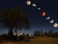
A Night to Remember by Shadowi6Comment: Critique Club feedback:
I found this to be one of, if not the, best of the eclipse images in the challenge. Obviously I wasn't alone in that opinion!
The only critical thing I would have to say about this shot is that the guy appears to be pointing and looking in a different direction from the moon(s), and it was odd enough that it was actually the first thing that hit me about the image. Were he pointing at the horizon in front of them (more towards the top of the shot), I think this would have looked frighteningly 'real'.
Minor nitpick. Hell of a picture.
Good job! |
| Photographer found comment helpful. |
| 09/14/2007 12:39:40 PM |
Venetian Parking Spaceby sh0rtyComment: Critique Club feedback:
This is a nice capture, if a bit static for a Free Study entry.
While there is no real excitement here to draw the eye, I do like all the textures and patterns and the overall clarity of the scene. Having been to Venice I realize that it isn't always possible to find different angles to shoot from, but assuming it was possible, a different point of view to give more emphasis to the boat and its reflection might make this shot pop.
Good work and I hope you enjoyed Venice! My fav city in the world. |
| Photographer found comment helpful. |
| 09/14/2007 12:29:32 PM |
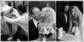
Transitionby jeroweComment: Critique Club feedback:
These are nicely lit and composed shots, and the triptych approach is something different to look at. While all technically competent, they lack any mass appeal and would have a hard time competing in a Free Study. Still you've captured some nice moments here and are obviously a capable wedding photog.
Good work! |
| Photographer found comment helpful. |
Home -
Challenges -
Community -
League -
Photos -
Cameras -
Lenses -
Learn -
Help -
Terms of Use -
Privacy -
Top ^
DPChallenge, and website content and design, Copyright © 2001-2025 Challenging Technologies, LLC.
All digital photo copyrights belong to the photographers and may not be used without permission.
Current Server Time: 06/22/2025 09:51:32 AM EDT.