| Image |
Comment |
| 09/15/2007 10:21:00 AM |
When the winds of life blow, bend if you must but dont you breakby Delta_6Comment: Critique Club feedback -
This shot had all the elements of a high scoring motivational poster, but a few things held it back.
The image itself is great and well composed. It almost screams 'slap some text on me and let's make a poster!'. It really needs increased contrast to get the tree to pop out of the rest of the scene. Also shooting this from a lower point of view so that the tree itself would be framed entirely by sky rather than by the horizon split would also give it more weight.
The phrase you chose works very well with the imagery. The layout of the text and the font used are also nice.
I think people had a fairly concrete notion of what these posters should look like as far as font and overall graphical design, and this poster is very different from that standard. That is probably the largest reason this didn't score higher.
Nonetheless, a very creative and well designed poster. If you choose to follow the herd-think next time this challenge pops, you will no doubt be a top contender.
|
 Photographer found comment helpful. Photographer found comment helpful. |
| 09/15/2007 10:16:08 AM |
Beauty - Appreciate Simplicityby KatheComment: Critique Club feedback-
This was such an odd challenge, and the voters seemed to expect a pretty standard type of 'poster'. While this is a nice combination of image and phrase, it doesn't immediately come across as motivational and can be (and likely was) interpreted as just a pleasant platitude on the benefit of appreciating the simple things in the world.
The font and placement of text on the poster also moved away from people's notion of what these posters should look like. There's nothing wrong with it, it's just different and likely different enough to have affected the score. I do think the placement of the words in the frame is ok, and the size change of the font was a good approach.
The photo itself is nicely lit with some good details around the water droplets. A bit deeper focus might have given this a bit more pop as much of the twig is blurred out in prominent areas of the overall poster.
Overall this isn't bad and it picked up a slightly above average score as a result. Good work! |
| Photographer found comment helpful. |
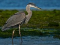
| 09/14/2007 08:36:42 PM |
The Great Blue Heronby SouthCoastOr3gonComment: Critique Club feedback -
A good shot is a good shot, even if it's "just a bird". This shot scored well and rightfully so. The level of detail on the bird is stunning and you got this shot at a great time of day when the light was very flattering.
Quite nice, well done. |
| Photographer found comment helpful. |
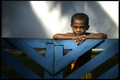
| 09/14/2007 08:35:33 PM |
The Children of Biak Islandby ilphotoComment: Critique Club feedback -
Lighting on the child and the fence he is leaning on are great. Tilt of the fence and blownout background, not so great.
Perhaps cropped so the child and the right portion of the fence fill the scene (placing the face on a thirds intersection most likely), would be an even more dramatic composition.
Very nice shot, well done! |
| Photographer found comment helpful. |
| 09/14/2007 08:33:47 PM |
Prefigurement of Lossby posthumousComment: Critique Club feedback -
I really have no background or credentials for commenting on graphical art. I think you did a good job with the painting, and this looks like a lot of pieces of art in this genre that I have seen before, so I have to assume that it is a good example of what it is. |
| Photographer found comment helpful. |
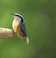
| 09/14/2007 08:32:24 PM |
Nuthatchby stargazer05766Comment: Critique Club feedback -
Wonderful detail, good lighting, good focus. I think swimming in a sea of green doesn't allow this fellow to show off asmuch as he could with a tighter crop.
Very well shot. |
| Photographer found comment helpful. |
| 09/14/2007 08:31:06 PM |
Tiger Pawsby TommyMoe21Comment: Critique Club feedback -
This is so unnatural looking as to be jarring. Still, I do like the symmetry and I think a tighter crop would really show off this effect well. It is probably a love/hate sort of thing, so may as well crop it to give the mirror tiger all of the real estate. Beyond the reflecting - great lighting, perfect exposure and dead-on sharpness. Really good shot. |
| Photographer found comment helpful. |
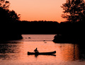
| 09/14/2007 08:25:30 PM |
Coming Inby ColeyComment: Crique Club feedback -
Good eye for the natural framing around the boater, and the silhouettes work very well against themuted orange tones. I think a tighter crop, even at the expense of the sky, might make this image look even better.
Nice stuff! |
| Photographer found comment helpful. |
| 09/14/2007 08:21:58 PM |
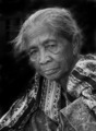
Window to the Soulby acoppolaComment: Critique Club feedback -
Nice portrait of an interesting face. One suggestion wouldbe a much tighter crop. This would make the most of those great facial details as well as lessen the need for burning out the background. A little background might even add to the image overall.
Nice work! |
| Photographer found comment helpful. |
| 09/14/2007 08:20:36 PM |
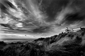
Glancing out to Seaby jblaylockraynerComment: Critique Club feedback -
Heh, why in the world you are requesting a critique I wonder. You have an eye for a scene, are creative and certainly a master of the technicals. This image is no exception to any of that, and the score it received reflects this as well.
My personal opinion - You did a really nice job dodging up some details in the foreground. For the sake of tonal balance, an equal amount of effort on some of the highlights in the clouds might work as well and keep the upper right portion of the shot from washing out a bit.
Great work (as usual) ! |
| Photographer found comment helpful. |
Home -
Challenges -
Community -
League -
Photos -
Cameras -
Lenses -
Learn -
Help -
Terms of Use -
Privacy -
Top ^
DPChallenge, and website content and design, Copyright © 2001-2025 Challenging Technologies, LLC.
All digital photo copyrights belong to the photographers and may not be used without permission.
Current Server Time: 06/22/2025 08:14:47 AM EDT.