| Image |
Comment |
| 09/15/2007 11:28:55 AM |
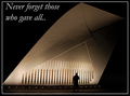
Never forget those who gave allby RulerZigzagComment: Critique Club feedback -
I gather this is a war memorial, though I don't know which one. That's a tough thing for a motivational poster as it really needs to connect instantly and completely with the viewer.
The photo itself is nice, though there are areas where it is poking out from its border. This sort of comes across as lack of attention to detail, even if it was done by choice.
Good match of quote with imagery. A different placement of the quote and a bit stronger style of font may have given it more impact. |
 Photographer found comment helpful. Photographer found comment helpful. |
| 09/15/2007 11:25:05 AM |
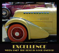
EXCELLENCE - When Only the Best is Good Enoughby dtremainComment: Critique Club feedback -
Best thing about this is the choice of font you used - perfect match for the old cars! Very subtle choice and I wonder if a lot of people recognizedit as a style of font from the same eras as the cars. |
| Photographer found comment helpful. |
| 09/15/2007 11:02:16 AM |
Fecundityby freakin_hilariousComment: Critique Club feedback -
Excellent image which is the perfect visual reinforcement for the message the poster conveys.
Propaganda doesn't work when people don't understand what they are reading. I can guess what Fecundity means, but I don't know for sure and haven't bothered to look it up. Not sure what a better catch word would be, but I'm thinking there may be more accessible words to choose from heh. Still, this was all about the phrase at the bottom and that message was crystal clear.
I laughed like hell when I saw this. I think this pulled a solid score that was well deserved on technical merit and for meeting the challenge.
Well done, this was a really creative and fun entry. |
| Photographer found comment helpful. |
| 09/15/2007 10:58:22 AM |
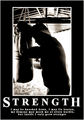
Strengthby Rainbow-Coloured-SoulComment: Critique Club feedback -
Great pairing of image to message. The message itself looks oddly out of focus. Good choice of font for the Strength part. The long-winded bit beneath the catch word is really the part that has my eye wandering a bit - almost as if the font is too thick or something for such small letters.
Nonetheless, this is a pretty good combination of everything you expect to see in one of these posters. Black and whites don't always find a warm reception here, so that might have been all that kept you from catching a 6 on this. As it is it scored quite well at 5.76 so I think that speaks for itself.
|
| Photographer found comment helpful. |
| 09/15/2007 10:54:36 AM |
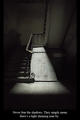
Where there are Shadows, there is Light.by smykComment: Critique Club feedback -
You paired imagge with message quite well. The message itself could be much larger. Mispelled word in the phrase probably knocked this down a bit as well.
Overall this is a very nice entry and scored very, very well. |
| Photographer found comment helpful. |
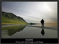
| 09/15/2007 10:52:11 AM |
Hopeby BrinComment: Critique Club feedback -
The photo carries this poster,and obviously carried it right to the top 10. Really super shot.
Probably the only reason this didn't climb all the way to top 3 is the font. The message is a bit small (the photo is there to reinforce the messsage, not the other way around) and the font is lackluster. Also the white font and border is rather jarring against the wonderful muted tones of the photo itself.
Great shot, and it scored very well. |
| Photographer found comment helpful. |
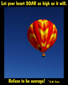
| 09/15/2007 10:49:54 AM |
Let your heart SOAR as high as it will. Refuse to be average! ~ A.W. Tozerby WriteHeartComment: Critique Club feedback -
Everything I would say abou this entry you already figured outfor yourself and are showing off in your 'what I would do know' shot. Only commentary I would add would be look for a font that delivers the message with authority. Forum experts aside, fonts such as Times New Roman are not the tools of designers who lack creativity - they have a look to them that adds a feeling of authority and impact to the message they deliver.
The photo itself here is quite beautiful. Could consider centering it in the frame or cropping wider a bit so you can push it up a bit more into the right corner.
Good work! |
| Photographer found comment helpful. |
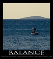
| 09/15/2007 10:44:41 AM |
BALANCEby gocComment: Critique Club feedback -
You have all the pieces of a classic 'motivational poster' here. Big image that reinforces the message and a very simple word or phrase presented in a bold manner.
The image itself is probably what kept this shot from scoring 6+. It needs a bit more contrast and some digial wizardry to knock that yellow haze in the sky into something a bit more eye catching. Might also benefit by reducing the size of the image slightly so the text below gets a bit more real estate and can make more of an impact rather than being completely dwarfed by the picture.
I think had you left the 'embrace me' part off the tag line, the layout of the text itself would have looked better (more room on each side's margin). Also, no one wants to embrace work and no poster short of one designed by Goebbel's himself is likely to make them do so - so no real gain by adding that line lol. ;) |
| Photographer found comment helpful. |
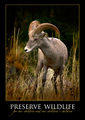
| 09/15/2007 10:40:45 AM |
PRESERVE WILDLIFEby ursulaComment: Critique Club feedback -
This entry followed the 'classic' motivational poster formula in terms of graphical design and content layout.
Very nice picture (the bit of dodge/burn to highlight the center of the shot is subtle and well done), the message in a large font and centered for impact, the font itself one that has a feeling of authority.
Two things that struck me as slightly off. First, it's more of a public service announcement than a motivational poster. Could argue it either way, but Smokey the Bear telling me not to toss cigarettes into piles of leaves doesn't make me feel motivated, just informed. I think a lot of people that voted in the challenge did have a fairly concrete definition of what type of message should be presented.
Second thing was the cursive script. I think it's pretty, I like how you placed it and the choice of color was extremely complementary to the rest of the poster - but I can barely read it. It just doesn't work well for the medium (medium being postage stamp sized web images) though is no doubt stunning at a decent size.
This image scored quite well and rightfully so. I think those couple of nitpicks probably kept it out of top 10, because really it's a solid entry.
Great work! |
| Photographer found comment helpful. |
| 09/15/2007 10:35:11 AM |
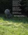
don't stop lookingby posthumousComment: Critique Club feedback -
Obviously voters in this challenge had one specific style of 'poster' in their minds, and the entries that stuck prety close to that ideal tended to do better than those that followed a different path.
Motivational posters are propaganda - nothing more, nothing less. Wether or not they are art is secondary to the fact that they are designed to inspire a very specific feeling in the people who look at them. They do this through 3 things
- message
- photo to reinforce the message
- font and text placement for maximum impact
This shot has a clear message. Making the catch-phrase larger than the rest of the poem was a smart move because you get about .047 seconds to get the message across so it had better be obvious.
This photo works well to reinforce that message. However the dog looking for something is such a small portion of the overall scene that its impact is greatly reduced. A much tighter crop focusing on the dog sniffing around on a patch of yard would be stronger and would also likely avoid the great shifts between dark and light that follow the poster from top to bottom.
The font used here is very lackluster and the message's placementin the scene is a bit haphazard. However, if done consciously, placing the catch phrase right at the spot the dog is sniffing was an excellent choice. Again, imagery to reinforce message.
Obviously this challenge called for skills (or at least the ability to copycat other's skills) that aren't entirely photographic in nature, so it was a tough one for many.
Good luck! |
| Photographer found comment helpful. |
Home -
Challenges -
Community -
League -
Photos -
Cameras -
Lenses -
Learn -
Help -
Terms of Use -
Privacy -
Top ^
DPChallenge, and website content and design, Copyright © 2001-2025 Challenging Technologies, LLC.
All digital photo copyrights belong to the photographers and may not be used without permission.
Current Server Time: 06/22/2025 05:11:20 AM EDT.