| Image |
Comment |
| 09/06/2006 09:53:23 PM |
|
 Photographer found comment helpful. Photographer found comment helpful. |
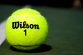
| 09/06/2006 09:50:17 PM |
The Old Number Oneby lkn4truthComment: Meets the challenge, nice focus. Looks a little oversaturated as I see some yellow that almost looks overexposed above the logo. Really the one complaint I have here is why just a tennis ball? If you're offering up some point of meditation here I am missing it entirely and then that's my fault. But given your title, this really looks like you just grabbed a tennis ball due to lack of imagination. |
| Photographer found comment helpful. |
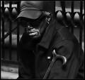
| 09/06/2006 09:46:23 PM |
Man With Caneby muur88Comment: Nice shot. Hoping that's not a bunch of dodging and burning that's going to get DQ'd and waste my vote. |
| Photographer found comment helpful. |
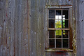
| 09/06/2006 09:44:26 PM |
|
| Photographer found comment helpful. |
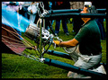
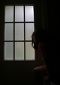
| 09/06/2006 09:41:39 PM |
|
| Photographer found comment helpful. |
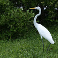
| 09/06/2006 09:40:43 PM |
Mile Marker 8by Baron152Comment: Something is amiss here. Almost looks like you focused on the leaves beneath the bird's beack. At any rate, this shot would be a lot better cropped vertically. The overwhelming amount of vegetation is a distraction and doesn't enhance the photo. Fairly tight crop would make the bird a more prominent figure, and you could probably still get its head lined up on an intersection to meet the challenge. Good luck. |
| Photographer found comment helpful. |
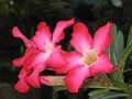
| 09/06/2006 09:38:47 PM |
Three in Thirdsby jlchavesComment: Guess this covers a few intersection points... Lighting here is not so good and nothing is in good focus. Good luck. |
| Photographer found comment helpful. |
| 09/06/2006 09:37:55 PM |
Sarahby stare_at_the_sunComment: I don't mind a softer focus on portraits but here everything seems just enough out of focus to irritate the eye. If even the eye on the right were nice and crisp it would give the eye something to move to in the picture. |
| Photographer found comment helpful. |
| 09/06/2006 09:35:53 PM |
At the Fair.by JEFFJSBComment: Silly subject but nice photo. Would have a little more pop if you increased the contrast some. |
| Photographer found comment helpful. |
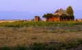
| 09/06/2006 09:34:26 PM |
Desertedby aberrationComment: Nice shot. Thanks for not going nuts on the saturation, it looks very real and very beautiful. |
| Photographer found comment helpful. |
Home -
Challenges -
Community -
League -
Photos -
Cameras -
Lenses -
Learn -
Help -
Terms of Use -
Privacy -
Top ^
DPChallenge, and website content and design, Copyright © 2001-2025 Challenging Technologies, LLC.
All digital photo copyrights belong to the photographers and may not be used without permission.
Current Server Time: 06/19/2025 02:05:27 PM EDT.