| Author | Thread |
|
|
09/19/2006 04:38:29 PM |
Critique Club Review:
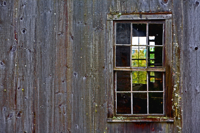
Color, saturation and hue are good. Brightness and contrast are OK.
Lighting makes the picture look a little flat. I can tell by what I see that there must be a lot of texture there, I just don't see it with this lighting.
You've followed the rule of thirds, but what happens here (at least for me) is the eye follows the windows to the the bright sky above the bit too soft trees. Once there, the sky is pale and featureless.
The windows are a nice effect, they just keep leading us to nowhere. I believe that is why you received the "forced" comment below. The windows command so much attention, that they really need a powerful subject when you get there.
I have no idea which way this builing faces, but a sunset in that window with some fill flash on this side, would be killer for me. |
|
 Photographer found comment helpful. Photographer found comment helpful. |
Comments Made During the Challenge  |
|
|
09/10/2006 08:32:45 PM |
|
Fit the challenge but seems forced. There is noting to really catch your attention. Showing the entire building against the sky may have come off better to me. 6 |
|
| Photographer found comment helpful. |
|
|
09/10/2006 01:15:20 AM |
|
love these kind of rustic shots. |
|
| Photographer found comment helpful. |
|
|
09/07/2006 07:17:18 PM |
|
Did you use a circular polarizer? There is some glare on the glass and the The only real shadows you have are inside the window. A better angle of light might have added some depth to the wood grain. |
|
| Photographer found comment helpful. |
|
|
09/06/2006 09:44:26 PM |
|
Nice idea, meets challenge, interesting subject. Way, WAY, too sharp. |
|
| Photographer found comment helpful. |
Home -
Challenges -
Community -
League -
Photos -
Cameras -
Lenses -
Learn -
Help -
Terms of Use -
Privacy -
Top ^
DPChallenge, and website content and design, Copyright © 2001-2026 Challenging Technologies, LLC.
All digital photo copyrights belong to the photographers and may not be used without permission.
Current Server Time: 06/28/2026 01:27:37 AM EDT.