|
|
|
Showing 391 - 400 of ~986 |
| Image |
Comment |
| 10/10/2006 08:22:19 AM | purple kabukiby silverfoxxComment: Hello from the Critique Club,
Congratulations on a solid score for your first challenge entry. As you can tell from the comments you received during the challenge, large borders are a love it or hate thing at DPC. The real disadvantage of such a large border is that it reduces the viewable size of the image for the voter. The smaller the image, the less time the voters are willing to spend looking at the image.
As for what could be done to improve your score. I think you achieved your intent for this image very well. It has a very artistic feel to it, with the desaturated colors and the film grain look. However, both of these effects generally don't score that well at DPC. It seems that the majority of voters like saturated colors and sharp images. So what do you do, stay true to your style or change for a better score? I encourage you stay true to your style, as images like this are appreciated by many members of this site. Just remember not to take the scores personally, as they will not reflect the true quality of your work. Thanks for submitting this image.
Feel free to PM me if you have any questions regarding this critique.
Tim
|  Photographer found comment helpful. Photographer found comment helpful. |
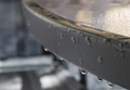
| 10/10/2006 07:59:25 AM | Elephant Earsby BlindBatComment: Hello from the Critique Club,
Congratulations on a new personal best and for placing in the top twenty in this challenge. It wasn't that difficult to determine that this was a studio shot. But it was so well executed that I had to give it an 8. This image really shows a lot of motion, with the water flowing from one leaf to the other and the shadows from the falling drops. Although the catch lights on some of the drops are kind of neat, I bet you wish you could have cloned them out, as they do compete with the leaves for the viewer's attention. You came up with a solid idea and executed it to near perfection. Nice job!
Feel free to PM me if you have any questions regarding this critique.
Tim Message edited by author 2006-10-10 08:00:24. | | Photographer found comment helpful. |
| 10/10/2006 07:51:22 AM | 30 Secondsby PixelstateComment: Hello from the Critique Club,
Wow, 22nd place out of 600+ entries and a 6.68 score. Being just a registered member I couldn't vote on this challenge but after reviewing the results, your image is a good as any of those in the top ten. Looking at your profile, I expect to see a ribbon on your page in the very near future.
This image suits my personal preference well, as I'm not a big fan of the hyper saturated look. About the only suggestion I could make for improvement would be to clone out or burn the bright spot on the rock along the bottom edge. My eyes were initially drawn there instead of to the wonderful birds sitting on the rocks.
Feel free to PM me if you have any questions regarding this critique.
Tim
| | Photographer found comment helpful. |
| 10/10/2006 07:36:59 AM | purple hazeby robaComment: Hello from the Critique Club,
Congratulations on a very solid score on this image. Your idea for this challenge was very creative. There are a couple of small technical issues that prevented this from making it into the top twenty. First, the composition looks a little unbalanced, as the negative space above the flower is taller than the stem of the flower. I think the square crop might not have been the best choice for this image. Second, your lighting is very effective except for the flashlight you used on the flower. This produced a couple of hot spots that almost look like pollen or something lying on the flower. If you could have found a way to bounce this light or diffuse it somehow, it really would have given you a bit more flexibility in post processing to bring more pop to the purple in the flower.
I really would like to encourage you to revisit this image now that you aren't handcuffed by the basic editing rules. By changing the crop and tweaking the flower, you will have something worthy of hanging on your wall. Nicely done.
Feel free to PM me if you have any questions regarding this critique.
Tim
| | Photographer found comment helpful. |
| 10/10/2006 07:22:52 AM | Aftermathby morg002Comment: Hello from the Critique Club,
I enjoyed reading your comments on how this picture was captured. You did a very effective job at making it look like the image was taken just after it stopped raining. Your post processing work is very good and the compositional arrangement of the table and use of DoF are excellent. So why didn't this score better? It's called the DPC game. Even challenges like rain, where people don't expect to see highly saturated images, the voters look for two things, mood and creativity. Your image doesn't have a lot of "Gee, I wish I had thought of that" to it and that is reflected in the score.
Your understanding of the technical aspects of photography leads me to believe you will score consistently in the sixes once you figure out how to play the game. I'm still working on this myself. Good luck with future challenges.
Feel free to PM me if you have any questions regarding this critique.
Tim
| | Photographer found comment helpful. |
| 10/09/2006 07:40:28 AM | Please Godby zaflaboutComment: Hello from the Critique Club,
I remember this image from voting and my first impressions were that it was nice to see a non-flower shot with a strong human element. However, the focus in this image looks a little soft like your failed to sharpen the image after resizing. I would suggest trying Unsharp Mask after resizing. For Paint Shop Pro, the settings I use most are Radius 1, Strength 100, and Clipping 5. If the sharpening effect is too strong (causes pixelation), decrease the strength to between 50 and 75 or decrease to around 30 and sharpen a couple of times.
Feel free to PM me if you have any questions regarding this critique.
Tim
| | Photographer found comment helpful. |
| 10/09/2006 07:31:15 AM | through these eyesby oneredstarComment: Hello from the Critique Club,
I remember when voting on this image that my first impression was "Very simple idea that was well done". I like the colors and lighting and the eyes on the umbrella are fun to look at. However, this image has a lot of negative space that doesn't really have any purpose. This could have been stronger compositionally if it had been cropped in portrait instead of landscape. Another option would have been to have the person turn slightly to her right so that the umbrella eyes were looking towards the left side of the image. This would have given the negative space on the left purpose (space for the eyes to look off into) and turned the dark area on the ground into a secondary focal point instead of a distraction (the eyes could have been looking towards that spot).
Tim
| | Photographer found comment helpful. |
| 10/09/2006 07:19:41 AM | Take my breath away by scaramangaComment: Hello from the Critique Club,
Ok, what am I supposed to say to a ribbon winner? I know, congratulations! Looking at your other challenge entries, you have great technical skills and a wonderful, creative mind. This image connected with the voters and won a ribbon. Once you get into the upper 6's for a score, the final outcome is related more to how the voters like your image more than how good the technical are. Congratulations again.
Tim
| | Photographer found comment helpful. |
| 10/09/2006 07:06:46 AM | Sad hot lazy dead or dying in silent pool of tears Bearby unknowndeathComment: Hello from the Critique Club,
My first impression when I voted on this image was "Ok, it's a nice snapshot of a polar bear and maybe it just finished raining, as the cement is wet". However, after reading your title I realized that your image was trying to convey something on a much deeper level than just a polar bear shoehorned into a rain challenge. The trouble is your message isn't delivered very strongly because the focal point of the message, the bear's eyes, are not sharply in focus. Added on top of this is the reality that metaphorical images often score low, as the metaphors don't always translate well to an international audience. After looking at your profile page, I'm willing to bet that you don't really care about the score, as photography is just the media you use to express yourself and I felt a very strong poetic connection while looking at your images.
Your style is definitely unique and I'm glad you feel comfortable expressing yourself at DPC. Feel free to PM me if you have any questions regarding this critique.
Tim
| | Photographer found comment helpful. |
| 10/09/2006 06:47:45 AM | Sea of Rufflesby collie65Comment: Hello from the Critique Club,
There is no doubt that this image meets the challenge, as it is about as purple as purple can get. So why did it score so low? Primarily because the image has no real focal point to hold the viewer's attention. With the frame almost entirely consisting of the same color and shapes, the eye naturally goes to the upper left hand corner of the image to find something that is different. One way to add a focal point in an image like this is to have one particular flower in sharp focus while the other are blurred (And don't forget the rule of thirds when doing this). You would probably need to use the macro mode on your camera to achieve this effect.
Besides this compositional issue with your entry, there are a couple of technical / post processing things that could be improved. The image really doesn't have any area that is sharply focused. My guess is that you did not sharpen this image after you downsized it for the challenge. Most people use USM (Unsharp Mask) or a light-sharpening step after they downsize. You made the right decision to shoot these flowers in the shade, as it is very easy to get blown highlights off the pedals if shot in bright sun. However when shot in the shade, a little post processing work is required to get the pop back in the colors. This can be achieved using levels and contrast or with curves. The easiest method would be to increase the gamma in levels (the middle slider) then increase the contrast and decrease the brightness.
Feel free to PM me if you have any questions regarding this critique or the post processing methods discussed.
Tim
| | Photographer found comment helpful. |
|
Showing 391 - 400 of ~986 |
Home -
Challenges -
Community -
League -
Photos -
Cameras -
Lenses -
Learn -
Help -
Terms of Use -
Privacy -
Top ^
DPChallenge, and website content and design, Copyright © 2001-2025 Challenging Technologies, LLC.
All digital photo copyrights belong to the photographers and may not be used without permission.
Current Server Time: 06/20/2025 02:03:10 AM EDT.
|