| Image |
Comment |
| 11/03/2006 07:38:33 AM |
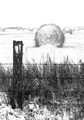
Winter is back... End of harvest season.by iceMan71Comment: Back to comment: I suspect you forgot to sharpen after down sizing this image for the challenge. This image would also benefit from a little post processing work with levels or curves to boost the detail in the hay bales. With levels, I would suggest dropping the gamma (the middle slider) and then boosting the brightness and contrast. |
 Photographer found comment helpful. Photographer found comment helpful. |
| 11/02/2006 01:26:15 PM |
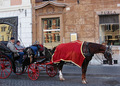
Coachmen at restby patryComment: Back to comment: Sorry to say but this is more of a candid photo than a portrait in my opinion. This image would be easier to accept as a portrait of the coachmen if it were more closely cropped and you could see both of their faces. The color and focus are nicely done but the cropped of back end of the buggy looks a little odd. |
| Photographer found comment helpful. |
| 11/02/2006 01:23:18 PM |
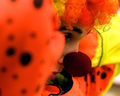
Jugglerby lambie83Comment: Back to comment: A creative idea for this challenge; however, the image has a couple of technical issues that will hurt your score a bit I'm afraid. First, the flash reflecting off the glasses is a major distraction. This is hard to prevent unless the flash is aimed more from the side of the subject. Second, it appears your camera focus on the hands and oranges instead of the eyes. Portraits don't score well without the eyes sharply focused. |
| Photographer found comment helpful. |
| 11/02/2006 01:19:14 PM |
Introspectionby freakin_hilariousComment: A lovely girl but sorry but this is more of a candid photo than a portrait in my opinion. As for the image itself, it appears to be a little flat looking (washed out). Maybe a little tweaking with curves or levels in posting processing would help, especially in the face area. |
| Photographer found comment helpful. |
| 11/02/2006 01:17:43 PM |
Surprised!by chesireComment: Back to comment: You did a nice job of getting a sharp focus on the girl's eyes but the colors in this image look weird. I'm not sure if you tried selective desaturation or had to crop this image a lot but the background has a weird cast and the girl's face (except for the eyes) look washed out. Part of this may be related to your file size being only 100 kb. The challenge rules allow for images up to 150 kb. The extra 50 kb might have helped the background in this image. I also betting that a little work in post processing with levels or curves could have brought about a bit more life in the face. |
| Photographer found comment helpful. |
| 11/02/2006 01:12:41 PM |
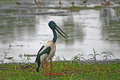
Jabiru in Kakaduby chrism23Comment: Back to comment: Sorry to say but this image looks more like a snapshot from the zoo that you thought might fit the challenge than it does a portrait. This image would be easier to accept as a portrait of a bird if it were more closely cropped. The partial birds at the top of the image are a big distraction and add nothing of value to the picture. I would suggest playing around in post processing a bit more with this image, as the detail in the bird's face are pretty much lost. |
| Photographer found comment helpful. |
| 11/02/2006 12:56:19 PM |
Challenging Life of a Clownby shaggy35Comment: Back to comment: Man, I think you would have had a killer shot here if the clown hadn't raised his/her arms. The out of focus elbow in front of the face is killing this image. |
| Photographer found comment helpful. |
| 11/02/2006 12:51:54 PM |
Beautiful Miseryby Shea927Comment: Back to comment: This image doesn't show a lot of personality, as it looks like you sneaked the shot and then cropped it to make a portrait. The face has a very flat look to it and I think a different B&W conversion technique would help bring out the details in her face. Take a look at this great tuitorial on B&W conversion. The focus also looks a little soft around the eyes. Did you remember to sharpen the image after downsizing it for the challenge? |
| Photographer found comment helpful. |
| 11/02/2006 12:49:10 PM |
Are you really???by ferrygunComment: Back to comment: Your image shows a lot of personality but the lighting looks a little harsh on the face. Maybe a different B&W conversion technique would help keep the details in her face. Take a look at this great tuitorial on B&W conversion. |
| Photographer found comment helpful. |
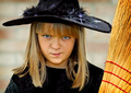
| 11/02/2006 12:37:34 PM |
|
| Photographer found comment helpful. |
Home -
Challenges -
Community -
League -
Photos -
Cameras -
Lenses -
Learn -
Help -
Terms of Use -
Privacy -
Top ^
DPChallenge, and website content and design, Copyright © 2001-2025 Challenging Technologies, LLC.
All digital photo copyrights belong to the photographers and may not be used without permission.
Current Server Time: 06/19/2025 02:11:20 PM EDT.