| Image |
Comment |
| 11/04/2006 10:34:46 AM |
Tympanistby onarComment: Back to comment: I realize you were going for an environmental type portrait here but the landscape orientation doesn't work very well for this subject. The shadows on his face also lower the protrait feel to this image. As an action shot/photo journallism type shot I love the motion you captured. Nice image, not the best subject for this challenge |
 Photographer found comment helpful. Photographer found comment helpful. |
| 11/04/2006 10:31:36 AM |
Casual Daysby anaheimca89Comment: Back to comment: A lovely little girl but sorry but this is more of a candid photo than a portrait in my opinion. As for the image itself, the focus around the girl's fore arm appears to be a little soft. Did you remember to sharpen the image after downsizing for the challenge?
Revisititng this image again: On my computer at home, this image looks a lot sharper than on the computer I used to vote. Her eyes look very nice and I'm bumping your score to correct my mistake. The only part of this image that doesn't work for me is the negative space on the right. I realize you needed to put it there to meet the challenge but it doesn't really add any value to the image itself. A tighter crop on the girl may help. |
| Photographer found comment helpful. |
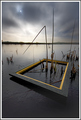
| 11/03/2006 11:41:32 AM |
The road homeby JohnnyflashComment: Hello from the Critique Club,
This image is definite proof that hitting a home run with the challenge topic can overcome technical flaws in the image. My firsts impression was that the image evokes a lot of emotion and has a nice feel of times gone by but the focus is not as sharp as it could be and the image appears a bit dark. However, I do believe that the focus issue can be minimized with some additional sharpening and the darkness issue is a matter or personal preference, so I never down score for that (unless it is so bad I can't see hardly any details).
You came up with an exceptional idea that could have been in the top ten easily with a little better execution. Nice job and nice image.
Feel free to PM me if you have any questions regarding this critique.
Tim
|
| Photographer found comment helpful. |
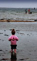
| 11/03/2006 08:25:32 AM |
toddler-and-nude-6x9.jpgby Bear_MusicComment: Bear,
This is an interesting image and very well processed but for me, the addition of the adults in the background actually weakens the emotional impact of this image. IMHO, the strongest contrast to be made with this image is between the size of the toddler and the size of the ocean. Seeing her trying to explore the vast world around her really tugs at the heart strings of this parent.
I am always facinated by how something as simple as cropping can change the emotion and focal point of an image for a person.
Tim
Edit: Have to learn how to write complete sentences and spell also. Message edited by author 2006-11-03 11:43:35. |
| Photographer found comment helpful. |
| 11/03/2006 07:55:53 AM |
The Reflective Eyeby GrayGhostComment: Back to comment and bump: Wow, this image plays dimensional tricks with the eyes. Really fun to look at and explore. Nice job. 9 |
| Photographer found comment helpful. |
| 11/03/2006 07:53:00 AM |
Withinby IvoComment: Back to comment and bump: Thank you for putting a focal point in your image. I also appreciate the realistic looking colors. I think I would clone out the sun/moon if this were my image. Nice job. 9 |
| Photographer found comment helpful. |
| 11/03/2006 07:51:06 AM |
The Shireby SiggavComment: Back to comment and bump: What a mystical feel to this image. The colors are rich but don't look over saturated. Nice job. 9 |
| Photographer found comment helpful. |
| 11/03/2006 07:50:18 AM |
Water Colors by NeilComment: Back to comment and bump: This image is a real pleasure to look at. I would not be surprised to see it with a ribbon after rollover. 10 |
| Photographer found comment helpful. |
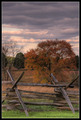
| 11/03/2006 07:49:09 AM |
Winter Approachesby glad2badadComment: Back to comment and bump: The fence gives this image a wonderful focal point that is missing in many of the images in this challenge. I also appreciate the natural looking colors. 10 |
| Photographer found comment helpful. |
| 11/03/2006 07:45:43 AM |
Factoryby hudsonComment: Back to comment: I love the composition of this image. A little tweaking with levels (bump the gamma & contrast)or curves would increase the depth perception of this image. |
| Photographer found comment helpful. |
Home -
Challenges -
Community -
League -
Photos -
Cameras -
Lenses -
Learn -
Help -
Terms of Use -
Privacy -
Top ^
DPChallenge, and website content and design, Copyright © 2001-2025 Challenging Technologies, LLC.
All digital photo copyrights belong to the photographers and may not be used without permission.
Current Server Time: 06/19/2025 02:11:36 PM EDT.