|
|
|
Showing 311 - 320 of ~986 |
| Image |
Comment |
| 01/12/2007 07:17:50 AM | I Think I Can! I think I Can!by SomeamateurComment: Hello from the Critique Club,
You received several comments during the challenge that point out that your image looks flat, washed out, etc. Adding contrast and saturation would help considerably. Not knowing what post processing software you are using, it is a bit hard to walk you through the steps to help this image. Many programs offer an autofix or autobalance option that would help some. If you are using a program with Levels or Curves, I would be more than happy to tweak your image and provide the steps taken to get there. Just send me a PM with your software type and we can start working on it.
One thing you can do on your own with this image to strengthen it is to crop it differently to see how the composition (look and feel of the image) changes. Since the sky has no real features that are interesting, it would help to minimize the sky as much as possible. As is, it is just dead space that adds nothing to the image composition. I would also suggest cropping the left side of the image to remove a significant amount of the bush. As is, it is as tall as the train and fights for the attention of the viewer. An added benefit of cropping off some of the left side is that the train will appear more to be moving through your image from the left to the right. With the train centered in the composition, it feels like it is parked.
Feel free to PM me if you have any questions regarding this critique.
Tim
|  Photographer found comment helpful. Photographer found comment helpful. |
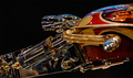
| 01/03/2007 10:49:59 AM | the moonlight sonata, pianissimoby silverfoxxComment: Hello from the Critique Club,
Let me start off with congratulations on your new personal best score. You've done a wonderful job composing and setting a mood in this image. However, there are a few items that might have kept this image from scoring higher.
First, soft focus is a tough sell at DPC but it does help set the mood in this image. Second, the lighting on the hands distracts from the overall impact of the image. The hands just happen to fall in front of the brightest part of the window and are almost in silhouette. This makes it difficult to see the fingers and in turn, looks a little odd. Adding to the silhouette distraction is the angle of the flute. With the end of the flute being closer to the camera than the mouthpiece, the hands look abnormally large in this lighting. If the whole flute was in the same plane as your face, it might have helped the lighting and provided better balance in the image (Although you might not have been able to actually play the flute after changing the angle, it still would have looked like you were). One other issue for some voters is the use of nudity. The nudity here is very tasteful and brings artistic merit in this image but it really doesn't relate well to an "Occupation" challenge.
Taking a look at your portfolio, I predict that I will be seeing your image on the front page sometime in the near future. You have a very artistic style and all you need is for the right challenge to come along for you to ribbon.
Feel free to PM me if you have any questions regarding this critique.
Tim
| | Photographer found comment helpful. |
| 12/11/2006 07:23:48 AM | I can see a bright light...by GordonComment: Hello from the Critique Club,
An amazing capture and one in which I would have never guessed how it was achieved in a million years. My favorite aspect of the image is the textured appearance caused by the waves. The clarity of the sky to pick up that much detail in the water must have been a joy to view.
As for your score, I think the comments you received during the challenge sum it up pretty well. Many people were fooled by this shot and thought it was a bit over processed. However, I think your scored suffered more from the weak tie between the challenge topic, the subject, and your title. The image doesn't really convey a bright light and I am having a little difficulty relating your title to "Famous Last Words". With the large number of 4 votes you received, you were lucky to score in the 5's with this image. Luckily there were quite a few voters that appreciated the image on it's own merit to counteract some of 4's you received.
Feel free to PM me if you have any questions regarding this critique.
Tim
| | Photographer found comment helpful. |
| 12/11/2006 07:09:18 AM | Diamonds Are Foreverby Dr.ConfuserComment: Hello from the Critique Club,
Photographically speaking, you did a very nice job capturing this image under what had to be tough lighting conditions. My only comment regarding the technical aspects of this image is the out of focus nut on the right side of the photo. I've never been a big fan of objects in the front plane of a photo being out of focus but that is a personal preference and I try not to lower a score for such things. Besides, at 1/45 sec, ISO 1600, and F5.3 (Hand held I assume), you did an amazing job with the limited depth of focus you had.
As for your score, I think the comments you received during the challenge sum it up pretty well. People had a small problem associating this image with the movie. I am really amazed that the score didn't suffer more from the DNMC crowd than it did. That probably was related to this being a member challenge and not an open challenge.
Feel free to PM me if you have any questions regarding this critique.
Tim
| | Photographer found comment helpful. |
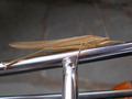
| 12/04/2006 08:03:05 AM | Grasshopperby walker1983Comment: Hello from the Critique Club,
First, let me welcome you to DPC and congratulate you on entering your first challenge. As for your image and how it relates to this challenge, the thing that kept your score below a 5 is that the angle you shot this image at is pretty much straight on and doesn't have a very unique perspective to it. If you had shot from a lower angle and maybe included a bit more of the bicycle in the image, you might have scored in the high 5's and maybe even a six. What also hurt your score a little bit is that the insect doesn't look sharply focused. I suspect that you didn't sharpen the image after you reduced the size to 640 pixels. Most people at DPC use Unsharp Mask to sharpen the image after downsizing.
Feel free to PM me if you have any questions regarding this critique.
Tim
| | Photographer found comment helpful. |
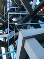
| 12/04/2006 07:48:59 AM | cornersby sickdogComment: Hello from the Critique Club,
First, let me congratulate you on your new personal best. There is a lot about this image that I like, the various shades of blue and gray, the three-dimensional look of the image, and the complex pattern. I do find the lights to be a little distracting but that is something you could not control. The reason you finally broke into the 6's is that you found a subject that strongly meets the challenge and you captured and post processed it extremely well. Although a building wasn't the strongest subject for a perspective challenge, the perspective you used definitely enhanced the subject matter. If this were my image I would try to clone out the lights and then print it for hanging on the wall. Nice job!
Feel free to PM me if you have any questions regarding this critique.
Tim
| | Photographer found comment helpful. |
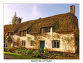
| 11/30/2006 07:40:07 AM | Dunster Cottagesby tembaComment: Hello from the Critique Club,
This image brings back fond memories for me, as I've have the pleasure of traveling through the UK a couple of times on holiday. You did a very nice job in post processing this image, as the colors and contrast are nicely done. I found the comment from GrayGhost very interesting, as there definitely are some wide-angle effects on the left side of the building but they weren't really noticeable to me until after I read his comment. All in all, I don't think a perspective correction would have changed your score that much, as it is the charm of the cottages that grab the viewer's attention.
I'm glad this scored over a 6, as it is a very lovely image and deserving of such a fine score. Feel free to PM me if you have any questions regarding this critique.
Tim
| | Photographer found comment helpful. |
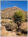
| 11/29/2006 10:54:12 AM | Greetings from the Desertby LoreneComment: Hello from the Critique Club,
You found a very lovely scene and did a very nice job with the composition. The size relationship between the plant and mountain give the image a lot of depth. Where I think this image falls a little short is in the color. The harsh sun gives the image a washed-out look. You might want to try bumping the gamma in levels and then decreasing the brightness. This will strengthen the colors and contrast in the mid-range features.
Feel free to PM me if you have any questions regarding this critique.
Tim
| | Photographer found comment helpful. |
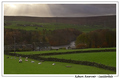
| 11/29/2006 10:44:07 AM | by KHoltComment: Hello from the Critique Club,
You found a very lovely scene and did an exceptional job with the composition. Overall, the image appears to be dark, as mentioned in more than one of the comments you received. However, I believe it is an optical illusion of sorts, as people expect the sun they see breaking through the clouds to shine on the sheep themselves instead of the countryside in the background. If you had balanced the light for the sheep, you would have received comments about the washed out sky. Tough lighting conditions to shoot under and I think you got as much out of this image as was possible.
Feel free to PM me if you have any questions regarding this critique.
Tim
| | Photographer found comment helpful. |
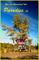
| 11/29/2006 09:31:38 AM | You Are Ascending Into Paradise, Caby cogeroxComment: Hello from the Critique Club,
This image definitely meets the challenge and you received a lot of feedback on this image (some if it contradictory). With over 40% of your votes being 5's, that to me indicates that people looked for literally 2-3 seconds and concluded, "this picture isn't bad (so I can't give 4 or less), but it doesn't do too much for me (so I can't give 6 or more). The compositional centering of the sign gives a snapshot kind of feel to the image and lacks the wow factor required for a 6+ score at DPC. Compounding that is that the yellow border and letters make the colors in the foliage look a little washed out. I'm betting that this area of California looks a lot more attractive in the spring and summer when the plants are a dark green and the sky is blue. The timing of this challenge worked against you.
Feel free to PM me if you have any questions regarding this critique.
Tim
| | Photographer found comment helpful. |
|
Showing 311 - 320 of ~986 |
Home -
Challenges -
Community -
League -
Photos -
Cameras -
Lenses -
Learn -
Help -
Terms of Use -
Privacy -
Top ^
DPChallenge, and website content and design, Copyright © 2001-2025 Challenging Technologies, LLC.
All digital photo copyrights belong to the photographers and may not be used without permission.
Current Server Time: 06/19/2025 08:05:13 AM EDT.
|