| Image |
Comment |
| 05/10/2007 07:50:03 AM |
Determinationby scarbrdComment: Back to comment and bump: You managed to take a very routine, everyday event and help the viewer achive an emotional attachement. 9 |
 Photographer found comment helpful. Photographer found comment helpful. |
| 05/10/2007 07:39:29 AM |
Headerby MattOComment: Back to comment and bump: Great timing on this shot. 9 |
| Photographer found comment helpful. |
| 05/10/2007 07:38:47 AM |
|
| Photographer found comment helpful. |
| 05/10/2007 07:38:11 AM |
|
| Photographer found comment helpful. |
| 05/07/2007 07:21:10 AM |
MotorCycleby TheStickComment: Hello from the Critique Club,
I didn't vote in this challenge so this is the first look I've had at your image. My first impression is that I like the balance of the three images, as the center image of the gages really help tie the top and bottom images together. However, the three images aren't really that sharp and the top one looks distorted somehow. Reading through the comments you received, many of the voters agreed.
Reading through your process steps I noticed that you intentionally added blur to this image. Was this part of a post processing style you were trying to emulate or an attempt to soften the sharpening artifacts on the engine image?
When I first upgraded my photo editing software to Paint Shop Pro I spent a whole month reprocessing my old images to learn the program. It was the best 30 days away from my camera ever spent. I think you have three very nice images for practicing your post processing skills. I love the composition of these three and hope you will take some time working on them.
Feel free to PM me if you have any questions regarding this critique.
Tim
|
| Photographer found comment helpful. |
| 05/07/2007 07:00:09 AM |
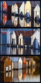
Boat House Reflectionsby alexjackComment: Hello from the Critique Club,
I didn't vote in this challenge so this is the first look I've had at your image. My first impression is that all three pictures look very nice but the combination of the three doesn't quite look balanced. Reading through the comments you received, many of the voters agreed. This was a good solid entry into this challenge and your score reflects it. I've always like waterfront images and all three of these are nicely captured.
To me, the most logical focal point in the collection is the red boathouse. You captured this boathouse in two of the three images but need to include it in the middle image. If you can go back and re-shoot, I would suggest a straight on shot with the red boathouse in the center to act as a transition between the two perspectives shown in the top and bottom images.
Feel free to PM me if you have any questions regarding this critique.
Tim
|
| Photographer found comment helpful. |
| 05/05/2007 04:57:37 PM |
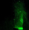
Take your Medicineby meneleComment: Hello from the Critique Club:
I didn’t vote in this challenge andI really haven’t looked at many of the other entries, so my critique will be based on what I see here and not in comparison to the other images. I like the concept for this image and the color works for me, as it adds interest to the image. However, as noted in the comments you received, the execution could have been a bit better. The biggest area needing improvement is the clarity of the image. I would think a faster shutter speed would help here considerably (20/20 hindsight on my part). Once the bubble clarity is solved, then the composition might be next. This is one of those subjects where it is hard to pin down what is best compositionally. In all likelihood, a simple vertical crop with the subject centered would probably be the strongest composition. There is no need for negative space on either side but some at the top could be useful. Overall, a good try and I hope to see more of your work in the future.
Please let me know if you have any questions regarding this critique.
Tim
|
| Photographer found comment helpful. |
| 05/05/2007 02:56:24 PM |
Bubbles of Funby JawnyRicoComment: Hello from the Critique Club:
I didn’t vote in the Bubbles Challenge so this is the first time I’ve looked at your image. My first impression was “Wow, this is a fun image”. The joy in the girl’s face is infectious and the lighting and focus are perfect. Obviously, a lot of people had the same impression, as your score was very good on this shot. I think the comments you received sum up the few short comings this image has very well. The horizon looks tilted and the crop needs to be a bit tighter on the girl, as the background is fighting her for attention. With a simple 5 degree rotation counterclockwise and a crop to place her at the right third of the image, the girl and the bubbles take on a stronger presence. A great capture and I’m sure your cousin loves the shot you took of her. Nice job.
Feel free to PM me if you have any questions regarding this critique.
Tim
|
| Photographer found comment helpful. |
| 05/05/2007 08:54:39 AM |
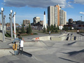
Spring Trainingby AngadeonComment: Hello from the Critique Club:
I didn’t vote in the Rule of Thirds Challenge so this is the first time I’ve looked at your image. My first impression is that the image is rather busy and I had to search to find the main subject. Probably what hurts this image the most score wise is that the subject isn’t isolated very well. The two people behind the skaterboarder really diminish the impact of the main subject. However, when you are shooting street shots, it is hard to control the environment around you. The focus on the skater also looks a little soft. Your shutter speed looks more than fast enough for the action in the image, so I’m left to wonder if it was a focusing issue or did you forget to sharpen after downsizing the image for the challenge. If it was the later, try a little Unsharp Mask with a radius of about 1 after downsizing.
Overall, you captured the action of the skateboarder very well and I love the fact that the colors in the image look very realistic. You found a great shooting location and I hope you go back and keep shooting.
Feel free to PM me if you have any questions regarding this critique.
Tim
|
| Photographer found comment helpful. |
| 05/05/2007 08:42:59 AM |
Double Bubble Troubleby marvinComment: Hello from the Critique Club:
I didn’t vote in the Bubble Challenge so this is the first time I’ve looked at your image. My first impressions are that the big bubble is so overpowering due to being out of focus that the visual effect of the light reflecting off the small bubble gets lost. What I would suggest is that you crop the image almost in half to remove the left half of the big bubble (Which is primarily negative space) including the bright spot at the top of the bubble. This would help feature the small bubble more and the big bubble would provide a dramatic line through the image from the bottom left corner to the upper right corner. I think the colors and saturation are well done in this image and you might have made to 6 with a different crop.
Feel free to PM me if you have any questions regarding this critique.
Tim
|
| Photographer found comment helpful. |
Home -
Challenges -
Community -
League -
Photos -
Cameras -
Lenses -
Learn -
Help -
Terms of Use -
Privacy -
Top ^
DPChallenge, and website content and design, Copyright © 2001-2025 Challenging Technologies, LLC.
All digital photo copyrights belong to the photographers and may not be used without permission.
Current Server Time: 06/18/2025 02:30:40 PM EDT.