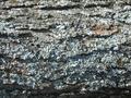
DPChallenge: A Digital Photography Contest You are not logged in. (log in or register
 
Browse Settings
Currently viewing:
Registered Userrmahan

Show comments:

Per page:

Order:

Comments:


Comments Made by rmahan
Pages:   ... ...
Showing 71 - 80 of ~214
Image Comment
Primary Friends
05/13/2003 09:56:13 AM
Primary Friends
by sagestudio

Comment:
I would have cropped the blue jeans on the left out so that the viewer concentrates on the colors. A good demonstration of these colors together.
Photographer found comment helpful.
water under the bridge
05/13/2003 09:44:04 AM
water under the bridge
by ellamay

Comment:
I see two really good photos within your picture. Both are vertical crops with the first taking in the left side of the picture (in a 4x5 crop) with the red shirt at the center bottom. The second is the right side of your photo (also a 4x5 vertical proportion) where the red oars are about 1/4 of the way up from the bottom and near the right edge. I think that either of these two would have squelched the comments about being too busy because they would have been concentrating on the beautiful lines within the photograph. Your viewpoint is excellent and the time of day must have been perfect since you captured the ripples in the water so well. The photograph is almost devoid of color but the splashs of red add points of interest. The exposure is quite good with some pure whites and some pure blacks. Although rowing is a sport, it involves a form of transportation just as much as walking, cycling, driving or flying do so I think you met the challenge --- and with a very interesting image.

Regards ... from the Critique Club,

Bob Mahan
(rmahan)
Photographer found comment helpful.
cat
05/09/2003 10:43:47 PM
cat
by GinaRothfels

Comment:
Hi Gina - I don't think you could have done better on sharpness and DOF. This is a powerful image. Without including any obvious label saying "Jaguar", you've let us know that we're looking at a Jag! The ONLY thing I would like to see is a slight (very slight) toning down of the brightness on the left so that the bumper isn't quite so wiped out. That pulls my eye away from the rest. In composition, you've done a good job of having triangular points in the picture. This leads the eye from one to the other to the third point and back again --- keeping the viewer's interest and attention within the photo. The "Meeow" is also a cute touch giving a little lightheartedness to the image.

Oh, and I would say that you definately met the challenge. Great representation of "Transportation" (pretty classy transportation, too!)

Regards ... for the Critique Club,

Bob Mahan
(rmahan)
Photographer found comment helpful.
2Lips in the Wind
05/02/2003 09:58:02 PM
2Lips in the Wind
by cjcox5673

Comment:
I like this photo quite a bit. It's really a "sea" of tulips!

The composition is good with the diagonal "lines" of color leading your eye into the picture. The focus and depth of field seem very good. Shooting at 1/250 second was a good idea to combat the effects of blurring that wind would have caused. This certainly is "flora" so you've met that part of the challenge. The main "WOW" factor for this photo is the brilliant colors and your composition. I wish there was MORE of a "WOW" somehow, but it's pretty good as is. I would crop the black and white from the top. The extra colors there tend to pull away from the good composition you've got.

Regards ... from the Critique Club,

Bob Mahan
(rmahan)
Photographer found comment helpful.
Bark
05/01/2003 08:36:06 PM
Bark
by KimInNB

Comment:
I think it's quite difficult to make the bark of a tree interesting to the people who view a photograph with just the bark. You've used some modeling effects of the light and managed to do a fairly good job!

It's not difficult to see why "Bark" was your choice for Flora given the winter you mentioned. Certainly it fits that category, so you're safe there.

In my opinion, there are some things you might try to improve this picture. Again, these are just thoughts I've had as I viewed your creation.

You might have tried a vertical format so that it doesn't look like it's from a dead tree which has fallen in the forest. (It might have been but I generally think of flora as currently living items. You want your viewers to think so too even if it isn't true.)

The contrast is, to me, a little too much. You might try to diffuse the light in some way or use a reflector to help fill in the dark areas.

The highlights are a bit too bright. Note that some of the detail is lost in these highlights.

The picture lacks a "wow" factor. It's just a record of some bark. This is fine if you're conveying information in, for example, a field or reference manual about tree bark. It doesn't work very well in a DPChallenge contest (unfortunately, even if it's a "Flora" challenge).

The picture seems slightly "cold" (too blue) which might be from having the highlights too bright. You could try a warming filter or a gel over the lens or might correct the tone in your photo editing software.

For what you had to work with, this is probably a pretty good choice of subjects. Someone suggested going macro for the lichen and that might have worked too. Or, if there was anything else of a "flora" nature in the area, the tree might have been used to frame that.

You've done a very good job with sharpness and depth of field. This is something I'm usually quite critical of in my own photos and you've done well there. The texture IS quite nice.

Finally, I hope your weather is getting better now and you can get out for some more pictures.

Regards ... for the Critique Club,

Bob Mahan
(rmahan)


Photographer found comment helpful.
Come forth to carry me home.
04/26/2003 03:31:26 PM
Come forth to carry me home.
by Geocide

Comment:
This is a really nice image showing the rays of the sun. I like it. I think I might like it better if it didn't have the tower in it but I not sure that wouldn't remove a focal point and the balance you have. Colors are quite remarkable and there is some differentiation between the dark clouds and the dark land. (I wouldn't want to be able to turn the photo upside down and have it look almost the same.) I have always liked crepuscular sun rays and you've captured them nicely. Overall, you've done a very good job of conveying an interesting moment for "Weather". In other words, I can't find much to critisize about your picture!

Regards ... for the Critique Club,

Bob Mahan
(rmahan)
Photographer found comment helpful.
My Pi(e) are squared.
04/16/2003 10:10:04 PM
My Pi(e) are squared.
by camelotnorth

Comment:
This is quite a creative idea for the interpretation of "Pi". Almost every school kid knows "Pi R Squared" and there have been many jokes made about it. You created a picture to match the words. I often find it hard to say that someone doesn't meet a challenge because the idea is that each photographer produces THEIR interpretation ... the question is whether a viewer can connect to that interpretation or not. In this case, I think your communication is loud and clear and, in my opinion, this meets the challenge quite well.

Now for some things which, in my opinion, could improve your photograph:

Composition: I personally would have cropped this picture differently. The left-to-right cropping is slightly unbalanced and the top-to-bottom cropping makes me feel that I'm bumping up against the top of the picture. I would like to see centered cropping left-to-right and to have some more "breathing room" at the top and sides of the photograph even at the expense of making the subject slightly smaller.

Technical: I see a focus problem here or maybe more like a depth of field problem. It looks like a delicious pie and I would like to relish it from front to back. I would like to see every flake of that crust and that requires a much greater depth of field. The right-hand side of the pan is "blown out" as well as the left, front corner. The "R" appears to be made of felt and I would like to see less detail in the material. These are distracting elements which generally can be corrected by exposure control. I have to agree with some of the comments, too, that the angle of the shot might have been better had the camera been at a higher angle to the subject. Notice that the "R", when viewed as a flat object (which it is in a photograph) is smaller at the top than at the bottom. A steeper angle would have moderated this effect.

Lighting: I don't know what your lighting source was but you might have used something like a white sheet to diffuse the light and make it more even. Except for the two hot spots I mentioned, it is pretty good.

So now that I've drooled over this photograph so long, I'm off to the kitchen to see what I can scrounge up ... I don't think I'll find anything as delicious as what you've portrayed, though. Thanks for sharing it with us.

Regards ... for the Critique Club,

Bob Mahan
(rmahan)
Photographer found comment helpful.
Cumulus Congestus in San Francisco Bay
04/14/2003 05:21:35 PM
Cumulus Congestus in San Francisco Bay
by Pep Ventosa

Comment:
I would like to see more of the bridge. I think it would add dimension and relationship to the clouds. The clouds are quite spectactular!
Photographer found comment helpful.
After the storm
04/14/2003 05:17:54 PM
After the storm
by vcosma

Comment:
Nice shot but I would like to see the horizon as a straight line. You've captured a nice scene here.
Photographer found comment helpful.
Balance
04/01/2003 08:20:21 PM
Balance
by andrewlr

Comment:
Very striking image and the colors are magnificent!
Photographer found comment helpful.
Pages:   ... ...
Showing 71 - 80 of ~214


Home - Challenges - Community - League - Photos - Cameras - Lenses - Learn - Help - Terms of Use - Privacy - Top ^
DPChallenge, and website content and design, Copyright © 2001-2025 Challenging Technologies, LLC.
All digital photo copyrights belong to the photographers and may not be used without permission.
Current Server Time: 07/30/2025 01:30:06 PM EDT.