| Image |
Comment |
| 02/26/2004 01:22:34 PM |
|
 Photographer found comment helpful. Photographer found comment helpful. |
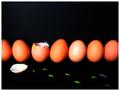
| 02/26/2004 01:14:51 PM |
Fire And Iceby Andyz1Comment: Meets the challenge, but I think Potrait would have worked better. Negative space to the right/left is a bit much. Stop on water is really good. |
| Photographer found comment helpful. |
| 02/24/2004 10:42:21 AM |
Rotten Woodby cjavierComment: I think this is a better picture without the lock. The wood has enough to stand on its own. I like the colors/shading. |
| Photographer found comment helpful. |
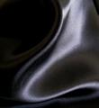
| 02/23/2004 08:43:13 PM |
Black Abstractby PoobaComment: I know it's a little late, but I still wanted to comment on this photo. I really enjoyed this one, but didn't get a chance to vote because I wanted to comment on it as well and ran out of time.
I think the shapes / fabric and lighting were your highpoint here. I think this photo would have come off a little better if the entire surface would have been in the focal plane.
The shallow DOF is somewhat distracting because I want to see how the light actually reacts with the texture of the fabric. I hope this makes sense. With the little blurring that there is, I cannot see how it reflects and plays off of the curves.
Nice work though. I would have given you 8 as is. |
| Photographer found comment helpful. |
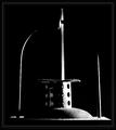
| 02/20/2004 11:12:06 PM |
Seeker in the Darknessby moodvilleComment: One of the few time I have seen Grain work. I don't know what this is, and I don't care. It's a great photo. What's right = Framing & composition & lighting. The edges of the two side vertical elements seem to be non-linear from compression, but that's ok given the restraints of the challenge. It also has a slight tilt from right to left...but I'm ok with that too. Still a 10 in my book |
| Photographer found comment helpful. |
| 02/20/2004 10:59:22 PM |
|
| Photographer found comment helpful. |
| 02/20/2004 10:58:49 PM |
|
| Photographer found comment helpful. |
| 02/20/2004 10:58:23 PM |
|
| Photographer found comment helpful. |
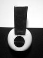
| 02/20/2004 06:03:30 PM |
Baby. It's cold outside.by pcodyComment: At first glance, I was thinking an 8. The cropping at the top was a lil tight. Seems like you are cutting off some of the sleave cuff. Also the lighting seemed like it could have been more dramatic. However, looking at the reflection in the glasses. 10! Great idea and execution. Thanks for sharing. |
| Photographer found comment helpful. |
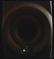
| 02/20/2004 06:00:32 PM |
Wooferby TooCoolComment: The bottom and top right of the photo are distracting. What happened? Maybe a closer crop? |
| Photographer found comment helpful. |
Home -
Challenges -
Community -
League -
Photos -
Cameras -
Lenses -
Learn -
Help -
Terms of Use -
Privacy -
Top ^
DPChallenge, and website content and design, Copyright © 2001-2025 Challenging Technologies, LLC.
All digital photo copyrights belong to the photographers and may not be used without permission.
Current Server Time: 08/20/2025 03:53:37 PM EDT.