| Image |
Comment |
| 06/11/2003 01:29:34 PM |
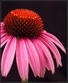
Garden Designby DennisFComment: Hrm, a flower picture (just kidding!) I really like this, it has great color and nicely sharp. The plain black background compliments it well and works as a format for a magazine. The tonal range of the petals is wonderful. The farthest right petal is a little soft, but it's only really noticable because my eye seemed to get drawn to it moreso than the others. It's something I would expect to see on the front cover of a gardening magazine. Well done |
 Photographer found comment helpful. Photographer found comment helpful. |
| 06/11/2003 01:18:41 PM |
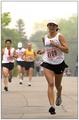
Runners worldby kengurinnComment: Great capture! The sports action and closeness of this shot is amazing. If he had been looking toward the camera with a neat expression it would have been even better, but you have to work with what you are given in these situations. I could easily see this on the front of the magazine. The only negative is that the colors look a little dull and flat, but looking at the sky it would seem you had a cold, dull day to shoot. Again, you have to work with what you got and what you got is pretty good! |
| Photographer found comment helpful. |
| 06/11/2003 01:14:39 PM |
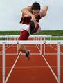
Runner's Worldby ToddhComment: Great image! The expression on her face is good and the stop action is clean but obviously you can see the motion without needing any blur. The composition is great with an appropriate dof. I'm sure I would be encourged to read the accompanying article. It seems the sky wasnt working for you, but as a magazine cover it makes a great place to put the title so wouldnt be detrimental to the image at all. |
| Photographer found comment helpful. |
| 06/11/2003 01:08:29 PM |
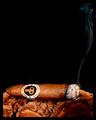
Cigar Aficionadoby crabappl3Comment: Simple and classy. I have no idea if that's a good brand of cigar or not, but it's something I'm sure would appear on your chosen magazine. I think the cigar is on some bark or maybe it's the leaves or something, but whatever it is I like the texture and color, very complimentary to the cigar. The trail of smoke leads upwards to where I assume the title would be. Great image! |
| Photographer found comment helpful. |
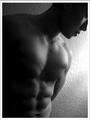
| 06/11/2003 01:04:20 PM |
Male Fitnessby imagesloyolaComment: Yum! The shadows really enhance the six-pack and the choice of black and white helps with the mood. Having the face not be the main focus works, especially as the magazine is promoting health and fitness. There is enough space around the image for the magainze blurbs and I could really see this on the front cover on Men's Fitness. The only negative is the over exposed area to the side of his shoulder. |
| Photographer found comment helpful. |
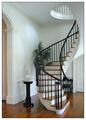
| 06/11/2003 01:00:36 PM |
Home and Design by sherComment: Oh how I wish my house looked like this! First impressions are that it's a clean image (and clean staircase), and very classy-looking. The curve of the staircase is appealing to the eye and something that isnt common and so it gives a sense of interest. It would certainly be a cover I'd expect to see on Home and Design and it would encourage me to read the accompanying article. The only negative is something petty, but I find the whiteness of the border makes the white in the photograph to appear somewhat duller, which is a shame because otherwise the feel is a bright, airy room. |
| Photographer found comment helpful. |
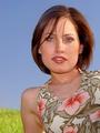
| 06/11/2003 12:56:20 PM |
ELLEby jenaromComment: Good tonal skin colors, although there is some light on the top right of her face that is causing a few shadows, but I think that adds a more natural feel and it doesnt distract. The background choice/colors are bright and clean. The pose is somewhat odd but it adds a good negative space on the left for the usual magazine blurbs. The model is very pretty and certainly a face I'd expect to see on Elle. The image looks very professional. Well done. |
| Photographer found comment helpful. |
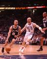
| 06/11/2003 12:50:41 PM |
Sports Illustrated by RiderGalComment: Wow, an amazing shot! Clean, sharp, the sport action is well captured. The expressions on the players' faces tell a story, which would certainly encourage me to read the accompanying feature article. Plenty of space at the top for the mag title. This is certainly something I'd expect to see on the cover of sports illustrated. A professional-looking shot. |
| Photographer found comment helpful. |
| 05/27/2003 02:01:29 PM |
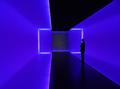
The Light Insideby xertionComment: This almost reminds me of a matrix shot. It's strange and surreal and I like it! I have no idea what it is, but the colors are appealing, the lines are intriguing, and the person in the middle just makes me curious. All good elements to me. The only slight negative I see is the slight purple tinge on the upper/lower left 'wall' |
| Photographer found comment helpful. |
| 05/27/2003 01:50:07 PM |
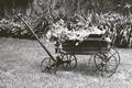
That Old Wheelbarrowby nathaliedooComment: I like the subject matter - the wheelbarrow. The image has some grain to it, which I'm not sure if it's intentional or not. The image also seems a little flat, which causes the top of the wheelbarrow to blend in with the background too much. More depth of field and contrast would probably bring the wheelbarrow out more and give the image more impact. |
| Photographer found comment helpful. |
Home -
Challenges -
Community -
League -
Photos -
Cameras -
Lenses -
Learn -
Help -
Terms of Use -
Privacy -
Top ^
DPChallenge, and website content and design, Copyright © 2001-2025 Challenging Technologies, LLC.
All digital photo copyrights belong to the photographers and may not be used without permission.
Current Server Time: 07/31/2025 06:23:31 PM EDT.