| Image |
Comment |
| 08/25/2003 01:05:12 AM |
Two Outs, Bottom of the Ninth by EddyGComment: I think the background really makes this image. The monument is great, dont get me wrong here, and the crop, which doesnt seem to work at first, actually doesnt really do anything too negative to the image, but coupled with the background it really tells a story. |
 Photographer found comment helpful. Photographer found comment helpful. |
| 08/23/2003 08:47:37 PM |
Rose in milkby IvarComment: The shadows are a little distracting, and the rose petals appear a little soft. There is also some noise in the red, which seems to suggest that you may have used low lighting. I think more lighting, possibly from the side, would have highlighted a few of the petals in a much more dramatic way, contrasting the red petals and shadows nicely with the creamy milk. |
| Photographer found comment helpful. |
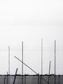
| 08/23/2003 08:39:22 PM |
Overcast at the Harbourby ImagineerComment: The negative space is effective, however, the horizontal lines are a little distracting, they almost remind me of folds in a piece of paper. Using grayscale I think helps with the white or 'overcast' sky. The angled pole (or what appears to be scaffolding) makes an interesting contrast or change to the vertical poles. |
| Photographer found comment helpful. |
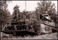
| 08/19/2003 11:19:52 AM |
Maroonedby sherComment: So that's where they go to die, in a large field! (or so it seems). This is interesting to me as I've never seen one of these boats other than in full working order on the river. The vegetation at the front (or is that back?) really ages it well, as do the sepia. It's almost like a huge garden ornament, pretty amazing. |
| Photographer found comment helpful. |
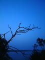
| 08/19/2003 11:12:19 AM |
As Darkness Approachesby ElizaComment: This is a really vivid blue, and I really like it! It certainly gives a 'wow' when you first look at it. The silhouettes are good, sort of framing the land off in the distance, although the horizon line looks a little crooked. Not instantly seeing desolation as it's a very pretty image, but I suppose it does support loneliness to some degree. |
| Photographer found comment helpful. |
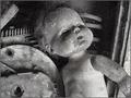
| 08/19/2003 11:03:58 AM |
Baby From the Black Lagoonby natorComment: I think this gets my whacky, creative vote of the challenge! It's quite surreal, and very disturbing, but I like it. It has quite a shocking visual, the black and white compliments it well, although not a big fan of the title. This seems very fringe and it will be interesting to see where it places at the end of the challenge. |
| Photographer found comment helpful. |
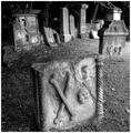
| 08/19/2003 11:00:14 AM |
Sadness ......by agwrightComment: I love old headstones, and what a find with the skull and crossbones! The foreground headstone, whereas it is centered, works well to enhance the background. I like how when you concentrate on one or the other that your eyes naturally create the dof and focus out the other. The use of black and white is, of course, perfect for the image. Not sure I can see much here that could be improved on. |
| Photographer found comment helpful. |
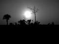
| 08/19/2003 10:56:21 AM |
Midnight in the swampby fleenkComment: I really like this. I'm becoming a sucker for silhouettes lately, plus it's black and white so that's even better! It reminds me of a desert oasis, which isnt really desolate but very pretty. I can see the lonliness factor here, though. The sun/moon is a little too centered, but I dont think it would have the same effect had you put it to the side, you would have had to try it I guess. Even so, a really nice image that I could see hanging on a wall! |
| Photographer found comment helpful. |
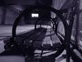
| 08/19/2003 10:52:51 AM |
Rounding the Nightby alternaruleComment: This conveys the loneliness definition of desolation to me, which the duotone compliments. The circular armrests of the bench are appealing, almost like a portal that draws the eye through them. I'm sure this is a basketball or tennis court in a park somewhere, but with the high wall on the left it sort of reminds me of a prison yard and I think that strenthens the loneliness feel of it to me. |
| Photographer found comment helpful. |
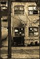
| 08/19/2003 10:48:18 AM |
Industrial Revolutionby crabappl3Comment: The dark sepia really ages the image - it is almost like a step back into the depression. There are a lot of textures here, which helps lead the eye around the photograph - there seems to be something to look at in every section. The tonal range is excellent, there is nothing too dark or too bright. A wonderful capture of desolation, as oxymoronic as that sounds. |
| Photographer found comment helpful. |
Home -
Challenges -
Community -
League -
Photos -
Cameras -
Lenses -
Learn -
Help -
Terms of Use -
Privacy -
Top ^
DPChallenge, and website content and design, Copyright © 2001-2025 Challenging Technologies, LLC.
All digital photo copyrights belong to the photographers and may not be used without permission.
Current Server Time: 08/02/2025 01:34:12 AM EDT.