| Image |
Comment |
| 11/04/2003 05:04:42 PM |
Progressby TimSComment: I'm not really a fan of the big bright sun breaking through the clouds, I think it's far too 'hot' for the image. The tree branches on the lower left dont really add anything as they are so small. The silhouette is good, but the crane itself seems to have been mostly cropped out of the image. Walking around the scene for maybe a better angle may have improved this some. |
 Photographer found comment helpful. Photographer found comment helpful. |
| 11/04/2003 03:14:23 PM |
In The Presence of Graceby magnetic9999Comment: The sky seems a little over-edited making it have somewhat of an unrealistic look. The very bright spots are also fairly distracting. I like how it's framed with the leaves, but the top right corner section has a loss of detail, which makes it just look like a big black blob. The focus also seems to be on the branches instead of the steeple, which has fairly soft edges in comparison. The edges also have a slight halo suggesting that they may have been oversharpened. |
| Photographer found comment helpful. |
| 11/04/2003 03:02:39 PM |
Mirror Mirror in My Hand...by GinxComment: This is a cute candid. The flesh tones are good, lighting is good, however, her sleeve seems a little too bright. The background is a little too much in focus and as such makes the image a little cluttered. Isolating her away from the background or having a plain background would have helped. Similarly I would have liked to have seen more of her in the frame than the background. I'm wondering if the cluttered feel of the shot was partly your decision to go black and white also. There really needs to be more contrast for the black and white to be truly effective. |
| Photographer found comment helpful. |
| 11/04/2003 02:52:13 PM |
Yearningby guobinComment: Composition is good, the lighting/exposure is good, the details are nice and sharp, although I think the pattern of his.. whatever you call the thing under his beak.. makes it seem a little out of focus. Obviously the two light smudges on the dark background are a little distracting, but I realise for DPC there is nothing that can be done for them. Nice close-up shot. |
| Photographer found comment helpful. |
| 11/04/2003 02:48:52 PM |
feminine allureby grigrigirlComment: I like the unusual pose, although I'm unsure of having the rest of her arms cropped out of the frame. The skin tone is good, no harsh shadows on her face, the expression is also good. There is enough light on her hair that the shape of her head doesnt look distorted due to some of the hair blending into the background. The catchlights in the eyes and the light on her lower lip add a nice touch. The line of light above her right eyebrow could have probably been avoided with some makeup, but overall it's a good portrait. |
| Photographer found comment helpful. |
| 11/04/2003 02:00:00 PM |
Grace And Beautyby LindaEComment: My initial thought was that the foreground leaf on the left that is out of focus is a little distracting. Cropping just above it would still have given you some room at the bottom and not taken away from the overall look and feel. The image is sharp where it needs to be, nicely clean, and the tones are good. Well spotted. |
| Photographer found comment helpful. |
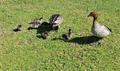
| 11/03/2003 07:36:47 PM |
Duck familyby paul190453Comment: This is certainly cute, the color of the grass is good, compositionally it's fine also. There seems to be quite harsh shadows, probably due to the time the photograph was taken. This only really becomes an issue on the middle large bird as the shadow obscures some of the ducklings. |
| Photographer found comment helpful. |
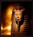
| 11/03/2003 07:32:26 PM |
By the Grace of Pharaoby gstrotmannComment: I like the warm tones of this. The lighting on the statue/mummy is wonderful with no glare and just enough shadow to make it interesting. I also like the shadowed background. The matching border also works. The detail is also very good. |
| Photographer found comment helpful. |
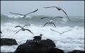
| 11/03/2003 07:20:09 PM |
Rising Above the Turbulenceby DiamondPeteComment: I like the fact that you included one of the birds on the rocks. Capturing the motion is good, the image is sharp, exposure is good. The only negative would be a suggestion of cropping out what seems to be a wing on the left hand side. It certainly captures the grace of flight. |
| Photographer found comment helpful. |
| 11/03/2003 07:07:28 PM |
Green Grass Graceby GordonComment: A very delicate abstract image. I like the diagonal line of the blade, as well as the patterns in the background. The use of dof here is, of course, exceptional and very effective in capturing the fragile mood of the image. |
| Photographer found comment helpful. |
Home -
Challenges -
Community -
League -
Photos -
Cameras -
Lenses -
Learn -
Help -
Terms of Use -
Privacy -
Top ^
DPChallenge, and website content and design, Copyright © 2001-2025 Challenging Technologies, LLC.
All digital photo copyrights belong to the photographers and may not be used without permission.
Current Server Time: 08/04/2025 10:00:54 PM EDT.