| Image |
Comment |
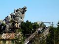
| 11/26/2003 12:38:01 AM |
Fresh Mountain Pine: Take a BIG Whiffby goinskiingComment: Hrm, looks like an amusement park ride. I think because of that any mountainous scent is a little lost. It's an ok shot but doesnt quite fool the senses to imagine being in a mountain, just the memories of cotton candy and popcorn. |
 Photographer found comment helpful. Photographer found comment helpful. |
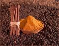
| 11/26/2003 12:35:17 AM |
Some bases of Curryby fanfuineComment: The cinamon sticks standing up like that just doesnt seem very natural to me. Having them more haphazard may have helped a little. I like the background, although not sure what it is. It adds to the earthy tone of the photograph. The colors are nice and rich and warm, and the border is complimentary. Having the bowl of spice in the center of the frame loses an impact, I think. Playing around with the placement of the sticks and the bowl could have made this good photograph even more dramatic. |
| Photographer found comment helpful. |
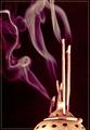
| 11/26/2003 12:26:11 AM |
Lotus fragranceby rhipsterComment: I like that you've used the entire frame for the shot. The black background makes everything stand out nicely. The purple smoke is interesting and fairly well lit. The burner only has a very small section on the top where the light seems a little too bright but it's not very distracting. I'm not sure about the border. At the bottom the golden color matches the burner, but around by the purple smoke it draws attention away from it a little. |
| Photographer found comment helpful. |
| 11/26/2003 12:19:37 AM |
Morning Coffee by ArtifactsComment: Now that's some steaming hot coffee. I really like the swirl of the one smoke curl near the top, it's kinda cute. Not a fan of the composition, tho. Why did you decide to crop the bottom of the glass or the coffee pot? The smoke is good, the background is good, the glass is sharp and clear with not too many light reflections, it's just the crop that doesnt do much for it. |
| Photographer found comment helpful. |
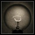
| 11/20/2003 09:40:12 AM |
Dim Bulbby adineComment: I love the tone of this! I'm curious to see what type of background you used, or whether it is just the mix of light, duotone, and contrast. The image is so sharp as well, very clear. There are far too many things I like about this. Certainly my fav so far. |
| Photographer found comment helpful. |
| 11/20/2003 09:27:10 AM |
Stop and Smell the Rosesby SamaraComment: I feel this should have even been a close up shot or probably vertical. There is a lot of empty space on the sides and yet the top of the bouquet has been cropped. Cropping off some flowers is sometimes ok if you have it full frame and there is cropping on all sides, but because this is only at the top I feel it has a severed feeling. The mix of pinks and reds on the flower are good, lighting is good with nothing blown or too dark. The connection to the phrase is good. Only thing letting it down is I think it really needed to be a vertical shot. |
| Photographer found comment helpful. |
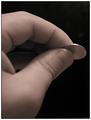
| 11/20/2003 09:15:58 AM |
Penny Pincherby vonautschComment: Interesting idea and I like how the fingers are framed in such a way as to lead the eye over to the coin. After looking at it for a while I find the inside finger in the center of the fingers to be a little distracting and would have rathered the center 'hole' be completely black. |
| Photographer found comment helpful. |
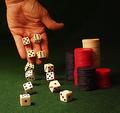
| 11/20/2003 09:12:04 AM |
Going For Brokeby GolferDDSComment: The hand and furthest die are a little OOF but I'm not sure if that is because of DOF or motion. My eyes seem to go to the hand more than the chips so I think I would have liked to have seen it more in focus. The lighting is good, a little bright on three of them, but not overly so. I'm not sure if you have the 12 die there in those positions hoping to come across like there are only two being rolled, or you only used 2 and a long exposure, although they seem a little solid with no obvious motion if you did the latter. If your attempt was the former then as I said above they seem a little too solid. Nevertheless, a good shot. |
| Photographer found comment helpful. |
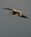
| 11/20/2003 09:01:44 AM |
Your Mileage May Varyby ellamayComment: This is a very good shot. Having recently tried some wildlife photography I can appreciate how difficult it is to get a shot like this. The negative space is good, complimenting the feeling of flying. The image is sharp with good color and light. Contrasts are also good. I dont really see anything that could be improved on. Well done. |
| Photographer found comment helpful. |
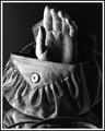
| 11/19/2003 06:30:11 AM |
Handbagby ShelleyComment: You managed to capture the nice textures of the bag, and I think the lighting/shadows leant themselves well to the black and white. The partly mirrored reflection is a nice touch too. Although it's not really a common phrase, it still is a literal representation. The lighting seems just a tad too harsh on the thumb. Overall a good shot. |
| Photographer found comment helpful. |
Home -
Challenges -
Community -
League -
Photos -
Cameras -
Lenses -
Learn -
Help -
Terms of Use -
Privacy -
Top ^
DPChallenge, and website content and design, Copyright © 2001-2025 Challenging Technologies, LLC.
All digital photo copyrights belong to the photographers and may not be used without permission.
Current Server Time: 08/05/2025 07:52:58 AM EDT.