| Image |
Comment |
| 04/23/2005 08:38:47 AM |
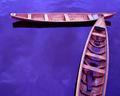
Wooden Canoesby BudComment: The complimentary colors together are appealing and as a graphical image it works well. The texture of the wood is interesting and the composition leads the eye through the image well. In the back of my mind and when I first looked at it, though, the purple water kinda threw me a little and it seemed a little surreal, but I think if you look at it long enough the graphical imagery wins through. |
 Photographer found comment helpful. Photographer found comment helpful. |
| 04/23/2005 08:35:16 AM |
Joyby JesuispeureComment: What fun! I like the sutle colors - it gives it quite an ageless quality to it. The light on the bubbles are great and really give a nice dimension to them. The backlighting is also wonderful and adds to the charm. It's almost like a mystical glow. The child in the bottom left is a slight detraction but when capturing the moment that isnt always something you can avoid. A wonderful captured memory. |
| Photographer found comment helpful. |
| 04/22/2005 10:00:53 PM |
|
| Photographer found comment helpful. |
| 04/19/2005 09:30:41 AM |
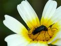
A bug in the flowerby NunoComment: The composition is good but the focus seems off or else very soft. There isnt really anything else wrong with it, just the focus issues. |
| Photographer found comment helpful. |
| 04/19/2005 09:28:36 AM |
Silkby samtrundleComment: This is a very serene image and I can certainly see the relation with your title. The reflections do look more like creases in a soft fabric than ripples in the water. I cant tell if you greyscaled the duck or just reduced saturation but the subtle color works well. I like how the pattern around the duck's eye compliments the reflections in the water. I like it! |
| Photographer found comment helpful. |
| 04/19/2005 09:25:57 AM |
Another Day in Paradiseby alanfreedComment: Looks a little windy but certainly it looks like a place worth visiting. I like the slight curve in the beach, which is mimicked in part by the palm. Composition is good, and those puffy clouds always makes things better. Certainly postcard material. |
| Photographer found comment helpful. |
| 04/19/2005 09:23:29 AM |
Twilightby TooCoolComment: I like the contrast between building and sky. If only nature would not have put those trees where they did, though! A slight halo around the building on the bottom left but overall it's a good shot. |
| Photographer found comment helpful. |
| 04/19/2005 01:08:09 AM |
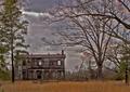
A House in the Countryby dahkotaComment: The house looks interesting but the sky just ruins it for me. I like the contrasting orange in the grass too although it looks like it could do with a slight rotation. |
| Photographer found comment helpful. |
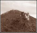
| 04/19/2005 12:59:59 AM |
Burg Mausby reeveyComment: The composition is good but it seems to be lacking contrast and a full tonal range. There does not appear to be any true blacks in the image and as such it comes across as a little flat. Using a black point and a slight curves adjustment would likely improve it immensely. I understand you were going for an olde world feel but a more subtle sepia tone may have added to the mood. |
| Photographer found comment helpful. |
| 04/19/2005 12:54:18 AM |
Elizabethby twm122Comment: The full frame composition is good and so is the use of the flowers as props. The soft focus technique can certainly be effective but as it is applied here I dont think it really works. The 'glow' has made several sections of the image overexposed, namely the ribbon in her hair and various spots in the background. The eyes are naturally draw to the lightest section of a photograph first and so these areas are where the viewer mostly notices. In the case of the ribbon this distracts from her face. Even though you want the face soft you still want to have the details sharp, namely her eyes. Creating the effect on a new layer allows you to use the eraser tool to delete the effect in certain areas and restoring the original sharpness. In this case her blue eyes would be greatly enhanced by having them sharp to engage the viewer. |
| Photographer found comment helpful. |
Home -
Challenges -
Community -
League -
Photos -
Cameras -
Lenses -
Learn -
Help -
Terms of Use -
Privacy -
Top ^
DPChallenge, and website content and design, Copyright © 2001-2025 Challenging Technologies, LLC.
All digital photo copyrights belong to the photographers and may not be used without permission.
Current Server Time: 07/31/2025 12:05:44 AM EDT.