| Image |
Comment |
| 12/03/2003 12:16:39 PM |
I'm thankful for my wifeby StevePaxComment: It's a good portrait. Not an expert on portrait shots but from what I can tell it doesnt have any shadows on the face, which is good, the eyes are bright and fairly sharp, the skin tones are good, and the pose looks quite natural. I'm curious why you decided on black and white, though. I know b&w can often even out skin tones, but with her bright smile and eyes and such a happy tone of the shot it seems to be screaming out for warm colors. |
 Photographer found comment helpful. Photographer found comment helpful. |
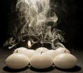
| 12/02/2003 11:43:26 PM |
Hot Candlewaxby hughletherenComment: Nicely sharp pillar candle that has wonderful soft, warm tones. Composition is good, lighting is good, and the capture of the smoke is excellent as I've heard it is fairly difficult to capture/light smoke effectively. |
| Photographer found comment helpful. |
| 12/02/2003 11:27:42 PM |
Fragranced by sahkoComment: I think I would have preferred some light on the neck area the same as the chin but otherwise this is an excellent photograph. The female neck can be a very sensual part of the body, but the lighting is clearly focused in other directions! The lighting/capture of the spritz really makes the shot. Very professional looking. |
| Photographer found comment helpful. |
| 12/02/2003 11:14:54 PM |
Odour from birth to deathby PabloComment: Not fond of the carpet although cant really say why. I like how you have one candle still lit. I'm leaning towards thinking that there is a little too much smoke, having less smoke would allow more individual plumes to stand out and add more interest, this way it seems a little chaotic. That said, I still think it's a good image. |
| Photographer found comment helpful. |
| 12/02/2003 11:10:17 PM |
Pine Tree Freshby ScottKComment: Cute idea! Lighting is good, composition is good, dof is good. I really cant see anything here that I would suggest changing. It's different, I like it. |
| Photographer found comment helpful. |
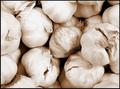
| 12/02/2003 10:55:06 PM |
garlic breathby jackditchComment: Ewww garlic! Composition is good and it's nicely sharp and clear. A few of the bulbs near the top seem slightly overexposed and the detail has been lost somewhat. They are all very similar color/tone and so could probably have done with a little more contrast. |
| Photographer found comment helpful. |
| 12/02/2003 10:52:46 PM |
Ahhhhhhh.... nothing like the smell of coffee in the morning.by kosmikkreeperComment: I can certainly relate to this, and what a great smell it is. I like the tone and the border, it reminds me of coffee. The light reflection in the coffee mug is a little distracting but I understand some things can not be avoided. The image is a little soft, almost like it has been through neatimage but not quite as severe, but I suppose this could add to the dreamy mood. I like the idea of capturing the steam, but the placement is not the best- it is almost as if she is crying into the mug. |
| Photographer found comment helpful. |
| 12/02/2003 05:08:48 PM |
Just For Men!by agwrightComment: Looks like an advertising campaign. The focus on the front bottle is good, lighting is wonderful, the cheeky bottle(?) in the background adds a sense of fun and sensuality. I even like the border on this. Cant really see anything I'd improve. Very professional-looking shot, well done. |
| Photographer found comment helpful. |
| 12/02/2003 03:26:38 PM |
Aroma is inspired by natureby rameviComment: I like the mix of white and green, they are very contrasting and complimentary colors. Edges are a little soft but it's quite an abstract image that I think it doesnt really matter. I would have liked to have seen a little more vibrant color, but white is so hard to get vivid without losing some details. The shadow on the petal is a little bit distracting, but not overly so. I like it. |
| Photographer found comment helpful. |
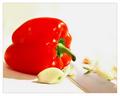
| 12/02/2003 03:22:35 PM |
Comfort Foodby CatherineComment: The right side just above the knife seems very blown out/overexposed/too bright. A lot of the details there have been lost. Because of that I'm not really sure about the composition, although the knife would be the leading diagonal line from the corner to the pepper that seems to be the main focus. With that in mind I wonder about the reasons for the garlic cloves. The red of the pepper is very vibrant. |
| Photographer found comment helpful. |
Home -
Challenges -
Community -
League -
Photos -
Cameras -
Lenses -
Learn -
Help -
Terms of Use -
Privacy -
Top ^
DPChallenge, and website content and design, Copyright © 2001-2025 Challenging Technologies, LLC.
All digital photo copyrights belong to the photographers and may not be used without permission.
Current Server Time: 08/05/2025 07:43:22 PM EDT.