| Image |
Comment |
| 02/16/2004 08:24:06 AM |
Lonesome eyesby JasonComment: I like the hair over the eyelid, and the catchlight on the eye is good. Only negative is the vast amount of negative black space on the right. |
 Photographer found comment helpful. Photographer found comment helpful. |
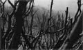
| 02/16/2004 08:20:01 AM |
Black Saturdayby melongrindComment: I like the harsh mood from the black, stripped bark. The seeming mist in the background adds a nice layer to it too. I dont normally complain about borders, but this one seems to invade the picture too much, it's almost like it's in the way of me seeing more of the limbs. |
| Photographer found comment helpful. |
| 02/11/2004 01:57:25 PM |
age 2 to 78by camelotnorthComment: This has a great photojournalistic as well as a family memoir mood to it. It's certainly something I would expect to see in a newspaper/magazine article about the person. The in-focus baby photograph is sharp and clear, and the OOF person is enough to bring the focus to the front but not enough that the person is completely out of the picture either. I like it! |
| Photographer found comment helpful. |
| 02/11/2004 01:52:38 PM |
On Edgeby crabappl3Comment: The background is nice and clear and the blue adds a wonderful mood. The OOF bubble balances the composition well, and I love the sharpness of the in-focus bubble. What looks like a window light reflection adds a complimentary white to the blue as well as give it an almost surreal insight into a mini-world. Very clear and clean shot. |
| Photographer found comment helpful. |
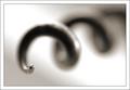
| 02/11/2004 01:49:42 PM |
Cork Screwby JackoComment: I really like this! Good diagonal composition, the focus tip is on the third, the tone is great, and the border is mimimal but effective. There is more OOF than focus and my eyes do dwell a little on the curls but I dont really see that as a bad thing. |
| Photographer found comment helpful. |
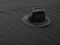
| 02/09/2004 11:19:58 AM |
When The Day Is Doneby zeuszenComment: Almost a low-key camoflage shot! The texture in this shot really stands out, and the black/grey is a nice strong color too. Placement of the hat is good, and of course the fact that it blends so well with the background seems to be the whole point of the shot! It's different, and I like it! |
| Photographer found comment helpful. |
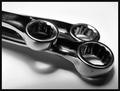
| 02/09/2004 11:17:27 AM |
Wrench Artby melkingComment: The lighting is a little uneven on the lower section, but not overly distractly. I like the 'imperfection' of the wrenches with the scratches, it gives the chrome some texture. The image is also very sharp and clear. Well shot! |
| Photographer found comment helpful. |
| 02/09/2004 11:14:01 AM |
Forgotten Cornerby leafComment: I have no idea what the 'machine' is but it looks old and really sets the tone for the image. The sepia toning is wonderful, and the slight grain gives it a nice gritty texture too. The toilet adds humor, but also serves to break up the browns, and it doesnt look out of place either. Great shot! |
| Photographer found comment helpful. |
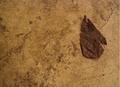
| 02/09/2004 11:11:49 AM |
My Garage Floorby latigo79Comment: The texture of both the floor and the leaf are good but the leaf doesnt really spring out from the shot. The placement is good, but maybe getting a little bit closer may have brought out more of the textures of the leaf. A slight brightness/levels adjustment may have helped a little, and the leaf looks a little soft too. |
| Photographer found comment helpful. |
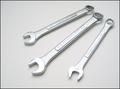
| 02/09/2004 11:09:04 AM |
white on white wrenchesby ScantyNebulaComment: Composition is good and the wrenches are nicely sharp and clean. You've lost a little bit of the texture/color on the two nearest wrenches but not distractingly so. A technically good image. |
| Photographer found comment helpful. |
Home -
Challenges -
Community -
League -
Photos -
Cameras -
Lenses -
Learn -
Help -
Terms of Use -
Privacy -
Top ^
DPChallenge, and website content and design, Copyright © 2001-2025 Challenging Technologies, LLC.
All digital photo copyrights belong to the photographers and may not be used without permission.
Current Server Time: 08/07/2025 12:37:38 AM EDT.