| Image |
Comment |
| 07/28/2004 10:40:54 AM |
Colored Bottlesby annasenseComment: The background is good, focus isnt bad, the mix of colors is good too. I dont understand the composition, though. You have the green bottle cropped partly out and negative space on the left - it gives a feeling of unbalance to the composition. Personally, I think a different crop may have improved the impact some, the rest of the shot seems fine. |
 Photographer found comment helpful. Photographer found comment helpful. |
| 07/28/2004 10:38:29 AM |
Don't leave home without it.by justineComment: The white background is good although I dont really see any true blacks in the shot. A slight curve adjustment and maybe some more contrast would darken the image a little more. That said the choice of black and white is an interesting one considering the subject choice. I would expect to be dazzled with color considering you are depicting makeup. The 'greyscale' doesnt really help the image much as there isnt a lot of shadow, texture, or form, and it also doesnt set up much of a mood either. |
| Photographer found comment helpful. |
| 07/28/2004 10:32:03 AM |
shabby spoonby GinaRothfelsComment: Hrm, the image seems a little dark with no definite blacks or whites in the image. The color of the spoon bowl seems a mix of blue and purple and does look a little 'shabby'. I'm not sure if the reflection adds much to the composition. It's not a horrible shot, it borders on being abstract, it just doesnt have much impact. |
| Photographer found comment helpful. |
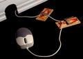
| 07/28/2004 10:28:24 AM |
A better mouse...by soccerdadComment: Certainly a quirky and interesting composition for such an everyday object, which I think is exactly what the challenge asked for. I dont know if it's a mixture of my eyes, the lighting or what but the focus seems slightly off on the traps. Overall it's a good creative shot. |
| Photographer found comment helpful. |
| 07/28/2004 12:57:46 AM |
Don't forget your keysby emb419Comment: Focus and lighting is good although I'm not sure about the composition. It meets the challenge, but doesnt really stand out much more than a picture of some keys and a phone. Could probably work as a stock image. |
| Photographer found comment helpful. |
| 07/28/2004 12:53:19 AM |
"Starry Light" (sic)by rgordonComment: I like the color combo of blue and yellow, they go together well. I also like the negative space on the left - which furthers the starry night theme. The one light being a bright star shape is cute too. The shadows are a little off, but nothing you could do to avoid those and I dont think they distract too much. I like it. |
| Photographer found comment helpful. |
| 07/28/2004 12:47:03 AM |
Lost Childhoodby mocabelaComment: Has good emotional values, which is further enhanced with the duotone. Personally I find the image a little too contrasty and/or sharp, but maybe that is emphasizing the harshness of the lost childhood. |
| Photographer found comment helpful. |
| 07/28/2004 12:42:08 AM |
Everyday for the past 24 yearsby MAKComment: I find the out of focus finger to be quite distracting. I realise the 'playing' is part of the every day thing but maybe a different composition or a less of a close-up may have helped the hand from being as intrusive. The image is also a little dark. The main problem is the composition, though. |
| Photographer found comment helpful. |
| 07/28/2004 12:39:43 AM |
What we do without it?by Prime_TimeComment: It's a good idea but there are a few technical issues. The focus is a little off, the white balance looks off (the yellow cast), and the composition isnt so good with the half cropped out clock and the negative space on the right and not on the left. Cropping it above the clock face and having more negative space above the bulb may have helped. |
| Photographer found comment helpful. |
| 07/27/2004 11:02:55 PM |
Choicesby adineComment: Good lighting, focus, and composition. Nice mix of textures too. It meets the challenge well, and I could also see it as part of an advertisement but it lacks the 'wow' for DPC. |
| Photographer found comment helpful. |
Home -
Challenges -
Community -
League -
Photos -
Cameras -
Lenses -
Learn -
Help -
Terms of Use -
Privacy -
Top ^
DPChallenge, and website content and design, Copyright © 2001-2025 Challenging Technologies, LLC.
All digital photo copyrights belong to the photographers and may not be used without permission.
Current Server Time: 08/05/2025 12:09:44 AM EDT.