| Image |
Comment |
| 03/29/2006 04:08:27 PM |
Lighting Up The Darknessby KitaComment: The image itself isnt bad but the composition seems to follow the basic stance of put everything in the middle. Because of that I am going to assume you're a beginner. The rule of thirds isnt a hard fast rule but for most situations it dramatically improves the composition, and I think this situation would benefit from it. The horizon line is almost exactly in the middle, effectively cutting the image in half. If you split the image into thirds and put the horizon on either the lower or upper third it would help. In this case since the water has more detail than the sky putting the horizon on the upper third would be better. Similiarly splitting the image vertically into thirds and putting the line created by the sun on the third it would make the image more appealing to the eye. |
 Photographer found comment helpful. Photographer found comment helpful. |
| 03/29/2006 11:44:28 AM |
|
| Photographer found comment helpful. |
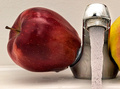
| 03/29/2006 11:43:35 AM |
The red oneby Robot-FotomatComment: Very original concept and I like the composition. The lighting and visual appeal is lacking, however, and is what lets the image down. This type of image is more appealing when it's brighter, more colorful, and 'cleaner'. The water droplets on the counter, the dullness to the chrome, and the 'corosion' to the spout makes it more 'real' but less appealing. |
| Photographer found comment helpful. |
| 03/29/2006 11:39:02 AM |
Lost Streamby goldenhawkofkyComment: I like the monochromatic tone of the image. It seems very peaceful and tranquil. A very soft flowing photograph. |
| Photographer found comment helpful. |
| 03/29/2006 11:37:33 AM |
trioby RikkiComment: Very bright and colorful, although could have done with being a little more sharper. Not so sure about the thick white line around the bigger droplet either. |
| Photographer found comment helpful. |
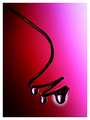
| 03/29/2006 11:30:39 AM |
It's water....manby stare_at_the_sunComment: I like the close-up and the stop-motion of the water is good. The lighting and tone could do with some work, though. I appreciate and understand the use of blue in the toning but it seems a little flat. Something more subtle may have worked better, such as adding some blue to the neutrals/whites or adjusting the blue in curves. With this type of close-up a lot of the emphasis is on the eyes and the eyes here look a little dark, esp the one on the right with no catchlight at all. |
| Photographer found comment helpful. |
| 03/29/2006 11:22:46 AM |
Nightsoundsby nards656Comment: The highlights on the water are the focal point of the image since they are the brightest parts. I like the circular ripples. The actual drops are almost pointless since they do not stand out in the image at all. On second thoughts if you crop just below the falling drop, eliminating it and the diagonal line the composition changes completely and the focus is put back on the splash. |
| Photographer found comment helpful. |
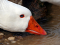
| 03/29/2006 11:12:08 AM |
Good to the Last Dropby susanhComment: Good closeup with nice saturation of the orange beak and no blown highlights on the goose. The white blur in the top right corner is very distracting. The color of the water is also not very appealing. A selective desaturation, black/white conversion, or even a sepia tone may have balanced the image. |
| Photographer found comment helpful. |
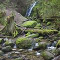
| 03/29/2006 11:08:14 AM |
Waterfalls in the Wildernessby cajayComment: I really like this shot. The composition is good, the eye flows nicely around the image. The green of the moss is lush and vibrant. The only thing I would have liked to see is more contrast as the whole image is very light on my monitor. |
| Photographer found comment helpful. |
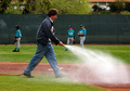
| 03/29/2006 11:05:49 AM |
Field Prepby Man_Called_HorseComment: This is an interesting photojournalistic shot. The body language of the boys, especially the one looking at the guy watering really help tell the story. Clarity and composition is good. |
| Photographer found comment helpful. |
Home -
Challenges -
Community -
League -
Photos -
Cameras -
Lenses -
Learn -
Help -
Terms of Use -
Privacy -
Top ^
DPChallenge, and website content and design, Copyright © 2001-2025 Challenging Technologies, LLC.
All digital photo copyrights belong to the photographers and may not be used without permission.
Current Server Time: 07/31/2025 06:16:28 PM EDT.