Handicapping the Poniesby
mpetersComment: ::: Greetings from Critique Club :::
Hi, as requested, here is an indepth critique of your submission.
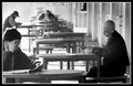
First Impression - the most important one:
I like it, it fits the challenge well and is well executed. Consequently, I gave it a high score.
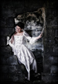
Composition:
You've used a really good composition to put your subject in a strong area of the image. However, I believe having a "secondary" subject out of focus in the foreground may be a bit distracting. He is also in a strong compositional area and is taking away from your main subject.
Subject:
Subject is strong, but as I mentioned is handicapped by the placement of the guy in the foreground.
Technical (Colour, focus, and light):
Focus: Good, perhaps a bit more USM in post.
Colour: You have a nice gradation of greyscales here and your b+w treatment is good. I see black blacks and white whites, so you pretty much nailed it.
Light: You have a nice play of light in the background and it's all well exposed.
To grow its vote?:
Two things. Compostion, as I've stated before. And, this isn't anything you could control... but I believe the voters were looking for isolation in a larger crowd.
Summary:
Overall, good work and it got a respectable score. Keep up the good work.
Hope to see more from you soon,
Leroy