| Image |
Comment |
| 03/17/2007 12:25:16 PM |
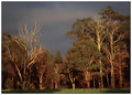
DAY 2. edited. gumsby rozComment: I like everything but the rotation. Side by side the edited version leans too far to the left and kinda makes me dizzy. Although, maybe that's what you were after. |
 Photographer found comment helpful. Photographer found comment helpful. |
| 03/17/2007 12:17:38 PM |
Lily, no edit PAD.jpgby MelonMusketeerComment: Did you take this with a tripod? It's very well focused if not. I find that hard to do with my 18 - 70, and am usually disappointed with handheld shots like this one. |
| Photographer found comment helpful. |
| 03/16/2007 06:10:13 PM |
Day 8 - Church - Editedby Bruce_the_RobertComment: Well this does NOT look like the work of someone unskilled in PS. I'm very impressed with the clarity you have been able to achieve in relation to the original post. Quite a difference. I really like the depth of color and the richness in the tonality. Very nice editing in my book. |
| Photographer found comment helpful. |
| 03/16/2007 03:49:53 PM |
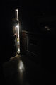
midnight snackby ShmeeComment: This is just delightful. It's a little dark overall so I might have used a low level light just to bring some illumination to the entire scene, but very imaginative and creative. |
| Photographer found comment helpful. |
| 03/16/2007 03:46:35 PM |
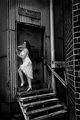
Day 1 edited: the stairsby ShmeeComment: I really don't think this needed any cropping. Everything in the picture works without it being too busy. I love all the horizontal and vertical lines everywhere. You did a great job lightening the dark areas and improving detail overall. She doesn't seem as sharp in the edited version, but that's the only critique I have. Nice. |
| Photographer found comment helpful. |
| 03/16/2007 03:37:44 PM |
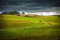
Day 2 edited: farm landby ShmeeComment: The sky in this is fantastic. I like the colors in the rest (though a bit over saturated) but I'm not too crazy about the blur. Vignetting would do the same job without calling so much attention to itself. |
| Photographer found comment helpful. |
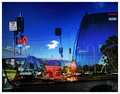
| 03/16/2007 03:33:09 PM |
DAY 7. edited . the intersection .by rozComment: Well....it's certainly different...and creative. You did kind of a drawing thing around some of the lightpoles. I like the way that turned out. You clearly had fun playing. |
| Photographer found comment helpful. |
| 03/16/2007 01:38:28 PM |
Day 8 - Prowby xianartComment: I love the simplicity and elegance of this piece. The sky creates such a wonderful negative space that flows around the hull like water. There is great detail everywhere, and nothing is blown out. Great! |
| Photographer found comment helpful. |
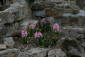
| 03/16/2007 01:33:14 PM |
Day 7 Among the Rocksby ElaineComment: I like the way the rocks form a frame for the flowers in the center. I might have moved a bit closer just to eliminate the tree trunk and enclosure wall behind. That would also enhance the flowers which are the main subject. Lighting is a little flat. Overcast? I would bump up the exposure one notch. |
| Photographer found comment helpful. |
| 03/15/2007 01:15:48 PM |
Day 4 Flowersby ElaineComment: This is incredible. Good comosition and perfect lighting/exposure.l The detail in the flowers (crocuses?) makes my knees weak. What beautiful colors and great contrast. I'm imagining a darkened background in pp to bring out the flowers even more. Can't wait. |
| Photographer found comment helpful. |
Home -
Challenges -
Community -
League -
Photos -
Cameras -
Lenses -
Learn -
Help -
Terms of Use -
Privacy -
Top ^
DPChallenge, and website content and design, Copyright © 2001-2025 Challenging Technologies, LLC.
All digital photo copyrights belong to the photographers and may not be used without permission.
Current Server Time: 06/25/2025 07:35:32 AM EDT.