| Image |
Comment |
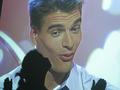
| 03/10/2004 12:32:09 PM |
MMMWWWAAAby swisskissComment: hahaha...I like his facial expression and your take on the challenge theme, which may not be apparent to everyone. You must have some big TV at home! I really find this shot very creative and like it alot. High mark. |
 Photographer found comment helpful. Photographer found comment helpful. |
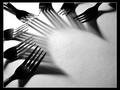
| 03/10/2004 12:29:18 PM |
Draging it in to Frameby MundiComment: Good concept to meet the challenge theme. I would like for subject not to have been so centered and positioned more to the left as well as, to have seen more of her torso. Also, I think the lighting is a bit too harsh, although I do like the unevenly lit background. I have mixed feelings about the color/toning. |
| Photographer found comment helpful. |
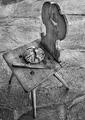
| 03/10/2004 12:09:11 PM |
Untitledby fotomann_foreverComment: I like the composition alot and you've exposed so that you can see just the right amount inside the structure. Good choice of B&W as well. |
| Photographer found comment helpful. |
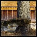
| 02/28/2004 05:41:12 AM |
|
| Photographer found comment helpful. |
| 02/28/2004 05:26:22 AM |
|
| Photographer found comment helpful. |
| 02/28/2004 12:10:25 AM |
Fresh Fruit Cupby MarjoComment: Whlie the colors are quite appertizing I find this capture to be too literal and too sharpened. Also, I don't think you had to lift up the tablecloth in the background. You've also got some blown out hightlights on top probably from lighting that is too harsh. |
| Photographer found comment helpful. |
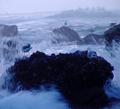
| 02/27/2004 11:07:17 PM |
Nature vs. Nature, Seagulls vs. Surfby ZoomdakComment: Great viewpoint and very interesting shot. Foreground rock is too dark and I don't find toning to be very pleasing although I like the blue cast. Horizon is tilted and the spray hitting the gulls is too blurred and seems to stop above the level of the rocks, as if you caught it at it's tail end. I think you could have also cropped out the top inch so as to eliminate a good part of the background. Still, I like very much. |
| Photographer found comment helpful. |
| 02/27/2004 10:51:52 PM |
winter V.S. springby leafComment: The background is much more interesting than the subjects. Too bad you couldn't have used that for the challenge. |
| Photographer found comment helpful. |
| 02/27/2004 10:33:02 PM |
If It Clashes - Wear It!by basia03Comment: I really like the angled lines of the hats and the way the person's head and mannequin's head are juxtaposed. It would have simplified the composition if you could have moved the woman slightly to the right so as to block out the feathers with her hat. The right side of the photo could have been cropped out to get rid of the extaneous yellow hats in the upper right and the white one in the lower right. That would have strengthened the image considerably, I feel, although I'm still confused as to what is clashing here...maybe because I'm a guy and not very fashion conscious. The intentional tilt of the camera adds a good effect. The complexion of the woman is not very flattering probably do to the harsh lighting from your flash(?) and there's a bit too much of a grainy look. |
| Photographer found comment helpful. |
| 02/27/2004 10:12:00 PM |
Faux Pasby thebone123Comment: I really like the concept here but the lighting really needs some improvement. The photo is divided into bottom/top light and dark areas. Also, I think the colors could be spruced up some...maybe a tomato soup in the plate instead of that bland looking apple sauce? |
| Photographer found comment helpful. |
Home -
Challenges -
Community -
League -
Photos -
Cameras -
Lenses -
Learn -
Help -
Terms of Use -
Privacy -
Top ^
DPChallenge, and website content and design, Copyright © 2001-2025 Challenging Technologies, LLC.
All digital photo copyrights belong to the photographers and may not be used without permission.
Current Server Time: 08/18/2025 03:35:49 PM EDT.