| Image |
Comment |
| 07/31/2004 05:37:50 AM |
Dancing Pathos Capersby rhipsterComment: Love this image and can see it, and your arrangement of the lettering as an album cover. The strong diagnol lines that these dancers create really make for a feeling of energy and action, as do the black colored clothing they are wearing, which also make them look heavy (not in their bodies, but in their dance steps). Background is wonderful too as it's simple and non-distracting and shows a unique place for this activity to take place giving the impression of originality to this group. Good job! |
 Photographer found comment helpful. Photographer found comment helpful. |
| 07/31/2004 05:30:23 AM |
Dead Poets' Childrenby Dr.ConfuserComment: I like the title and the white lettering. Image gives somewhat of eerie feeling with the harsh lighting. The three tombstones also seem to contribute to this and seem to convey some sort of meaning. Ordinarily, I would say that technically the too well defined shadow that goes accross the image and subject (tombstones) would be a detraction, but in this case, I think it's appropriate and also adds to the general feeling of today's groups. Didn't like this when I first saw it, but after looking at it for a while I think it's a good effort. |
| Photographer found comment helpful. |
| 07/31/2004 05:23:25 AM |
Distant Ports Callingby L1Comment: Wonderful crisp image with good saturated color. I think you should have tried to isolate the sailboats more as they get lost in the background building. Either a different point of view to isolate them, or zoom in for a close up. |
| Photographer found comment helpful. |
| 07/31/2004 05:20:58 AM |
Deranged Psychedelic Childrenby peeteComment: Funny picture and title, but the surroundings of this image show more of a contemporary home than the psychedelic 60's image that I think you were trying to portray, and this, imo, weakens the message of the album cover. While all the clutter of the forground help to give the impression of "deranged," I find it to be visually difficult to look at and the 60's generation woudl not have aligned themselves with Coka-Cola. Lighting is good, but a bit harsh. |
| Photographer found comment helpful. |
| 07/10/2004 01:20:16 PM |
Up and Awayby prettyshoes1Comment: Nice composition with rich colors but I don't like the way you've cut off the basket at the bottom border. The black of the bottom of the balloon could be a bit more black to add some more impact, I feel. The color of the sky is a bit weak. Overall, though, I like it. |
| Photographer found comment helpful. |
| 07/10/2004 01:15:16 PM |
Grapes of Wrathby DefyTimeComment: Love the color combination here, but wish there was a bit more order and arrangement to this mess. Background does not add to the overall effect. |
| Photographer found comment helpful. |
| 07/10/2004 12:58:51 PM |
The World in a Ballby KaDiComment: This could be a nice portrait, but the harsh lighting hides the girls face in strong shadow. |
| Photographer found comment helpful. |
| 07/10/2004 12:52:17 PM |
Hard Lickerby BassieComment: Very cool photo and great title. I love the effect of the rich colors against the black face and background. Teeth are brightly white and only thing I think would have addes some more impact is the whites of the left eye showing more. A brillant concept that was well executed and is going in my favorites list. Wish I could give more than a 10. |
| Photographer found comment helpful. |
| 07/10/2004 12:47:29 PM |
Purple is soooooo smooooooooothby PioneerComment: colors are good and I like the wide angle distortion to give emphasis to the glass and bottle, but I feel the POV and framing was not given much thought and gives a haphazard appearance. |
| Photographer found comment helpful. |
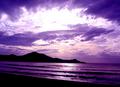
| 07/05/2004 11:41:20 AM |
Tequila Sunriseby TiberiusComment: Great scene but looks like you exposed beyond the capacity of your camera's contrast latitude. |
| Photographer found comment helpful. |
Home -
Challenges -
Community -
League -
Photos -
Cameras -
Lenses -
Learn -
Help -
Terms of Use -
Privacy -
Top ^
DPChallenge, and website content and design, Copyright © 2001-2025 Challenging Technologies, LLC.
All digital photo copyrights belong to the photographers and may not be used without permission.
Current Server Time: 08/15/2025 07:57:54 PM EDT.