| Image |
Comment |
| 01/17/2005 12:25:12 AM |
|
 Photographer found comment helpful. Photographer found comment helpful. |
| 01/05/2005 10:58:49 AM |
Weary Little Touristby SandyPComment: Lighting is wonderful and I like the soft focus as well. Very natural looking colors too. Only thing I can see as a bit distracting is the woman's watch. |
| Photographer found comment helpful. |
| 01/02/2005 10:38:33 PM |
Air Freshnikovaby aznymComment: Great idea that could have been carried out a bit better, but I love it anyway! The composition is terrific and I love the touch of the scarf that gives the back side of the air freshener a human touch. The blurred and spotted bg along with the overexposed figure gives an outdoor urban appearance. However, I wish the overexpose wasn't so extreme and think that focus could be sharper on the subject. Other than that, I think this is brilliant! Message edited by author 2005-01-03 00:39:10. |
| Photographer found comment helpful. |
| 01/02/2005 10:10:16 PM |
Ebenezer CorkScrooge by scalvertComment: Focus is really sharp and I really like what you did with the colorful reflections in the chrome. good job. |
| Photographer found comment helpful. |
| 01/02/2005 09:39:16 PM |
Santa and friends (only cropped and rotated)by CamComment: It's a bit of a stretch for me to see any faces here. What I do see is a bit of posterization or noise. I don't find the compostion to be terribly interesting either. Sorry for the blunt comments but hope it was helpful. |
| Photographer found comment helpful. |
| 01/02/2005 09:36:08 PM |
Hephaestos & Hestiaby typologicComment: I love how this subtly meets the challenge theme with a face on the left side and a face and left shoulder on the right. It appears to be two people in repose maybe lying on a sofa with the man's arm around the woman in front of a fireplace. This is exceptionally well done! 10 |
| Photographer found comment helpful. |
| 01/02/2005 09:30:45 PM |
It Bytesby sannokComment: Appears overexposed and the format and subject matter seem to clash. With the subject weren't truncated on bottom. |
| Photographer found comment helpful. |
| 01/02/2005 09:29:31 PM |
No Teethby GolferDDSComment: Meets the challenge theme well. I really like the deep rich colors of burnt orange and brown here, as well as, the testure. Imo, the compostiion is lacking and I wish you could have included more brown leaves and green grass to balance things out a bit. The grain also is film like and very appealing to my eye. |
| Photographer found comment helpful. |
| 01/01/2005 02:37:06 AM |
eau de toiletteby grigrigirlComment: What a wonderful concept this piece of photographic art is! Very well constructed image. I love how the angled lines of the walls, the lines of the bars your model is resting on, and especially the lines of the models body (legs and arms) all lead to and emphasize her derierre. The choice of dark black clothing giving her a formless and unappealing shape, along with her distant and disgusted gaze upward give us the first clues as to what this photo is NOT about...it's not about sensuality. The choice of pose is classic for the idea of feminine beauty and along with the distance of her bottom to the toilet seat and paper dispenser alert us to the conflict a woman may undergo seeing herself as beautiful while at the same time having to address her more earthy aspects and possibly the dismay she feels at the thought of telegraphing it through the olfactory sense. As if she wishes she could seperate herself from the act. Well done. Message edited by author 2005-01-01 13:42:49. |
| Photographer found comment helpful. |
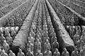
| 11/01/2004 12:19:24 AM |
Battle Lines by CamComment: Awesome picture! congratulations on your ribbon. |
| Photographer found comment helpful. |
Home -
Challenges -
Community -
League -
Photos -
Cameras -
Lenses -
Learn -
Help -
Terms of Use -
Privacy -
Top ^
DPChallenge, and website content and design, Copyright © 2001-2025 Challenging Technologies, LLC.
All digital photo copyrights belong to the photographers and may not be used without permission.
Current Server Time: 08/14/2025 11:56:21 AM EDT.