| Image |
Comment |
| 08/09/2003 03:04:44 AM |
The Right Way!by sandabellaComment: Good exposure but the tree obstructing the view ruins the picture for me. I do like the way the blue sky contrasts with the stone of the architecture. |
 Photographer found comment helpful. Photographer found comment helpful. |
| 08/09/2003 02:59:01 AM |
Sleeping tightby MjrTomComment: Strong point of the photo is not the right angles, but of the cute and cuddly creatures...I also like the contrast between subjects and earth. Good texture and detail presented. |
| Photographer found comment helpful. |
| 08/09/2003 02:55:13 AM |
Sky Crossingby roleychiuComment: I like the way the sign contrasts with the sky, but I think you did a bit too much post processing of the color and saturation. I also find the composition to be too static. |
| Photographer found comment helpful. |
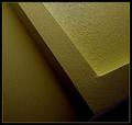
| 08/09/2003 02:38:05 AM |
"It is all aglow.."by tfarrell23Comment: Neat abstract...I like the color and the way you've brought out the texture. And even though I find the highlight area a bit too hot, I like the contrast here. There's a bit too much noise in the image, but I think it adds to the photo. |
| Photographer found comment helpful. |
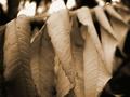
| 08/03/2003 02:09:29 AM |
Hanging Leafby K-RobComment: Contrast is too low but I do like the grainy texture of the image. I also don't find the compostion to be all that interesting. |
| Photographer found comment helpful. |
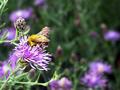
| 08/03/2003 02:06:06 AM |
Natural Gardenerby WesComment: The flower and bee are overexposed but I like the job you did with DOF. |
| Photographer found comment helpful. |
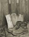
| 08/03/2003 01:57:57 AM |
Done in the Gardenby OneSweetSinComment: While exposure and tone are good, the eye is lead to the pair of softly focused boots at the bottom, which IMHO should be in better focus. Also, I would have liked to see this image in sepia and the shovels and boots not so centered. |
| Photographer found comment helpful. |
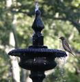
| 08/03/2003 01:49:19 AM |
Fountain of Hopeby ceovishyComment: Good job on the DOF but I think this shot would have been better had you zoomed out a bit and not had the fountain dead center. |
| Photographer found comment helpful. |
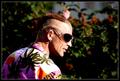
| 07/27/2003 11:33:18 PM |
Rebelby NazgulComment: While the lighting is harsh and the contrast extreme, I think it adds to the picture, given your subject matter. I also really like the pose you've captrued here. Only problems I have is the flower that's coming out of the man's head and your title, which I don't like. |
| Photographer found comment helpful. |
| 07/27/2003 11:25:36 PM |
Financial Trendsby caroleeComment: Great idea that I think could have been carried out better. For instance, I think the dollars should have been placed so that they go down, and not up. Also, would have liked to have seen a more appropriate background to add additional clues that what we're looking at is a graph and to add visual interest. Maybe graph paper? |
| Photographer found comment helpful. |
Home -
Challenges -
Community -
League -
Photos -
Cameras -
Lenses -
Learn -
Help -
Terms of Use -
Privacy -
Top ^
DPChallenge, and website content and design, Copyright © 2001-2025 Challenging Technologies, LLC.
All digital photo copyrights belong to the photographers and may not be used without permission.
Current Server Time: 12/15/2025 12:06:02 AM EST.