| Image |
Comment |
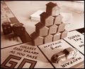
| 12/03/2003 09:47:41 PM |
Monopolyby marboComment: Not sure why you went for the sepia toning, but I don't think it adds anything to the image. I would have really liked to see this picture in color. Also, the lighting is too harsh and has given the image an overexposed look. I'm not really crazy about the triangular pile of houses. It seems their only purpose is to obscure a lacking top half of the photo. |
 Photographer found comment helpful. Photographer found comment helpful. |
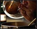
| 12/02/2003 11:54:22 PM |
Feeding The Sensesby ToddhComment: I ike the composition very much and even with the blownout highlights on the pot cover and wine bottle label, I find the exposure very good. I even like the grain/grit feel to this image. Only thing I find distracting is the bright circles near the hand and on the bottle in the background. |
| Photographer found comment helpful. |
| 12/02/2003 11:47:45 PM |
rising ringsby claudiadfComment: The photo appears to be of onion rings, and while I like the concept and treatment, I find it to be too obscure and abstract to think in terms of smell. Also, the hightlight is way too bright and distracting. |
| Photographer found comment helpful. |
| 11/28/2003 03:29:13 AM |
Winter Aromasby adineComment: I love your use of negative space here. Very creative composition. Just wish the colors were more saturated and it would have been nice to see a vapor trail rising from the hot coco. As it is now, the image leaves me a bit cold. |
| Photographer found comment helpful. |
| 11/28/2003 03:13:38 AM |
Breakfast Offeringsby amyheartsjapanComment: I like the humor in this photo but find the exposure lacking in that you have blown out highlights as well as lost detail in the shadows. Lighting is way too harsh and I wish that the bacon strip was also in focus. |
| Photographer found comment helpful. |
| 11/28/2003 03:05:47 AM |
The Scent of a Womanby TerryGeeComment: Good concept that could have been carried out better. Lighting is too harsh and exposure seems off as you've lost detail in the hand and shoulder. I also find a lack of coherence between the graininess of the image and the refined and delicate features of the woman. More light shed on the glass applicator and maybe doing away with the shadow in the background would have improved the picture IMO. I'm a bit undecided about the blue-green-grey cast but do think it adds a feeling of sensuality |
| Photographer found comment helpful. |
| 11/18/2003 10:16:19 AM |
|
| Photographer found comment helpful. |
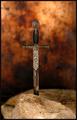
| 11/18/2003 08:15:12 AM |
The Sword in the Stoneby moodvilleComment: Despite the centered subject matter, I like the composition and especially the colored background. I think what's missing is lack of visual detail of the interesting looking sword, which I think should be lit better. Also, more accoutrements of that period of history would also add more interest, such as, a draped robe or shield. |
| Photographer found comment helpful. |
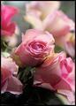
| 11/11/2003 12:23:44 PM |
Rosa, rosae...by azuzarteComment: I love the soft pastels but while I like the backlighting, I find it to be too strong so that the background roses are too washed out and merge and detract from the main rose. I also think some fill light could have been used to illuminate the bottom of the photo more to show the greens of the stems better. Good DOF. |
| Photographer found comment helpful. |
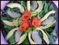
| 11/11/2003 12:12:48 PM |
Salmonsaladby MonaComment: Beautifully laid out platter but I think the contrast could be better. I also find the border does not add anything to the photo |
| Photographer found comment helpful. |
Home -
Challenges -
Community -
League -
Photos -
Cameras -
Lenses -
Learn -
Help -
Terms of Use -
Privacy -
Top ^
DPChallenge, and website content and design, Copyright © 2001-2025 Challenging Technologies, LLC.
All digital photo copyrights belong to the photographers and may not be used without permission.
Current Server Time: 08/21/2025 08:50:08 PM EDT.