| Image |
Comment |
| 12/14/2003 06:54:33 AM |
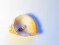
Wow! What a findby jmritzComment: I am really enjoying this image very much. Love the colors, especially how the combination of the understated duotoned background makes the yellow of the shell pop. I also like how the blue shadow contours and contrasts with the yellow outline of the shell. Very beautiful! I can see this photo in a catalogue of jewelry. Good luck! |
 Photographer found comment helpful. Photographer found comment helpful. |
| 12/14/2003 06:47:31 AM |
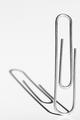
Homage to Johan Vaalerby EddyGComment: Wonderful concept and I like the compostion very much. I especially like the way the clip just stands there. Overall, I would have liked the image better had the lighting not been so harsh and maybe a less bright and slightly toned background. |
| Photographer found comment helpful. |
| 12/14/2003 06:43:59 AM |
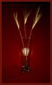
Simplicity In Red & Goldby Spanish_GreaseComment: This is an absolutely lovely picture that I like very much. I really enjoy the way the stalks of wheat capture the golden light against the dark red background. There are two issues I wish were improved, however. I find the highlight in the glass to be distracting as it's color is "off." I also find it to be too defined and wish it were more diffuse. In addition, I don't like your treatment of the glass supporting structure. It juts out of nowhere and just hangs there. I still like the image very well. Good luck. |
| Photographer found comment helpful. |
| 12/14/2003 06:33:25 AM |
As Simple As ...by GeneralEComment: Excellent concept that I wish was carried out differently, as I do not like this combination of subject and background in regards to color. They seem to clash I do like the way the letters are arranged. Also, it appears the lighjting is uneven and there is too much glare coming off the letters. |
| Photographer found comment helpful. |
| 12/09/2003 11:57:22 PM |
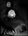
Spare Change?by adineComment: This shot is so expressive and fits the challenge perfectly ! I love the predominantly low-key tones and your cropping. The lack of identity of this person was very wise as it shows poverty more of a societal problem than just an individual's plight. The clutching hand and dirty cup add to the emotion and I like your point-of-view, as well. The lighting way down at the bottom gives it a glimmer of hope, though. Very well done! |
| Photographer found comment helpful. |
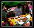
| 12/04/2003 01:03:33 AM |
Yes, I Have Money; Now What?by librodoComment: Wonderfully rich, bright and saturated colors!!! What I"m getting from this picture is indecison on what to buy from the numerous choices presented by the street vendors. I love the way you've managed to capture the woman in the middle of the frame in motion and appearing to turn to and fro undecided about what to buy countered by the three other women who are still and appearing relatively in focus...This is a wonderful effect! Adding to the effect is the verdant green bus in motion in the background which gives the whole scene the feeling of the hustle and bustle of city life. The only question I have about this image is the use of a very thick border that has a grey outer edge. Not too crazy about it, but I do feel that the heavy black border does make the bright colors stand out even more. I really love this picture and hope it does well. Good luck. |
| Photographer found comment helpful. |
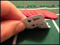
| 12/03/2003 11:55:11 PM |
Blackjack pays 3 to 2by ZalComment: Very good arrangement of picture elements but the lighting is too harsh and the colors look washed out and dull. DOF is very good. |
| Photographer found comment helpful. |
| 12/03/2003 11:20:50 PM |
Get whatever your little heart desires, Sugar!by drydocComment: Excellent take on the challenge and I like the composition very much, especially the bowtie on the candy...Very well placed! Only things I can see critiquing are the lighting being too harsh and I don't like that the two areas of the black background came out different looking. The lower left shows much more sparkles than the upper right. I enjoyed viewing this photo very much...well done, and good luck in the challenge...I'm rooting for you. |
| Photographer found comment helpful. |
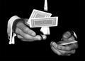
| 12/03/2003 11:05:32 PM |
Poker Handsby jonpinkComment: Really nice use of negative space and I like the way the shirt cuff and hands are showing, but I find the shirt behind the cards distracting and wish it weren't showing. Also, it would have been nice to see both arms showing the white cuffs. If this were a staged shot, a ncie pair of colored or gold cufflinks would be good too. |
| Photographer found comment helpful. |
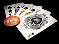
| 12/03/2003 10:59:56 PM |
BlackJackpotby eswikComment: I like the concept, but think it could have been carried out better. First, the lighting seems too harsh and there seems to be glare coming off the whites of the cards. Secondly, I would have preferred a green felt background to mimick the kinds of tables that poker is played on. I also would have preferred to see real coin scattered about and in more abundance than the stingy single token in the image. |
| Photographer found comment helpful. |
Home -
Challenges -
Community -
League -
Photos -
Cameras -
Lenses -
Learn -
Help -
Terms of Use -
Privacy -
Top ^
DPChallenge, and website content and design, Copyright © 2001-2025 Challenging Technologies, LLC.
All digital photo copyrights belong to the photographers and may not be used without permission.
Current Server Time: 08/21/2025 03:13:37 PM EDT.