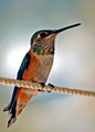
| Image |
Comment |
| 09/07/2006 01:29:31 PM |
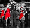
Do you want to dance with me?by zaflaboutComment: OK job on the selective color, but there are some major flaws. For instance, the nearest girl (who is a stunning beauty, btw) has a glow of fleshtone around her ruby lips that makes her look a bit wierd and there are artifacts on the legs of all of the lovely ladies. I'm not too sure about the composition, though I can't say what I would have done to make it better. The background is too busy and the selective color is just a bit too over the top, even for advanced editing. I also could do without having the scrawny, baggy panted rear of the Harry Connick, Jr. wanna-be in front so prominent in the frame! LOL! |
 Photographer found comment helpful. Photographer found comment helpful. |
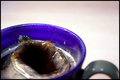
| 09/07/2006 01:22:21 PM |
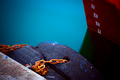
XIby bragurComment: It is unclear what this is and why it should be interesting. |
| Photographer found comment helpful. |
| 09/07/2006 01:17:15 PM |
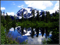
Cascade Reflectionsby madhatterComment: If the sky weren't blown out it would be better. Also, I don't like the composition. The mountain being further left in the frame, at the expense of the uninteresting left end of the lake, and a crop just below the tree reflections would improve the shot. |
| Photographer found comment helpful. |
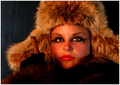
| 09/07/2006 01:14:52 PM |
Sexy Stareby behindthescenesComment: This would be better cropped portrait or with the subject offset more. Also, the visible metal supports in the background are a distraction. You need a less transparent backdrop or dispense with the backdrop and have the background look industrial. As for the model, the stare is reasonably sexy, but the eye make-up is over done and dark patch on the cheek makes her look somewhat sickly or malevolent. Also, the flyaways in the hair look unkempt instead of sexily rumpled, as I expect was the intent. As for the lack of shirt front, it doesn't hurt the shot, but it isn't really adding that much to it either. A style of shirt and pose that gave some hint of curves instead of simply showing cleavage would be more enticing. |
| Photographer found comment helpful. |
| 09/07/2006 01:09:13 PM |
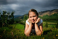
Mariaby steinarComment: A bit too centered. It would be more effective if she were over to the right (her left) about one head width. Also, the bush on the left woudl be better in focus or out of the shot. The background being out of focus is good, but that bush is too close to the subject and distracts. The lighting is also a bit harsh, with too dark of shadows on her face. A slightly different angle or later in the day might have helped, or a reflector or or something to spread a kinder light on your pretty subject. |
| Photographer found comment helpful. |
| 09/07/2006 01:05:16 PM |
Sugar in my coffeby tryggunnzComment: Nice stop action! It would be nice if you could still see the sugar cube (which is, I assume, what made the splash). Also, a slightly longer focus and tighter crop, eliminating the negative space at the top, would improve the image. As it is, the large white space leaves one wondering why the whole cup is not in the frame and the splash is not all in focus? |
| Photographer found comment helpful. |
| 09/07/2006 01:02:31 PM |
|
| Photographer found comment helpful. |
| 09/07/2006 01:01:39 PM |
It's Cold Outsideby TransitComment: Well composed, good focus, interesting lady! The colors are a bit ruddy, but that is not a major knock. |
| Photographer found comment helpful. |
| 09/07/2006 01:00:29 PM |
NOPE! No kiss. No jump!by drydocComment: Compositionally uninspirring. The focus could be a bit longer, as the frog is just on the edge of being in focus. I would crop it closer to the frog, since the out-of-focus orange stuff draws the eyes away from the story here. |
| Photographer found comment helpful. |
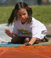
| 09/07/2006 12:58:15 PM |
Her Teddyby rossbillyComment: Cute kid. The dark spots on the pillow/blanket in front of her face are a distraction, as is the out-of-focus hair. Compositionally, I would have put her lower in the frame. |
| Photographer found comment helpful. |
Home -
Challenges -
Community -
League -
Photos -
Cameras -
Lenses -
Learn -
Help -
Terms of Use -
Privacy -
Top ^
DPChallenge, and website content and design, Copyright © 2001-2025 Challenging Technologies, LLC.
All digital photo copyrights belong to the photographers and may not be used without permission.
Current Server Time: 08/22/2025 04:15:41 AM EDT.