DPChallenge: A Digital Photography Contest You are not logged in. (log in or register
 
Browse Settings
Currently viewing:
Registered UserArtifacts

Show comments:

Per page:

Order:

Comments:


Comments Made by Artifacts
Pages:   ... [260]
Showing 11 - 20 of ~2598
Image Comment
Sandstone
06/22/2009 02:01:30 AM
Sandstone2nd Place
by LoudDog

Comment:
Congrats on a well deserved ribbon with a superlative image. You were overdo for a win.

You Da' Man!!!
Photographer found comment helpful.
Riding the Wave
02/17/2009 09:37:48 AM
Riding the Wave
by rjkstesch

Comment:
This is a gorgeous image with great perspective and lines. Captures the feel of The Wave exceptionally well.

This is nitpicking but "The Wave" is actually in the Vermillion Cliffs National Monument just over into the Arizona side of the border. The expansive Grand Staircase-Escalante National Monument is next door on the Utah side of the border.
Photographer found comment helpful.
DSC_0237.jpg
11/21/2008 01:32:45 PM
DSC_0237.jpg
by Breeee123

Comment:
K10DGuy is correct... this one is "better" than your entry. Color processing and composition are both superior.
Photographer found comment helpful.
Eagle Nebula, M16
06/04/2008 10:10:57 PM
Eagle Nebula, M163rd Place
by CyMaN

Comment:
jlanoue... hope voters make a liar out of me and ribbon this one.
Photographer found comment helpful.
"The Itsy Bitsy Spider..."
04/14/2008 07:48:38 PM
"The Itsy Bitsy Spider..."
by bs-photos

Comment:
Nice picture... great dew detail and technical quality. It has great green BG.

However, this isn't an English Cross Spider like this one being eaten by a Preying Mantis:
//www.pbase.com/azleader/image/84903267

You can tell because yours does not have the unmistakable "cross" structure.

Photographer found comment helpful.
2 Days Old
06/09/2007 10:36:17 PM
2 Days Old
by shanksware

Comment:
Positives:
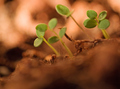
Greens contrasted against full earth tones with good background bokeh to emphasize the challenge topic.

Technicals:
Overall a decent quality macro capture. Brown tones across the whole image well emphasizes your intended purpose.

The general composition lacks a directing purpose and a true central interest point for viewers to latch onto and has a very shallow depth of field at f/2.8. It needs something more added to the composition.

Contrast looks weak but overall technical quality is acceptible except for the blurring of some of the plant leaves is not very smooth and act as viewer distractions because they are so close to the sharpest areas of the image. Their edges just don't look right.

The Challenge:
Obviously, you met the challenge. Despite all the discussion about such things virtually every photographer intends to and does meet the challenge. That is not a big issue here.

Though yours is a little more pronounced than most, you will notice that 85% of voters scored your image 4, 5, or 6... only 15% outside that range. It is fairly typical for an image be scored in a narrow range and therefore hard to know exactly what it means. There are HUGE quality differences between images scored 4.0 from ones scored 6.0 yet that is the mixed message sent to you with your vote distribution curve.

The fact there are only 15% of the votes above or below this range probably means there was little in the composition to provoke a user reaction. You were scored below average in a high quality challenge, but with added value this image would have finished much higher.

Suggestions:
------------------------------------------------
Probably the most important thing to do to "improve" your image is to add something more to the composition.

Your image reminds me of a story DrAchoo told about this sorta similar red ribbon winner he took for the Shapes challenge:


He explained that he picked a pea sprout with an interesting swirl from his garden and taped it to the kid's swing set to photograph. But he felt it was missing something so vainly went in search of his tradmark ladybug to include in the composition. He couldn't find one. Then he remembered where there were some big ants so went and got one, put it on the sprout and quickly photographed it for about 30 seconds while the ant struggled to escape.

Your image needs it's ant or equivalent. The sprouts are not enough. Its a great setting waiting for a main subject. The highest scoring images not only meet the challenge but always have added value to make the composition unique and more interesting.
------------------------------------------------

Even with your lens wide open you still had to have a 13 second exposure to get the picture. It would be very difficult include any animate object at that shutter speed. Additionally, shallow depth of field(DOF) hurt this image in voting somewhat. You need to shoot at a higher f/number for greater DOF. You could either lengthen the exposure time or get more lighting to make that possible. Of course, shooting at a higher f/number would screw up your great circular background bokeh. Ya just can't win sometimes and have to make compromises.

To see if the contrast is 'really' weak just do a quick "autolevels" adjustment. If it looks better to you after "autolevels" then it is weak and should be adjusted. :)
Photographer found comment helpful.
 m
06/08/2007 08:51:49 AM
m
by mattmac

Comment:
Positives:
The selective desaturation was done very competently. The moment captured with the bird good and overall technicals fine.

Technicals:
The trick with selective desaturation is to get the borders natural and keep the color natural with the black and white background. You did well on both counts.

Sharpness and general lighting are all right.

Overall the background is featureless and on the dark and forboding side in strong contrast to the main subject. The entire left side of the image adds little to the overall image and leaves the bird nearly center framed.

The Challenge:
Boy, did you hit the nail on the head. You predict 5.45 and get a 5.47. You might consider buying a lottery ticket. :)

Your score and placing were a little above average. Back when I was allowed to vote I scored this one a "7". In my world that means I agreed with voters and thought it average to. So did you, btw. :)

I was influenced by the featureless background and that the entire left side adds so little to the composition. Otherwise, technically speaking, it is well done and I'd consider giving it an "8" now. I scored that challenge fairly low overall. I'm not a particularly strong fan of selective desaturation to start with.

Suggestions:
Since the background adds so little you might consider a square crop with the bird on the far left of the crop. It would give the viewer more subject to look at, give it an off-centered positioning of your main subject and remove the uninteresting background on the left side.
Photographer found comment helpful.
still standing
06/08/2007 08:03:11 AM
still standing
by AzCKelly

Comment:
Positives:
General technical quality and tonality are the strength of this composition.

Technicals:
Tonality is particularly nice in this image, especially the browns on the cacti. They are just plain nice. Sharpness is very good except for a little haloing around the right arm and a bit of digitalization visible in some of the "skeleton" fine detail on my sharpness sensitve LCD monitor. The clouds, which sometimes are really hard to find in Arizona, make a nice background.

The Challenge:
In free study challenge voters always have exceptionally high expectations and look mostly for two things. 1-Exceptional technical quality and 2-The elusive "wow" factor. Your technical quality is good but not exceptional and the "wow" factor kinda low. Combined, voters felt yours was a little below average for the challenge.

Suggestions:
kawhona makes some excellent observations and very good suggestions in the comments. I'd go with what he says. His comments remind me of this picture similar to yours that I took down in Tucson using a polarizer:

Photographer found comment helpful.
Tetelestai!
06/08/2007 07:25:53 AM
Tetelestai!
by JamesKW

Comment:
Positives:
Well constructed image. The strength of the composition is in the detailed clouds and bright highlighting behind the main subject.

Technicals:
Nice use of silhouette, background highlighting and the rule of thirds in a clean and simple composition.

You don't say, but it looks like you used the burn tool on a data layer to darked the image edges. If so, you may have overdone it slightly making the darked areas look a tad bit unnatural with a brownish color cast typical from using the burn tool.

Even though the image was shot at f/14 it still looks as though it was focused at infinity on the sky background, which is nice and sharp, but left some softness in the main subject.

Though the silhouette is soft focused in places it appears haloed on the hands and has some digital "jaggies" on the cross edges in a few places which is typical of oversharpening. Looks like the sharpen tool may have been used for selective sharpening.

The Challenge:
This image has a very unusual double winged vote distribution curve. You have a jump in votes at both ends of the scale, yet not a single "1" vote. That usually indicates a highly controversial image but it IS a religion challenge. This is pure speculation but perhaps a display of The Crucifiction generates strong emotions both ways.

40th out of 302 is a very good placing with a 5.9 score. That means in general voters felt this is a very good image. The strong background highlighting effect likely played a roll in that.

Suggestions:
If, in fact, you used the burn tool for background darkening then I have an alternative suggestion that you might want to try. It will reduce or eliminate the brownish hue. It is a bit more work but is non-destructive and gives a more natural result...

Add a new layer and make it an "overlay" layer and click the 50% grey box. You can paint with white and black to perform dodge and burn but without using the actual dodge and burn tools themselves, just the paint brush.

To burn, like for darkening the clouds, you select black for the brush tool and set the mode to "darken" and opacity around 10%. When painting on the 50% layer this combines naturally with the layers below it to produce nice darkening of the clouds without the brownish color cast typical when using the dodge tool.

Seems like both the silhouette and sky should be in sharp focus when shooting at f/14 but maybe not in this case. Shooting at an even higher f/stop might be needed and since you shot at 1/400th you have the lighting to conveniently bump the f/stop. You always want the edging of a silhouette to be crisp and sharp and that does not appear to true in this particular image.

Sorry... this is a lot of verbiage for such a conceptually elegant image.
Photographer found comment helpful.
Blessing Buddha
06/07/2007 06:13:41 PM
Blessing Buddha
by hajeka

Comment:
Positives:
Post processing is the main strength of this image. The incense is a nice addition.

Technicals:
Basically the sharpness, background and those types of things are all OK.

Perspective and composition, however, are on the weak side. Lighting choice does not add a lot of viewer interest to the composition though there is nothing really wrong with it either. The depth of field makes the near foreground part of the incense out-of-focus

The Challenge:
You got 4.9 but that is only about .3 below the challenge average. It probably would hve scored lower if it were not for its technical merit.

It is doubtful voters had a problem with your religious choice, but pictures of stationary art objects typically score low at DPC. Your idea to add more interest by including the incense is a good one, it just needs more viewer interest.

Suggestions:
As far as it goes there really is not much "wrong" with your picture. But there are some things you might try to increase viewer interest.

One thought would be to change from the snapshot perspective. Try a dramatic angle either high or low. Be creative. Another change would be to give it angled and more dramatic lighting as well. Both would add lots of viewer interest.

Instead of having one incense stick, maybe have two or three and maybe add some breeze to show the smoke curling up better during the timed exposure. Directing strong lighting to the smoke rising would help.

Once I photographed a coffee pot with steaming coffee coming out and took over 70 exposures. I had to boil the coffee in a pan and pour it into the pot every two or three shots before the steam disappeared and I had to do it over again. I did that until I got a smoke curl that worked. That effort earned a yellow ribbon. Consider that for yours.

Lastly, you shot at f/6.3 which left the closer part of the incense stick out-of-focus. Consider a higher f/number for greater depth of field if that is practical. It will make the exposure a lot longer which might screw up the smoke curls so you'd have to work with it to find the right combination. Don't discount the possibility of simply letting the incense burn down enough that you could set them more upright.
Photographer found comment helpful.
Pages:   ... [260]
Showing 11 - 20 of ~2598


Home - Challenges - Community - League - Photos - Cameras - Lenses - Learn - Help - Terms of Use - Privacy - Top ^
DPChallenge, and website content and design, Copyright © 2001-2025 Challenging Technologies, LLC.
All digital photo copyrights belong to the photographers and may not be used without permission.
Current Server Time: 08/01/2025 01:09:55 AM EDT.