| Image |
Comment |
| 03/09/2005 09:41:43 AM |
Anticipationby BikeRacerComment: Very nicely done, professional looking image. This is a technique to remember. |
 Photographer found comment helpful. Photographer found comment helpful. |
| 03/09/2005 09:40:10 AM |
|
| Photographer found comment helpful. |
| 03/09/2005 09:39:27 AM |
Snow whiteby AnastasiaComment: A simply incredible portrait. This defines perfection in subtle lighting detail. |
| Photographer found comment helpful. |
| 03/09/2005 09:37:29 AM |
Innocents by SonifoComment: Another in a long series of great photography from you. You just keep getting better and better. |
| Photographer found comment helpful. |
| 03/09/2005 09:36:34 AM |
|
| Photographer found comment helpful. |
| 03/09/2005 09:31:02 AM |
swans by arngrimurComment: Congratulations on the blue for this marvelous image. Your detailed description of how you achieved your result and a link to the original is appeciated by all. |
| Photographer found comment helpful. |
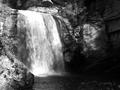
| 03/08/2005 12:33:33 PM |
Looking Glass Falls 2005by nards656Comment: This image fits the high contrast style of Adams and is well composed and applies the rule of thirds to good effect. The vegitation on the left is almost oversharpened. The waterfall is a little overexposed topside and the dark area on the right is a bit distractive and should have a little more detail showing. You will never see either in Adams' work. I must admit, however, my own submission has that same darkside defect that I kick myself over now. I was going to correct it after submission but later did not have time.
Overall this is a tranquil image with a full range of tones. (Score: 6) |
| Photographer found comment helpful. |
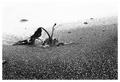
| 03/07/2005 08:45:06 PM |
Strugleby garlicComment: Good idea and framed properly according to the rule of thirds. This image is more high key than it is Ansel Adams style but that did not bother me. It suffers from what most of my digital images suffer from... It looks both oversharpened and out of focus at the same time when there is a lot of fine detail like in the sand. It is made worse in a demanding challenge like this one. The top of the frame is washed out and makes you wonder more what was missed than it does enhancing the main subject. (Score: 5) |
| Photographer found comment helpful. |
| 03/07/2005 04:30:05 PM |
|
| Photographer found comment helpful. |
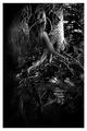
| 03/07/2005 04:28:07 PM |
rootsby whiteroomComment: You will see that in all Adams' images they have high contrast, like yours, but also are perfectly focused. Yours is not. Yours looks to have digital sharpening yet does not seem in clear focus. |
| Photographer found comment helpful. |
Home -
Challenges -
Community -
League -
Photos -
Cameras -
Lenses -
Learn -
Help -
Terms of Use -
Privacy -
Top ^
DPChallenge, and website content and design, Copyright © 2001-2025 Challenging Technologies, LLC.
All digital photo copyrights belong to the photographers and may not be used without permission.
Current Server Time: 08/22/2025 02:59:26 AM EDT.