|
|
|
Showing 491 - 500 of ~861 |
| Image |
Comment |
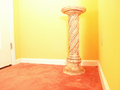
| 06/12/2006 01:51:40 AM | The Pedestal: Default Storage For D.P.Challenge!by 777STANComment: Critique Club Comment
Initial thoughts: Very bright, nice idea and it meets the challenge.
Visual appeal: I like the colors, and I've noticed that some people have mentioned oversaturation, and the colors look a little oversaturated in some places and somewhat washed out in other places. The room has a clean fresh look to it and the pedastal is a nice subject.
Subject & background: The door is distracting and then upon further inspection, so is the electrical outlet on the right side wall. This was an advanced editing challenge, so the outlet imo is a small enough element that could have been cloned out.
Angle, framing & composition: now, for this shot, I would try a vertical orientation, because it would both cut out the door and add some much needed space above the pedastal to give it more of that "expanse in a small space" feel you were going for. I would also pull the pedastal out from the back wall a bit to give it some more space. I think that you did a great job balancing the photo as it seems very level to me.
Focus, clarity & DOF: The focus seems to be pretty good, you might try selectively sharpening the pedastal (since this is advanced editing) to really help bring it out against the yellow wall. I like how the rest of the photo has a kind of soft glow to it.
Lighting & exposure: I think that you did a fairly good job at lighting the area --I see some shadows behind the pedastal and a slightly blown out area above it-- but for a very pale pedastal on a yellow background, I think that you could have used the shadows to your advantage. I think that maybe you could try messing around with pulling the pedastal out from the wall a bit and try casting a sharp shadow to add interest and depth to your photo and also bring it out from its surroundings. Also, you could try some moody, dramatic lighting, maybe a single spot light from above. Just a few suggestions :)
Post processing: This photo doesn't seem to have any obvious editing errors. Like I said earlier, I would try selectively sharpening the pedastal and cloning out the outlet. You also might try messing with contrast to see what you get
Overall, my opinion: I think you have a great idea going here and I would love to see you try this shot with different types of lighting and different lighting techniques to add some more interest. I also wanted to say that I am also confused by your title, I'm not sure how the pedastal is DPC's default storage... but overall, nice job, glad to see that you are experimenting with mirrors and different lighting placements
If you have any questions regarding this critique, feel free to PM me
Amanda
|  Photographer found comment helpful. Photographer found comment helpful. |
| 06/12/2006 01:17:40 AM | by fotomann_foreverComment: well, don't know why you did it, you must have expected a ton of DNMCs, but maybe you were just going for the comments? welp, I would say that I like the pink background and the softness... even the wrinklyness of the fabric would be ok to me if she weren't pushing it around with her body (feet, arms, etc) does that make sense? if not, let me know, I'll try to clarify. I like the framing, at least knowing that this was intended as a portrait, not a DPC pic, you might try the third line thing, but sometimes I think that rule is over-rated. also, that necklace looks familiar to me and I'm guessing it had meaning to her and that she probably doesn't take it off or at least especially isn't going to take it off for pictures, I think it looks finel
Other than that, she's very pretty and I think that this shoot of yours turned out pretty good. | | Photographer found comment helpful. |
| 06/10/2006 02:12:48 AM | Melissa-mat-2006-05-24_b.jpgby nomad469Comment: very nice! the only thing is maybe a looser crop, because I am trying to figure out whose hands belong to whom... I think I know, but still, this one is definitely better than the first, just beautiful | | Photographer found comment helpful. |
| 06/10/2006 02:03:58 AM | Peaty (crop)by shalrathComment: whoa! really cool, love what you did.... how'd you do it? mirrors or photoshop or other? | | Photographer found comment helpful. |
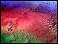
| 06/10/2006 02:02:33 AM | Rainbow Dreamsby RikkiComment: This is very pretty, maybe boost the colors just a tad (if it doesn't ruin them of course) but I love the composition and the abstract-ness of it | | Photographer found comment helpful. |
| 06/10/2006 02:00:13 AM | Flower Abstractionby RikkiComment: very nice! and I don't think it is oversaturated or anything (unless you've edited it since that comment) I love abstract, looks like a painting almost, makes me want to start painting more often again | | Photographer found comment helpful. |
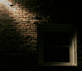
| 06/09/2006 05:42:41 PM | The darkness withinby TheMegalomaniacComment: Critique Club Comment :)
First impression: Neat subject, nice dramatic effect, conveys some emotion and seems to give me that overall feeling of something mysterious, not to mention it definitely meets the challenge.
Focus and clarity: The focus seems to be pretty good, though I would like to see the bricks in the upper left hand corner a little sharper. I like that your window is not in as much focus, because the window is not the main subject of this photo
Angle, framing & composition: I think that the composition is very nice; I don't have a ruler on me, but looks like good use of the rule of thirds. Seems to me that you based the balancing of the photo on the window by compromising between the bottom line and the right side line of the window. I took your photo and tilted it counterclockwise just a smidge so that the bottom of the window was parallel to the horizontal axis. This also aligned the left side of the window with the vertical axis but tilted the right side of the window just a bit, but the picture seems more balanced to me this way. I might suggest leaving a tad more space between the window and the bottom right hand corner.
Lighting: I think that you did an excellent job with the lighting, like you said, not too much and not too little. You can see some detail in most all of the photo, while maintaining the dramatic single lighting effect you were going for. I noticed that someone mentioned they would like to see more detail on the window frame, and I see what they are saying. The lighting in the bottom right of the window is a bit harsh compared to the top left. This would be a hard feat to accomplish given that you can only have one light and the angle of the light is already on the breaking edge of almost having a blown spot where it first hits on the bricks. You might try playing around with angles, but I think that you have already done a great job.
Post processing: I don't see anything that jumps out at me as evidence of post processing errors. My suggestion would be to bump up your colors. Also, since this is advanced editing, you could try selective sharpening to bring out the bricks while leaving the window how it is. (and while you're at, maybe selectively lighten the top left diagonal of the window)
Overall, my opinion: I think that you did a great job on this photo, and you've got the score to prove it. Getting a good in-camera photo to play with in the first place is always a one-up, now with a little post processing, this photo could really stand out.
If you have any questions/comments regarding this critique, or would like further clarification, feel free to PM me.
Amanda | | Photographer found comment helpful. |
| 06/07/2006 06:57:44 PM | | | Photographer found comment helpful. |
| 06/05/2006 04:34:36 AM | Old Adobe Chapelby AzCKellyComment: I think a vertical (portrait orientation) would have been more interesting, and since you can see the bushes anyway, maybe crop lower and have more space at the top. pic seems chopped off to me, but your focus and colors seem to be good | | Photographer found comment helpful. |
| 06/05/2006 04:32:17 AM | linesby fordmanf1Comment: yeah, maybe if you could have found an interesting perspective to shoot from, this could have been better, the colors are good though | | Photographer found comment helpful. |
|
Showing 491 - 500 of ~861 |
Home -
Challenges -
Community -
League -
Photos -
Cameras -
Lenses -
Learn -
Help -
Terms of Use -
Privacy -
Top ^
DPChallenge, and website content and design, Copyright © 2001-2025 Challenging Technologies, LLC.
All digital photo copyrights belong to the photographers and may not be used without permission.
Current Server Time: 12/15/2025 12:20:12 AM EST.
|