| Image |
Comment |
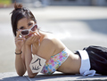
| 06/02/2007 05:30:02 PM |
Lifeguardby meyersComment: great shot, really harsh lighting - which you'd expect for a lifeguard. I'm not sure about the really high contrast, bright area in the upper R and I wish the glasses were a bit more centered
7
J |
 Photographer found comment helpful. Photographer found comment helpful. |
| 06/02/2007 05:28:14 PM |
Beautiful Eyesby griz210Comment: it appears a bit soft and I find the lighting too bright on her chin and neck - great connection with her though, appears you just missed
6
J |
| Photographer found comment helpful. |
| 06/02/2007 05:26:33 PM |
Proud Mother by sfmorrisComment: beautiful animals, I would have preferred a shallower dof as the backgroudn is distracting.
6
J |
| Photographer found comment helpful. |
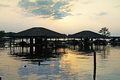
| 06/02/2007 05:24:56 PM |
Cross Lakeby moviemanComment: Well I'm not sure what your trying for here but I'll offer some suggestions. First the composition has some troubles - the horizon line is centered which is generally not a good idea - it appears there is a great barrier between the lake and the sky with the strong horizontal lines across the photo. The posts in the water are a major distraction especially the one in the l lower corner, many shadows are lost under the boat houses, the colors appear to be too saturated, especially in the reflections in the water. Overall you have a good eye in seeing the potential for this shot but you need to think about your composition. Hope this helps, of course this is just my opinion, many may really like this photo.
6
Jack |
| Photographer found comment helpful. |
| 06/02/2007 09:13:49 AM |
|
| Photographer found comment helpful. |
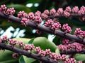
| 06/02/2007 09:13:07 AM |
Pink Budsby kotzieComment: I like the complementary colors of magenta and green, I like the strong diagonals, but overall the compostion is cluttered, the bright contrasting areas in the background are distracting
6
J |
| Photographer found comment helpful. |
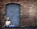
| 06/02/2007 06:36:15 AM |
The Door to Her Dreamsby Jason_CrossComment: Personally I find her expression not too interesting, especially with the title. I feel having her looking out of the frame to the L may have helped balance the picture, as it is all I look at is her face and then her hand. Obviously depends on your story of course. Technically seems fine
6
J |
| Photographer found comment helpful. |
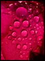
| 06/02/2007 06:33:05 AM |
Cliche Water Beadsby AgaerisComment: the large shadow area in the LR is distracting and could have been cropped out effectively, or a vignetting mask perhaps too
5
J |
| Photographer found comment helpful. |
| 06/02/2007 06:31:20 AM |
Aloneby surfinbirdComment: Nice composition, nice processing, I'd like t perhaps see the yellows and blues played against each other a bit more to make it more interesting
6
J |
| Photographer found comment helpful. |
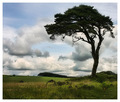
| 06/02/2007 06:26:02 AM |
Beneath the Treeby CrazyStripesssComment: I dont really care for the over-saturated colours, on my monitor the background trees even have a pinkish tint, I also don't like the blow out in the sky
5
Jack |
| Photographer found comment helpful. |
Home -
Challenges -
Community -
League -
Photos -
Cameras -
Lenses -
Learn -
Help -
Terms of Use -
Privacy -
Top ^
DPChallenge, and website content and design, Copyright © 2001-2025 Challenging Technologies, LLC.
All digital photo copyrights belong to the photographers and may not be used without permission.
Current Server Time: 09/02/2025 12:19:56 AM EDT.