|
|
|
Showing 401 - 410 of ~575 |
| Image |
Comment |
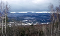
| 05/01/2007 12:00:05 AM | The not-so-green-yet Mountainsby mistchild2008Comment: Hi from the CC,
Your intentions were good with this image. Unfortunately, it's simply not an exciting shot, which explains the low score of this submission. The technical aspects of the photo are good: well framed by the trees and the whites are white. I like the reddish hues in some of the trees.
My first question when I saw this picture was "what's the subject?" The mountains are out of focus, have low local contrast, and don't have sufficient colour to make them "pop out". You said you did auto contrast and levels, but more could have been done. See how flat those trees on the mountain look? They could really stand out against that snow. Also, even though I said the trees frame the shot nicely, it is quite predictable. I'm betting that the sky looked more ominous when you first framed this shot; the foreboding could have been restored with some dodging and burning.
When you've got a shot with flat colour, always consider using black and white. I think a high contrast B&W shot would have scored much better here.
Regards,
Geoff Ball |  Photographer found comment helpful. Photographer found comment helpful. |
| 04/30/2007 11:38:47 PM | Puppy Hair-Doby patio127Comment: Hi from the CC,
What an expression! You captured the emotion perfectly. Colours are good, as is the contrast and depth of field. The mouth and important fur are in focus, and I assume the eyes are, too. Some might complain that the eyes are underexposed, but I would disagree; they are perfectly soulful, and help convey the mood. As for the rest of the dog, perhaps it could use some frontal lighting. However, all the detail is observable and there is no noise, so it's certainly not mandatory. The background is sufficiently blurred to shift focus to the dog.
I don't have many negative things to say about this image. Perhaps a slight desat of the background? I'd say you met the challenge requirements, so I have no idea why you got a 1, some 2s, and so many 3s.
This shot ranked lower than it should have, given the competition.
Great job with this shot.
Regards,
Geoff Ball | | Photographer found comment helpful. |
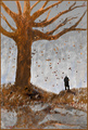
| 04/30/2007 07:50:11 PM | The Tale of Tress-Lock Forest (enitrely of hair!)by LaMasComment: Greetings from the CC,
Wow! What a labour of love! I feel like I'm critiquing a painting rather than a photograph, which isn't necessarily a bad thing. All photographs have an art component to some degree, and you have certainly conveyed your artistic side here. There are great colours, interesting textures, and good contrast in this image.
The problem many had, I believe, is that it no longer appears to be a photograph. This is certainly a work of art (and a good one, in my opinion), but this is primarily a competition of photography. Although the pictures of the hair are your originals, they've been used as a texture to create a painting, not a photograph.
With that being said, there's not much technically lacking with this shot. Everything is crisp (except the outline of the tree bark along the trunk), and actually looks like a forest scene if you let your imagination run wild a bit. The tree is well-positioned, and the falling leaves are a nice touch.
I can't do much else to critique this image, since there aren't many photographic elements beyond those I've already discussed. Artistically, this is stunning, so I can see why it scored as well as it did. Since this is a photography site, I can also see why it didn't score even better.
Overall, I like it!
Regards,
Geoff Ball | | Photographer found comment helpful. |
| 04/27/2007 02:22:40 PM | | | Photographer found comment helpful. |
| 04/24/2007 01:32:19 PM | | | Photographer found comment helpful. |
| 04/24/2007 01:31:55 PM | | | Photographer found comment helpful. |
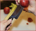
| 04/24/2007 01:31:01 PM | The Knifeby HaneckComment: Nice close-up. Good colour and pretty good contrast. | | Photographer found comment helpful. |
| 04/24/2007 01:30:29 PM | | | Photographer found comment helpful. |
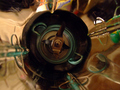
| 04/24/2007 01:30:08 PM | Yin-Yangby meneleComment: Good detail, but the white isn't very white (it's too gray in the bottom-left). | | Photographer found comment helpful. |
| 04/24/2007 01:29:17 PM | Oh NO!by tomcatComment: Original theme. Nice detail. A bit flat, though. | | Photographer found comment helpful. |
|
Showing 401 - 410 of ~575 |
Home -
Challenges -
Community -
League -
Photos -
Cameras -
Lenses -
Learn -
Help -
Terms of Use -
Privacy -
Top ^
DPChallenge, and website content and design, Copyright © 2001-2025 Challenging Technologies, LLC.
All digital photo copyrights belong to the photographers and may not be used without permission.
Current Server Time: 08/27/2025 03:23:36 AM EDT.
|