| Image |
Comment |
| 05/30/2006 09:55:33 AM |
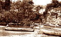
River Workby TuckersmomComment: This a great example of high key. I usually see it done in black and whites but this coloring really adds an old almost poverty like feeling and I think it brings out more detail. I see nothing wrong with this really. The best I can come up with is I would MAYBE crop a little tighter in the left hand side but it would be a shame to cut off any of the whole boat so thats a tough call. I'd also probably clone some of the trees into the open blown out sky area. great photo! |
 Photographer found comment helpful. Photographer found comment helpful. |
| 05/30/2006 09:35:31 AM |
resized raw.jpgby notonlineComment: you did a wonderful job in post processing. didnt go too far. thanks for adding the original. its nice to see the difference. Message edited by author 2006-05-30 09:36:20. |
| Photographer found comment helpful. |
| 05/30/2006 09:31:14 AM |
A Portrait Of A Portraitistby KrisbyComment: i gave you a seven apparently but the weirdest thing about this for me is the blue hands. like zombie hands. lol. not sure if thats lighting or just from holding that pose too long but its off putting.
edit for spelling Message edited by author 2006-05-30 09:31:45. |
| Photographer found comment helpful. |
| 05/30/2006 09:28:47 AM |
dimiso 040b1.jpgby KrisbyComment: Id like this better if the blurry girl were cropped out entirely, i love the left side though all the way up to the white space before the blurry girl. |
| Photographer found comment helpful. |
| 05/30/2006 09:26:24 AM |
Footballersby KrisbyComment: possibly a tiny bit too much contrast on the people. And maybe if the roof were a tad darker it would balance out the photo. otherwise very nice.
just realized there is a distracting line under the roof on the upper left hand corner. is that from post processing? perhaps a mistake? just wanted to point that out. Message edited by author 2006-05-30 09:27:18. |
| Photographer found comment helpful. |
| 05/30/2006 09:23:42 AM |
Down the stairsby KrisbyComment: I love this one. the guy being blurry is a bit distracting but even the blown out sky works well with this one. the women are in fantastic focus. great capture. |
| Photographer found comment helpful. |
| 05/30/2006 09:06:46 AM |
Soft Tulipby BenComment: I like the placement of the flower in this one. I also enjoy the amount of blur in MOST of the shot but would prefer even more blur on the out of focus flower so my eye wouldnt be quite so drawn to it. since i can still see the shape of it it makes me want to see more. Hope I make sense. lovely color, lighting, and focus on the foreground flower though. ;) |
| Photographer found comment helpful. |
| 05/30/2006 09:03:37 AM |
Bluebell Pathby BenComment: this is exquisite. ive seen it a couple times in the pick your favorite thread. its awesome, the ONLY criticism I have is the big blurred leaf in the upper left hand corner is distracting. great work! |
| Photographer found comment helpful. |
| 05/30/2006 08:58:08 AM |
Img_3724a_filtered-sm.jpgby ShamanComment: A slightly larger depth of field would have helped here. i assume thats why her face is focused but her chest is not. if all of her was focused it would look better to me but if thats what you were going for than just ignore me. you can see by my self portrait im usually a fan of shallow DOF myself. the background could use a little neat image too. its has good potential though. i love the lgihting |
| Photographer found comment helpful. |
| 05/30/2006 08:55:39 AM |
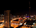
Toronto Nightby pidgeComment: the buildings are perfect. i like the left side of the sky alot, if the lower right corner of the sky had the same smoothness and darkness as the rest i think id like it better. the stars work in this one though. they are nice and sharp. good work! |
| Photographer found comment helpful. |
Home -
Challenges -
Community -
League -
Photos -
Cameras -
Lenses -
Learn -
Help -
Terms of Use -
Privacy -
Top ^
DPChallenge, and website content and design, Copyright © 2001-2025 Challenging Technologies, LLC.
All digital photo copyrights belong to the photographers and may not be used without permission.
Current Server Time: 06/17/2025 10:26:59 PM EDT.