| Image |
Comment |
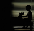
| 08/31/2006 07:27:42 AM |
my palby lynnmarieComment: not sure how I feel about the dark spot on the left of the frame. I dont think it possibly adds anything. however i love the rest of the photo. 8 |
 Photographer found comment helpful. Photographer found comment helpful. |
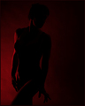
| 08/31/2006 07:25:55 AM |
Scarletby idnicComment: I'd prefer this if the model were completely nude as the cloth isnt very smooth and makes the lines of the body choppy and it loses that nice flow that would help this. fantastic color though. and great composition. lovely.8 |
| Photographer found comment helpful. |
| 08/30/2006 10:08:38 AM |
Wet Sandby cerebisComment: beutiful when i saw the thumbnail i thought it was a shiny hardwood floor. it has a great mood to it and interesting color tone. |
| Photographer found comment helpful. |
| 08/30/2006 09:19:54 AM |
|
| Photographer found comment helpful. |
| 08/30/2006 08:38:52 AM |
|
| Photographer found comment helpful. |
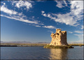
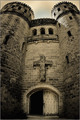
| 08/30/2006 08:08:02 AM |
Steve Joined a Monasteryby idnicComment: great placement with this photo. very funny. when we went down there we never found castle ottis. too bad. looks like an awesome place for a shoot. but i did pretty well with my "oldest schoolhouse" photo. love the light sepia tone in this. and fantastic POV. |
| Photographer found comment helpful. |
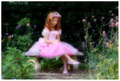
| 08/30/2006 08:03:13 AM |
Katie Bubbles 3by otisXmikeComment: the girl in me can't resist commenting on that "way cute" dress. I love it. I have this super cute green pattern 50's june cleaver type dress that this photos makes me yearn to wear again. now I gotta go lose some weight and get back into that thing. lol. thank your wife for the inspiration. ;) great photo and series. I think her hair and eyelashes could use a tad more contrast or darkness but that's my only complaint. |
| Photographer found comment helpful. |
| 08/30/2006 07:56:49 AM |
|
| Photographer found comment helpful. |
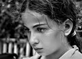
| 08/28/2006 05:31:48 PM |
introspectionby ErinMComment: I agree i'd like some more room off to the left. also it looks to me like the hair is the sharpest instead of the eyes or some other part of the face. i think that detracts from it a little. but i like everything else. the look, the black and white, the DOF etc.. |
| Photographer found comment helpful. |
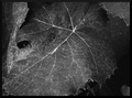
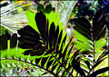
| 08/28/2006 04:53:35 PM |
Natures Patternsby sherpetComment: the lighting makes this. its adds such a great mood to otherwise boring subject matter. I also really like the hints of blues and reds found throughout if you look closely. great job. |
| Photographer found comment helpful. |
Home -
Challenges -
Community -
League -
Photos -
Cameras -
Lenses -
Learn -
Help -
Terms of Use -
Privacy -
Top ^
DPChallenge, and website content and design, Copyright © 2001-2025 Challenging Technologies, LLC.
All digital photo copyrights belong to the photographers and may not be used without permission.
Current Server Time: 06/23/2025 06:31:05 PM EDT.