| Image |
Comment |
| 10/01/2009 01:47:20 PM |
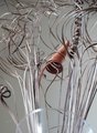
Twistyby HepciComment: *not voting as I'm in this challenge-just commenting since I've seen requests for comments in the challenge thread*
I've seen a few of these in this challenge so far and although I like the concept I think it would have helped had you twisted it into some sort of shape. The placement in the frame is intersting and I like how you've matched your border to the twist tie. |
 Photographer found comment helpful. Photographer found comment helpful. |
| 10/01/2009 01:44:53 PM |
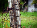
...and rustedby androgeusComment: *not voting as I'm in this challenge-just commenting since I've seen requests for comments in the challenge thread*
Wow, very close up macro. Excellent DOF and sharpness and clarity. These colors should work well together being that they are nearly complimentary but I think that possibly the darker reddish tones in the rust is clashing a bit with the blue BG. For me at least.
HTH |
| Photographer found comment helpful. |
| 10/01/2009 01:42:50 PM |
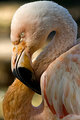
Guardianby HipychikComment: *not voting as I'm in this challenge-just commenting since I've seen requests for comments in the challenge thread*
Very pretty colors. I love the clairity and colors on the left side of the shot but those seem to get lost on the right hand side. Great textures and colors for sure. |
| Photographer found comment helpful. |
| 10/01/2009 01:38:15 PM |
Bike lights!by acg83Comment: *not voting as I'm in this challenge-just commenting since I've seen requests for comments in the challenge thread*
Nice. I like the colors here too. The red white and black that is. I think that the yellow at the bottom takes away from the beauty of the rest of the shot. great job capturing and editing this though.
HTH |
| Photographer found comment helpful. |
| 10/01/2009 01:36:55 PM |
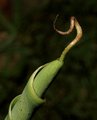
twisted bananaby browda1Comment: *not voting as I'm in this challenge-just commenting since I've seen requests for comments in the challenge thread*
It's a very interesting subject which could do quite well when photographed in the right way but I think your photo suffers from being too soft and having a lot of noise in the background. Good eye though.
HTH |
| Photographer found comment helpful. |
| 10/01/2009 01:35:01 PM |
And God Said, "Let There Be Light..."by VivaLaAlexanderComment: *not voting as I'm in this challenge-just commenting since I've seen requests for comments in the challenge thread*
Cool idea and you did a very nice job of make smooth lines. Soemtimes when one is trying to make lines perfect they do it slowly and it ends up shakey. This is not shakey looking at all. My only nitpicks are one the line at the bottom on the carpet or sand (I beleive it is carpet). Which brings me to my second nitpick. The carpet/whatever it is itself. I'm almost positive it's carpet at least but to someone voting fast they may just think it's noise and vote you down. next time a smoother surface would probably help.
HTH |
| Photographer found comment helpful. |
| 10/01/2009 01:30:59 PM |
S Curveby izadoodleComment: *not voting as I'm in this challenge-just commenting since I've seen requests for comments in the challenge thread*
Nicely composed. I think this sufferes from some harsh lighting but I love how you've included the face. Many others in this challenge did not. I really dig the lines in this. He/She has almost made a figure 8. very cool. |
| Photographer found comment helpful. |
| 10/01/2009 09:59:51 AM |
Twisted Twigsby asamiteComment: *not voting as I'm in this challenge-just commenting since I've seen requests for comments in the challenge thread*
Beautiful idea. If the vase were in sharp focus too I'd really love this. Still wonderful as is but the blurry vase really takes something away from it for me. |
| Photographer found comment helpful. |
| 10/01/2009 09:58:35 AM |
Twisted & Tangledby Hye5Comment: *not voting as I'm in this challenge-just commenting since I've seen requests for comments in the challenge thread*
Beautiful model and great idea. This could really benefit from some advanced editing. That black spot in the lower left corner is distracting as are the harsh shadows. also looks like it could stand to be brightened up a bit all over. I really do dig this photo overall though. Great creative idea. |
| Photographer found comment helpful. |
| 10/01/2009 09:56:22 AM |
vortexby jnix1asdfComment: *not voting as I'm in this challenge-just commenting since I've seen requests for comments in the challenge thread*
Very nice colors. The compositons not working for me and seems like it could probably use a bit more contrast too though.
HTH |
| Photographer found comment helpful. |
Home -
Challenges -
Community -
League -
Photos -
Cameras -
Lenses -
Learn -
Help -
Terms of Use -
Privacy -
Top ^
DPChallenge, and website content and design, Copyright © 2001-2025 Challenging Technologies, LLC.
All digital photo copyrights belong to the photographers and may not be used without permission.
Current Server Time: 06/16/2025 11:11:36 AM EDT.