|
|
|
Showing 141 - 150 of ~1449 |
| Image |
Comment |
| 08/24/2009 04:38:17 PM | Egg with a Side of Ribbonby LadyKComment: Greetings from the Critique Club!
First Impression: You really must love eggs! :) This is a really fun and a very original photo (and sounds like you had fun setting it up as well!).
Technicals/Processing: Although the composition is good, having the pan straight on (like your inspiration) or a tighter crop would have strengthened your composition significantly. I am not a big fan of your background, its texture and pattern seems to compete with the omelet. While your focus for the most parts is good, I really wish the focus was sharp throughout -- the slightly out of focus handle knobs and lower right of the omelet are a little distracting. I think a final pass of sharpening would have helped to bring out some texture in the omelet. The lightning on the top left of the pan is a little strong.
Final thoughts: Unfortunately, I think, your choice of background costed you a few points, as technical shortfalls are fairly minor. This is a fun and very original image and, as  Jutilda Jutildasaid, you really can't go wrong with Calphalon!
Please feel free to PM me if you have any questions.
Cheers,
Anna |  Photographer found comment helpful. Photographer found comment helpful. |
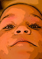
| 08/24/2009 01:26:36 PM | Falling asleepby MistyMuckyComment: Greetings from the Critique Club and congratulations on top 10!
First impression: It made me laugh, the faces are too cute. Fantastic image, very original and well done.
Tehcnicals: Your technicals are spot on, I love the selective desaturation. Your composition is good, although it feels a little tight for me -- a little more space on the sides would do it. Your focus is spot on and exposure is great, I love the wrinkles on the pillow.
Final thoughts: It is hard to critique an image that I like. The photo is really well done and everything works well. Great job!
Feel free to PM me if you have any questions.
Cheers,
Anna | | Photographer found comment helpful. |
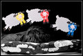
| 08/24/2009 10:10:42 AM | Ribbons brings life to a photo...by tinkie2010Comment: Greetings from the Critique Club!
First impression: What a cute face and such a fin photo! Unfortunately, you got penalized for not depicting DPC ribbons, as directed in the challenge description.
Technicals/Processing: I like the use of selective desaturation here. I like the tilt of the head and the shadows from the whiskers -- it actually looks like he is smiling! The light on the ribbons is a bit harsh, though, and composition is too central for me. The beauty of the advanced editing challenges is that you can spot edit your photos (some burning of the highlights would have helped). The face of this fun creature is too flat, I would have liked to see a little more contrast. The background feels a little cluttered for me. If you could not change your angle, a bit of vignette would have helped. Your focus is good; a pass of sharpening after resizing can help to bring out the details.
Final thoughts: Showing DPC ribbons would have definitely helped the score. While a fun shot, the image does not catch my attention for a very long time. Advanced editing is great as it allows you to explore different processing techniques.
Feel free to PM me if you have any questions.
Cheers,
Anna | | Photographer found comment helpful. |
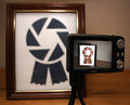
| 08/24/2009 09:55:17 AM | The Road to Brown is Paved With Good Intentionsby SenayComment: Greetings from the Critique Club!
First impression: I remember this image from glancing through the entries and I love your take on the challenge and your creativity.
Technicals: The composition feels a little unbalanced to me, the camera position is a little off. While focus on the in-camera picture is great, I would have liked to see the framed ribbon was in focus as well. Setup similar to this has been done before and advanced editing would have allowed sandwiching different apertures. In addition, the photo looks a bit flat on my screen.
Final thoughts: I love the idea but I feel that execution fell a little short. The colors feel too muted; I would have liked to see blue and brown ribbon a bit brighter. I am not a fan of the table either, seamless background would have worked better, I think.
Feel free to PM me if you have any questions.
Cheers,
Anna | | Photographer found comment helpful. |
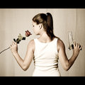
| 08/21/2009 12:13:04 PM | Femme Fataleby rmezzoComment: Greetings from the Critique Club!
First impression -- love the image, the tones and the light. Agree with the commenters about the sheet, I think it costed you quite a few points, unfortunately.
Techinicals -- I really love the light here. I would have like to see it as a more central composition, with rose and the gun equal distance from the edge. The focus is spot on, while the exposure on the model is good, the background seems a bit underexposed to me and is too similar in tone with the skin of the model.
Final thoughts -- I love the muted colors and the feel of the photo. Great composition and light. Good work.
Feel free to PM me if you have any questions.
Cheers,
Anna | | Photographer found comment helpful. |
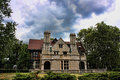
| 08/21/2009 11:58:54 AM | House Of Secretsby SenayComment: Greetings from the Critique Club!
First impression -- I like the serene feel here, beautiful old house and really interesting clouds. I wish the sky was blue, though.
Technicals -- The perspective seems a bit off to me, as the first glance it looks like the house is about to fall backwards. I would have preferred to see it from a different angle. While the house is nicely framed, by all the vegetation, I find the shrubs in the foreground in the current a bit distracting. They were cut off at an odd level; more of shrubs in the foreground would give the house more of a dignified look. The focus is good; the white sky looks blown out, though.
Final thoughts -- Your processing did not seem to add much to the photo -- I believe it might have benefitted from a pass of USM, some additional contrast and color boost. I also believe it would have looked great in b&w. This is definitely an interesting subject and a great candidate for HDR, so I really hope to see this house again in a different challenge or a free study.
Feel free to PM me if you have any questions.
Cheers,
Anna | | Photographer found comment helpful. |
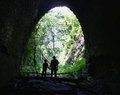
| 08/17/2009 04:48:32 PM | abandonedby vawendyComment: Greetings from the Critique Club!
First impression: I like the silhouettes, father and son "story line" is very cute. I think there was potential to make more out of the image but there seem to be very little processing done besides resizing.
Technicals and composition: I really like the framing and the angle that emphasized the height of the tunnel and really forces me to look at the silhouettes. The exposure seems to be off -- the highlights in the trees and rocks are blown out and the shadows are too dark to see all the intricate brick work. The out of focus top of the tunnel with a blue tint is a bit distracting, I cannot stop looking there and I wish I could focus more on either the father and the son or the brickwork. Lack of noise for ISO of 1600 is quite impressive.
Final thoughts: While I like a lot of the elements of the photo, I find the blown out rocks and trees very distracting. I agree that some dodging inside the tunnel and burning the trees and the rocks would have provided more details to admire. This looks like a perfect candidate for HDR, although you really have to plan for that kind of shot in advance. Some shadows/highlights adjustments might have helped as well.
Please feel free to PM me with any questions.
Cheers,
Anna | | Photographer found comment helpful. |
| 08/17/2009 12:26:01 PM | Tunnels of smellby tinkie2010Comment: Greetings from the Critique Club!
First impression: This is quite an OOB submission!
Composition and technicals: The technicals (from what I can see after all the editing) are fine; the composition is centered but works for me here. The angle at which it was shot links the image to the challenge topic and is quite fun.
Final thoughts: The image is very over processed for my taste, it is definitely belongs more in the realm of digital art. While intentional, processing does not work for me. This is fun shot but is too out of the box for me (it feels more like a shoehorn, really).
Feel free to PM me if you have any questions. | | Photographer found comment helpful. |
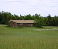
| 08/16/2009 05:06:49 AM | Barn On The Prarieby WishingdoveComment: Greetings from the Critique Club and welcome to DPC!
First impression: I like the tall grass on the foreground but the image does not have anything that captures my attention for a long time.
Composition: Your composition is too central for me, I would have liked to see it with less sky, which would put more emphasis on the grasses.
Technicals: Your focus seems a bit off -- nothing seems in focus. I would suggest getting off the landscape mode and try your hand at actually taking control over your photo -- aperture of 2.97 does not really work for a landscape shot, try F 8 and higher next time.
Final Thoughts: While your photo has potential, there is nothing there that grabs attention for a long time and the technicals are off. There are good tutorials on this site about how to improve the technicals and the processing skills as well as multitude of forum threads which can be very helpful.
Feel free to PM me if you have any questions.
Cheers,
Anna
| | Photographer found comment helpful. |
| 08/16/2009 03:57:58 AM | Pulau Mabul Village, Malaysian Borneoby in2truthComment: Greetings from the Critique Club!
First impression: Nice photo but it seems to be a bit busy and I find my eyes flitting from place to place never really settling on anything in particular.
Composition: Your composition is good, nice use of the rule of thirds and leading lines to guide the eye around the photo.
Technicals: Your technicals are good as well, great control of shadows and, especially, the highlights.
Final Thoughts: I feel that you have gone a little too far with Topaz color boosting, giving the photo an very overprocessed feel. And I really wish that that dark cloud in the top left was not there.
Feel free to PM me if you have any questions.
Cheers,
Anna
| | Photographer found comment helpful. |
|
Showing 141 - 150 of ~1449 |
Home -
Challenges -
Community -
League -
Photos -
Cameras -
Lenses -
Learn -
Help -
Terms of Use -
Privacy -
Top ^
DPChallenge, and website content and design, Copyright © 2001-2025 Challenging Technologies, LLC.
All digital photo copyrights belong to the photographers and may not be used without permission.
Current Server Time: 09/03/2025 06:00:15 PM EDT.
|