| Image |
Comment |
| 03/16/2008 03:14:46 PM |
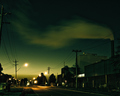
Toxic hazeby FirstyComment: The editing you've chosen for this perfect.. even though it's a very simple image it's very appealing.. there's something very ghostly about the emptiness of the street |
 Photographer found comment helpful. Photographer found comment helpful. |
| 03/16/2008 02:13:48 PM |
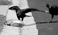
Waters Edgeby pillikcamComment: This seems like quite a photogenic place.. It's full of textures and shapes.. The light here is rather harsh.. The bird is almost completely overblown because of this.. I would have liked to have the landscape view here.. it would have shown more context and make the composition seem less awkward.. |
| Photographer found comment helpful. |
| 03/16/2008 02:06:19 PM |
|
| Photographer found comment helpful. |
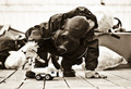
| 03/16/2008 01:48:14 PM |
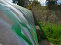
Graffiti Pollutionby MatrimComment: This would have been more interesting composition if there had been something that was being led to by the wall.. instead I end up not paying attention to what should have actually been the focus.. |
| Photographer found comment helpful. |
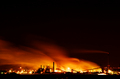
| 03/16/2008 01:44:15 PM |
Where Oil Meets Waterby cnsComment: I like how you've combined the beach and factory in the composition.. Gives the image an interesting twist.. |
| Photographer found comment helpful. |
| 03/16/2008 01:36:24 PM |
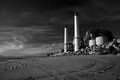
The Future?by cptpolandComment: I adore the use of high contrast and really like the setup.. I only wish this hadn't been taken straight head on.. the darker area is all clumped together.. and the details of the stance is slightly lost.. |
| Photographer found comment helpful. |
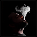
| 03/16/2008 01:31:50 PM |
Lung Pollution  by timfythetooComment: Love how you've captured the wispiness of the smoke.. and great lighting. another winner mr. toole.. |
| Photographer found comment helpful. |
| 03/15/2008 11:13:42 AM |
|
| Photographer found comment helpful. |
| 03/15/2008 10:53:54 AM |
|
| Photographer found comment helpful. |
| 03/15/2008 10:52:05 AM |
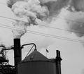
Giving America a Bad Nameby zillahlewisComment: I think you should have straightened the image to get rid of the tilt.. that's the first thing I noticed instead of the actual image.. The upper half is interesting.. the combination of the smoke and the wires are very appropriate for the challenge.. The lower half is just in the middle of being a silhouette and then not..not sure it looks that great.. I do like how the flag is instatntly recognisable |
| Photographer found comment helpful. |
Home -
Challenges -
Community -
League -
Photos -
Cameras -
Lenses -
Learn -
Help -
Terms of Use -
Privacy -
Top ^
DPChallenge, and website content and design, Copyright © 2001-2025 Challenging Technologies, LLC.
All digital photo copyrights belong to the photographers and may not be used without permission.
Current Server Time: 06/20/2025 02:04:22 PM EDT.