| Image |
Comment |
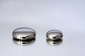
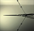
| 11/19/2008 09:57:04 AM |
Mercury by robstComment: Congratulations. Great simple photo. |
 Photographer found comment helpful. Photographer found comment helpful. |
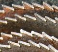
| 11/19/2008 08:49:10 AM |
macro-48by picksterComment: Saw blades? Photo is out of focus and looks very grainy. |
| Photographer found comment helpful. |
| 11/19/2008 08:47:34 AM |
Do Not Touchby treimeeComment: Very nice. Bed of nails? Maybe a box of nails. I like the hue and the DOF. I wish the nails would have been more inline with each other. |
| Photographer found comment helpful. |
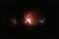
| 11/17/2008 11:09:44 PM |
Hydrogen - Dominant Element in the Universeby PascalComment: Being an astrobuff and physics major, I can really appreciate this photo. You don't get more basic than Hydrogen in stellar nurseries.
I love how you can see so much detail in both the Orion Nebula and the Running Man nebula. Great colors! |
| Photographer found comment helpful. |
| 11/17/2008 10:30:03 PM |
Now and forever with all my heart :)by FocusPointComment: Simple but elegant.
The reflection off the lower portion of the photo is a little bright. Could use a polarizing filter to reduce the reflection.
When I first looked at the photo, I did not notice the halos over the heads of the shadow. Are those meant to be halos? If so, I wish they were a little thinner because when I first noticed them I thought they were hats. Then again, making them any thinner and some voters might miss the slight elegance they bring to the photo. |
| Photographer found comment helpful. |
| 11/17/2008 10:26:32 PM |
A Mothers Loveby JudiComment: Great photo. I love the message it conveys.
Lighting is a bit bright on the stomach area, but other wise great composition.
I wish the wedding ring was a simpler band. It is a beautiful ring, but I find it a little distracting and it takes away from the rest of the image.
Beautiful photo. |
| Photographer found comment helpful. |
| 11/17/2008 10:23:19 PM |
Heart full of colorsby sekarmalathyComment: I am not sure of the message this photo conveys.
Great colors and I like the use the desaturation of the pencils. I wish one of the pencils had yellow since there is so much yellow in the heart and I wish I could see more blue in the heart. |
| Photographer found comment helpful. |
| 11/17/2008 10:14:48 PM |
young at heart...by shamerComment: Neat photo. I like the young at heart message and it is creative.
The think the overall composition is good. I like the DOF of this image. The lighting in my opinion is perfect.
My only complaint would be the fact the heart was cut out of the red leaf. The clean lines of the cut feel unnatural. Your photo contains a lot of great texture and I think the cut takes a way from it a little bit.
Great photo! |
| Photographer found comment helpful. |
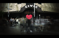
| 11/17/2008 10:06:52 PM |
Pulseby rinacComment: Great photo.
I like they message it conveys. The people walking around add motion to the photo, giving the photo a "I will always be here for you" feeling. I could stare at this photo for hours... it really tells a story for me.
Great composition. The left side of the photo feels all a little darker than the right and it gives the photo a slight uneven feeling. The unevenness probably comes from the person to the right wearing liter clothing than those people on the left.
I also like the use of the desaturated colors except for the hart. I can really tell because of the stop light and the street sign because they aren't distracting |
| Photographer found comment helpful. |
| 11/17/2008 09:09:28 PM |
Water Challenge Outtakeby IreneMComment: Awesome photo. I love the tone you have chosen for the photo. I am amazed at how well this photo is focused. Awesome work! |
| Photographer found comment helpful. |
Home -
Challenges -
Community -
League -
Photos -
Cameras -
Lenses -
Learn -
Help -
Terms of Use -
Privacy -
Top ^
DPChallenge, and website content and design, Copyright © 2001-2025 Challenging Technologies, LLC.
All digital photo copyrights belong to the photographers and may not be used without permission.
Current Server Time: 08/19/2025 08:56:57 PM EDT.