DPChallenge: A Digital Photography Contest You are not logged in. (log in or register
 
Browse Settings
Currently viewing:
Registered UserDaybis

Show comments:

Per page:

Order:

Comments:


Comments Made by Daybis
Pages:   ... ... [60]
Showing 211 - 220 of ~595
Image Comment
Glance
12/03/2008 10:15:54 PM
Glance
by Brad

Comment:
I wish I could see her eyes a bit better. Good photo, but the focus feels a bit soft.
Photographer found comment helpful.
Red
12/03/2008 10:15:01 PM
Red
by brownsm

Comment:
Nice photo, but your model looks like she doesn't want to be there.
Photographer found comment helpful.
My Secret Space
12/03/2008 10:14:41 PM
My Secret Space
by timfythetoo

Comment:
Beautiful and I love the colors and the DOF used.
Photographer found comment helpful.
Steeltown
12/03/2008 10:14:15 PM
Steeltown
by Strikeslip

Comment:
Cool night shot.
Photographer found comment helpful.
Monarchs by Three
12/03/2008 10:14:02 PM
Monarchs by Three
by tinky2

Comment:
The first thing that caught my eyes was the color of the flowers. And the butterflies are perfectly in focus.
Photographer found comment helpful.
A Body in Motion
12/03/2008 10:12:49 PM
A Body in Motion
by tate

Comment:
Nice capture and the blur gives some motion, but the photo feels over exposed.
Photographer found comment helpful.
Mother
12/03/2008 10:12:19 PM
Mother
by jjbeguin

Comment:
A little dark. But I feel that there is a lot more detail in the face and then the detail falls off as you move away form the face. I like the look, just too dark. Creepy photo!
Photographer found comment helpful.
Lost in Each Other
12/03/2008 10:11:35 PM
Lost in Each Other
by jerowe

Comment:
The white shirt feels a little blown, but awesome photo.
Photographer found comment helpful.
On a desert island
12/01/2008 09:40:35 PM
On a desert island3rd Place
by Brin

Comment:
Greetings from the Critique Club Bragi!

First Impression: Words can not explain how I initially felt about this photo... it literally took my breath away.

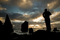
Composition: Awesome composition. The only thing I can complain is that the man looks like he is leaning forward instead of standing up strait. Also, there is some spots on the rocks below the waves, I wish that it was all black instead of seeing a little bit of the rock's texture. Other than that, the composition is absolutely perfect.

Subject:
To me, there really isn't any specific subject... the whole image tells a story.

Creativity:
I can tell you put a lot of thought into this photo. I love how you put the woody on the man's shoulder.

Improvements: Besides the few things I mentioned in the composition portion, this photo needs NO improvements.

My Thoughts: Wow... This is an amazing photo. The photo tells a story and casts a beautiful seen. I almost feel like I am there watching the sunset. I can hear and smell the sea. I can also feel the wind. The photo also also reaches me at an emotional level as well. I feel calm and collected.

Overall, this photo should have received first place in my opinion. You are a great photographers and this photo was so well done that I feel that I am not qualified to critique it.

I hope my critique has been helpful.

Cheers,
Ron
Photographer found comment helpful.
Rocking Out At A Concert
12/01/2008 09:13:21 PM
Rocking Out At A Concert
by Spongetoast

Comment:
Greetings from the Critique Club Shirley!

First Impression: My first impression was that this looked like a snap shot, but a bit better.

Composition: I like the over all composition, but there are something that you might want to change. In the black area of the photo there are some white spots that are distracting that could have been cloned. Some similar spots can be seen on the edge of the overhang. The lighting is decent for what your were shooting. Exposure is good. If you didn't use a tripod, you have very sturdy hands. The red lettering above the marquee is also grainy and I would have liked to have seen entire name of the place the concert was held. It also appears that the light bulbs on the overhang were the focus point instead of the letters on the sign.

Subject: This subject really doesn't tell my anything about where art may have gone. I could see that it might be possible to assume that he went to a concert.

Creativity: This photo doesn't look overly creative to me. This looks like a snapshot and your comments reinforce that idea.

Improvements: To improve the photo, fix some of the things I have mentioned above. Use the clone tool in photoshop to get rid of the spots. You could also use USM to sharpen the photo a bit. You should have also tried to implement some of Art's personality into your photos like some of the other photographers did.

My Thoughts: This photo has potential, but because some of the fine details were overlooked, the image fell short.

Overall, it's an ok photo. I hope my critique has been help and informative If you have any questions please PM me.

Cheers,
Ron
Photographer found comment helpful.
Pages:   ... ... [60]
Showing 211 - 220 of ~595


Home - Challenges - Community - League - Photos - Cameras - Lenses - Learn - Help - Terms of Use - Privacy - Top ^
DPChallenge, and website content and design, Copyright © 2001-2025 Challenging Technologies, LLC.
All digital photo copyrights belong to the photographers and may not be used without permission.
Current Server Time: 06/20/2025 08:14:20 AM EDT.