| Image |
Comment |
| 12/03/2012 07:55:17 AM |
Morning Marketby giantmikeComment: I like how you've isolated the umbrella from the background, but I find the lamp post to be too much of a distraction |
 Photographer found comment helpful. Photographer found comment helpful. |
| 11/30/2012 12:59:54 PM |
Walk on the bright sideby HalldorIngiComment: I like the originality of you concept but I just wish you had made the umbrella stand out a bit more- maybe you could have taken this in more open ground where the umbrella would have been silhouetted against the sky? |
| Photographer found comment helpful. |
| 11/30/2012 12:57:06 PM |
cocktail umbrellasby DustDevilComment: For me I feel you're sitting in the middle ground between having a lot of umbrellas and having a few, so you've got too many for a minimal look and too few for a "full" look.
I do like the clarity and colours however. |
| Photographer found comment helpful. |
| 11/30/2012 12:52:15 PM |
|
| Photographer found comment helpful. |
| 11/28/2012 02:42:45 PM |
|
| Photographer found comment helpful. |
| 11/27/2012 05:56:44 AM |
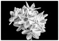
narcissusby neilmwilsonComment: I like the shot but I think it needs a different crop - put more black between the flowers and the border at the top and bottom, and remove some of the black at the sides. |
| Photographer found comment helpful. |
| 11/27/2012 05:54:34 AM |
White on blackby BamBamPKComment: In my opinion there's potentially a great image here, but as it is I don't find it that compelling. I think that the white isn't bright enough. I also think that you could have cropped it much tighter at the top to make the image into three distinct areas - black/white/black. |
| Photographer found comment helpful. |
| 11/27/2012 05:48:53 AM |
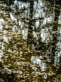
Ink on the Waterby juackComment: It's a good take on the challenge, but as you have two strong linear features that are only slightly off vertical I find it slightly off-putting. I'd rather you had them either more diagonal or actually vertical. |
| Photographer found comment helpful. |
| 11/23/2012 09:46:25 AM |
The Hatchling by markwileyComment: Congratulations and thank you for taking the time to explain how you got the shot. |
| Photographer found comment helpful. |
| 12/06/2011 09:11:41 AM |
|
| Photographer found comment helpful. |
Home -
Challenges -
Community -
League -
Photos -
Cameras -
Lenses -
Learn -
Help -
Terms of Use -
Privacy -
Top ^
DPChallenge, and website content and design, Copyright © 2001-2025 Challenging Technologies, LLC.
All digital photo copyrights belong to the photographers and may not be used without permission.
Current Server Time: 07/17/2025 10:05:23 PM EDT.