| Image |
Comment |
| 10/16/2006 10:20:11 AM |
|
 Photographer found comment helpful. Photographer found comment helpful. |
| 10/16/2006 09:45:19 AM |
In the mirror.JPGby HairlessmanComment: very, very nice. there's something about the bottom right corner that bothers me, but not sure quite what. maybe a little deeper tone there? |
| Photographer found comment helpful. |
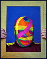
| 10/16/2006 09:31:10 AM |
Gift Wrappedby sherpetComment: i tought this was yours, shez. i love the bright colours on the face, and the fact that you can see the forms of his face beneath the wrapping. i think it might be improved with a darker tone on the background - it's a very strong, pure blue, and is quite distracting. |
| Photographer found comment helpful. |
| 10/16/2006 07:06:52 AM |
|
| Photographer found comment helpful. |
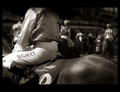
| 10/16/2006 07:02:20 AM |
The Horse and The Rider: Darren Gauciby hotpastaComment: ok, not judi. sorry. i had read somewhere of her going to the races a while ago, so i thought... i even googled darren gauci to discover he is australian...
i stand by comments - this is a stunning image. it didn't place as well as it should have, but, well, that's par for the course.
well done indeed. |
| Photographer found comment helpful. |
| 10/15/2006 10:02:08 PM |
Don'tby fotomann_foreverComment: leroy? this is stunning. a lovely image, and the perfect title, so ambiguous, letting us supply the context ranging from a model's reluctance to true horror.
a vulnerable male nude is so rare, thank you. |
| Photographer found comment helpful. |
| 10/15/2006 09:40:02 AM |
The Outdoor Man by TUBORGComment: superb. the leading lines work very well, bringing the eye to the man. the exposure and compostion are spot on. as with many ohters in this challenge, we can fill in the story, as we can't see his face. and you have created an image with fascinating story potential. |
| Photographer found comment helpful. |
| 10/15/2006 09:38:19 AM |
ANGELby cheleComment: a wonderful image, an 8 even though i have a tiny technical niggle. the content of the picture is so powerful it overcomes the slightly overblown bottom. just a tiny bit deeper tone on the bottom of the image would have made this simply superb.
the contrast between the texture of hte skin, the size of the man, or preconceptions of large tattooed men, and the tattoo itself, andthe title, work wonderfully. (it could have been in unrelatedness too...) |
| Photographer found comment helpful. |
| 10/15/2006 09:35:04 AM |
|
| Photographer found comment helpful. |
| 10/15/2006 09:28:57 AM |
Photograph the Hawkby GeneralEComment: a nice idea, but the resolution really brings you down in this one. the composiotn is good, but i would like to see more doen with the exposure, this is advanced editing, you could have played with the levels much more than you have, creating more drama and visual interest. |
| Photographer found comment helpful. |
Home -
Challenges -
Community -
League -
Photos -
Cameras -
Lenses -
Learn -
Help -
Terms of Use -
Privacy -
Top ^
DPChallenge, and website content and design, Copyright © 2001-2025 Challenging Technologies, LLC.
All digital photo copyrights belong to the photographers and may not be used without permission.
Current Server Time: 06/21/2025 12:43:16 AM EDT.